Project: Account management
Client: BT Wholesale
Company: EPAM
Date: October 2021
Skills used: Leading workshops, Wireframing & Prototyping, UI design, Team leadership, 3 Amigo’s
The problem: Initially the business used an out of the box solution from Salesforce, so that resellers (BT Wholesale customers) can manage their colleagues within our system. This posed a number of problems as more requirements were required.
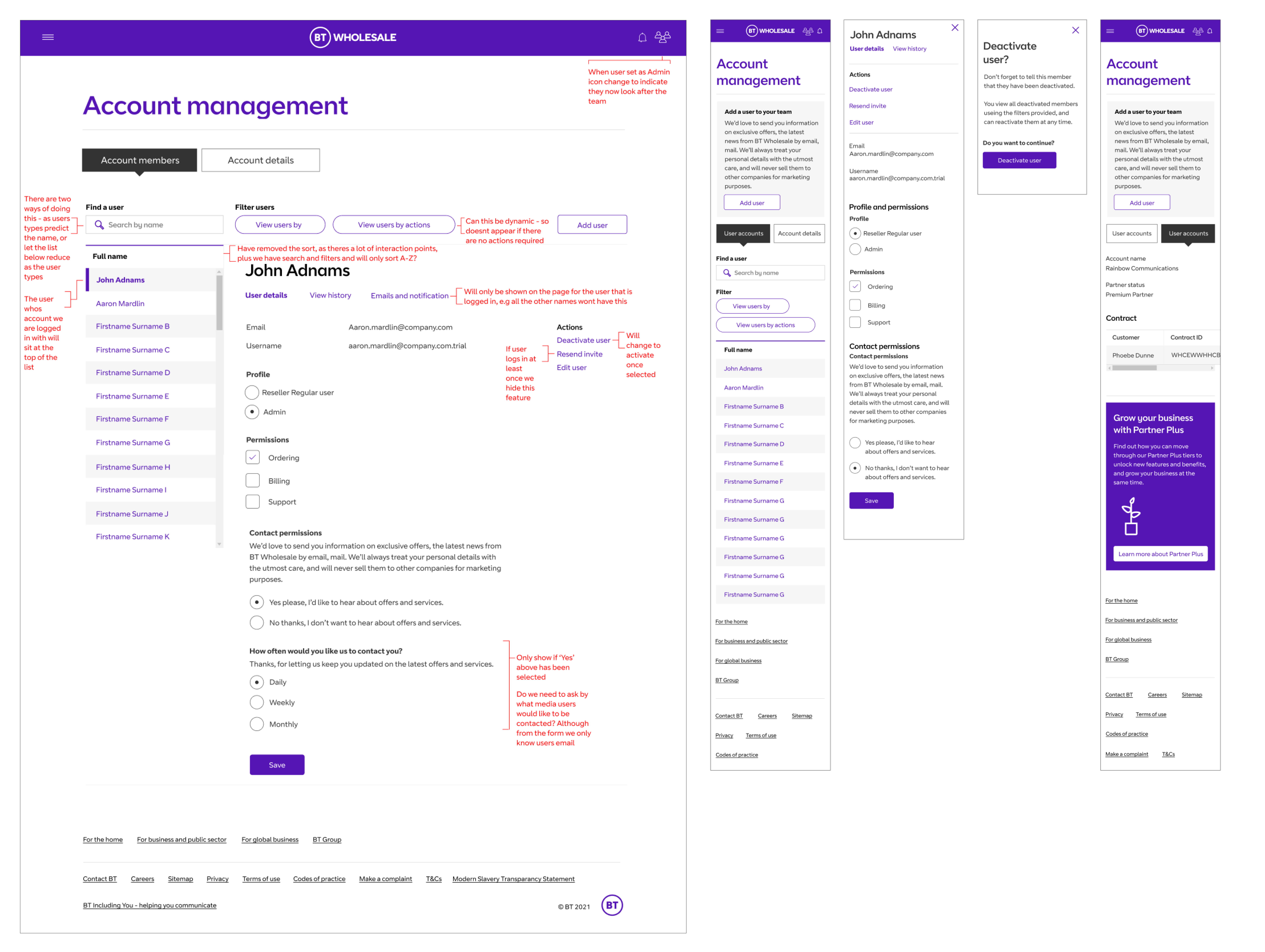
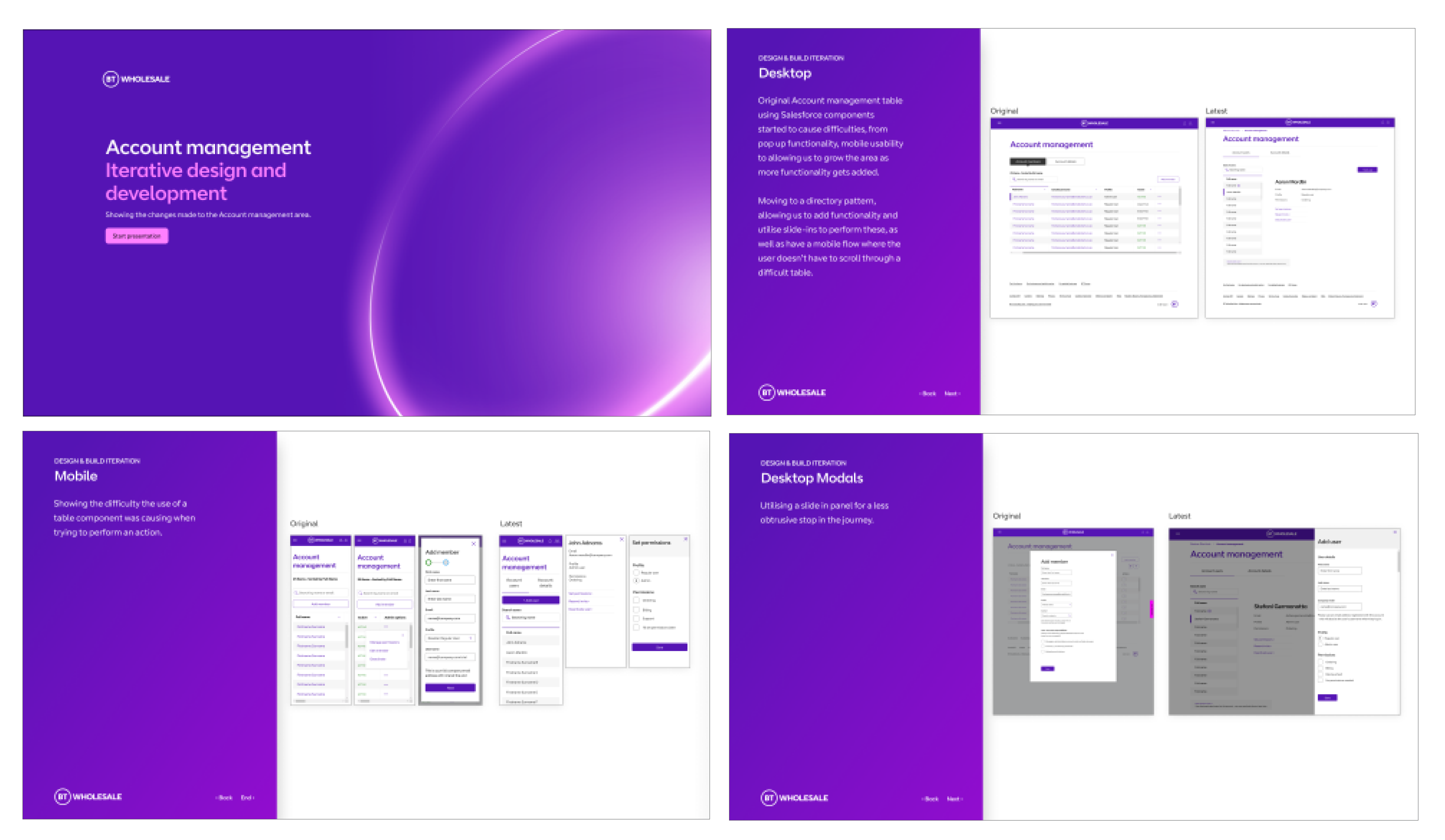
Some of the main problems from the original table
being used was that theres a lot of action points within the table, with a lot being hidden away. There were a number of pop up that had to be used for the functionality to work, and it increasingly became a struggle using this table to add functionality and still allow smooth journey for our users in mobile and tablet.
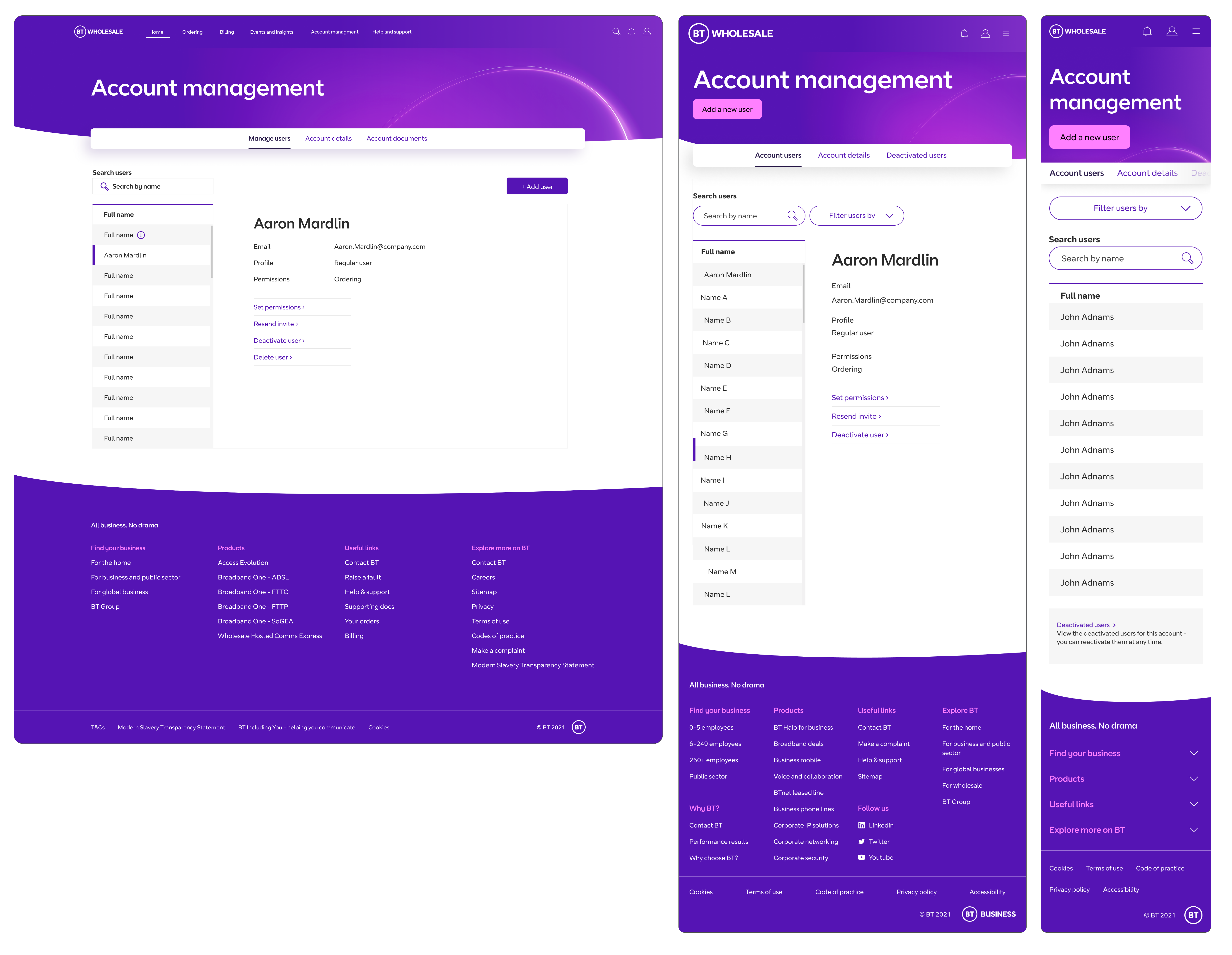
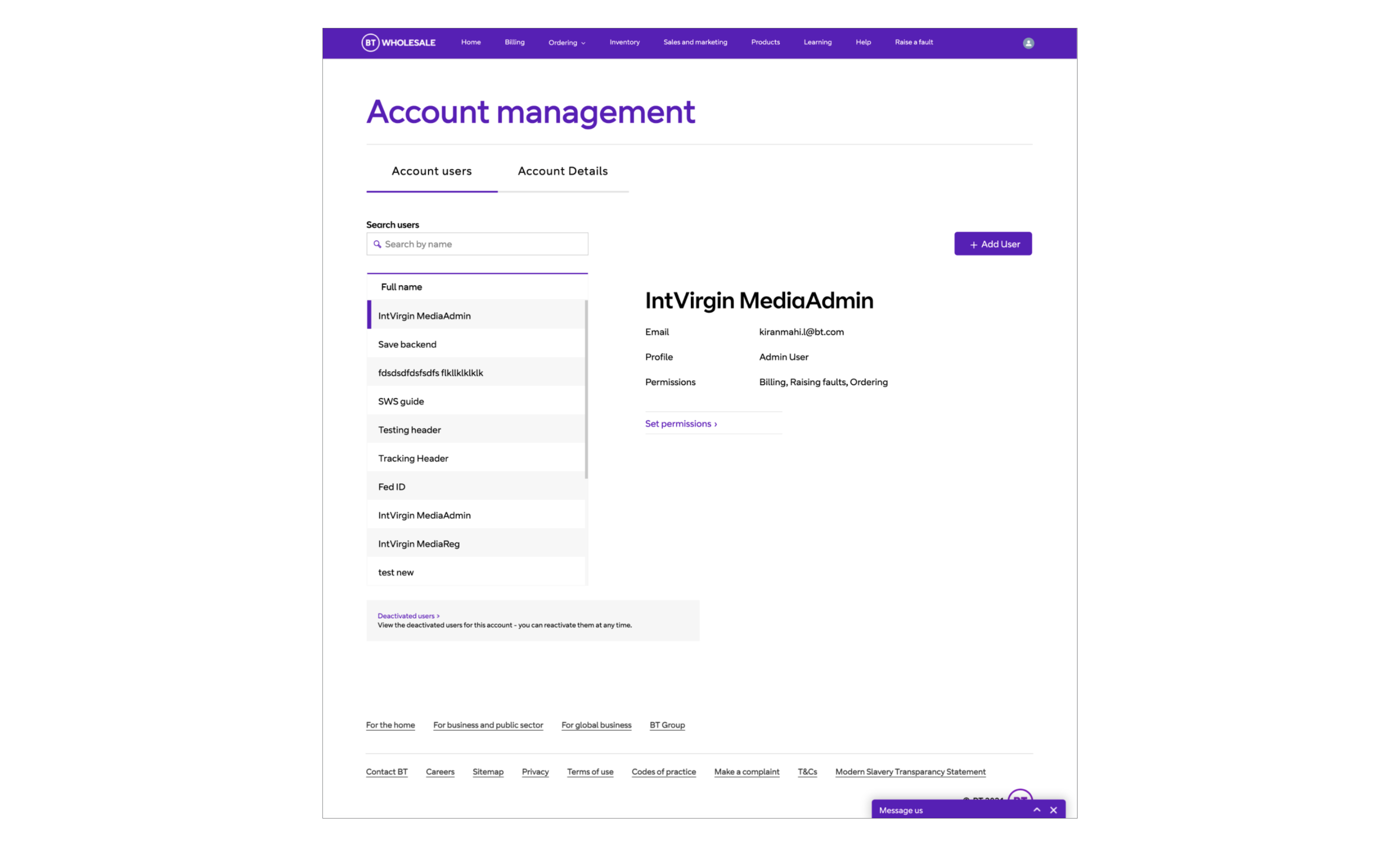
Solution: To re-look at the original table and design a directory from the ground up, that would allow functionality to be added at a later date, plus work seamlessly in mobile and tablet.
Intro
Working with a Business Analyst, Copy writer, and UI Designer, we took a break from designing functionality to fit into the original table from the out of the box solution. Here we sketched out what we would do if we had a clean sheet of paper.
Below showing how certain functionality was hidden away, and how on smaller screens users would be tasked to try and navigate around a large table.
Here are the initial sketches to create a more directory feel and to remove the clutter that the user sees when first landing on teh page
3 Amigo workshops
The next phase of this work was to create a couple of workshops to include the rest of the squad, including the PO, BA, UI Designer, and Front and back end developers. This would allow us to understand what would be possible and what other requirements might be needed so that we could future proof the design.
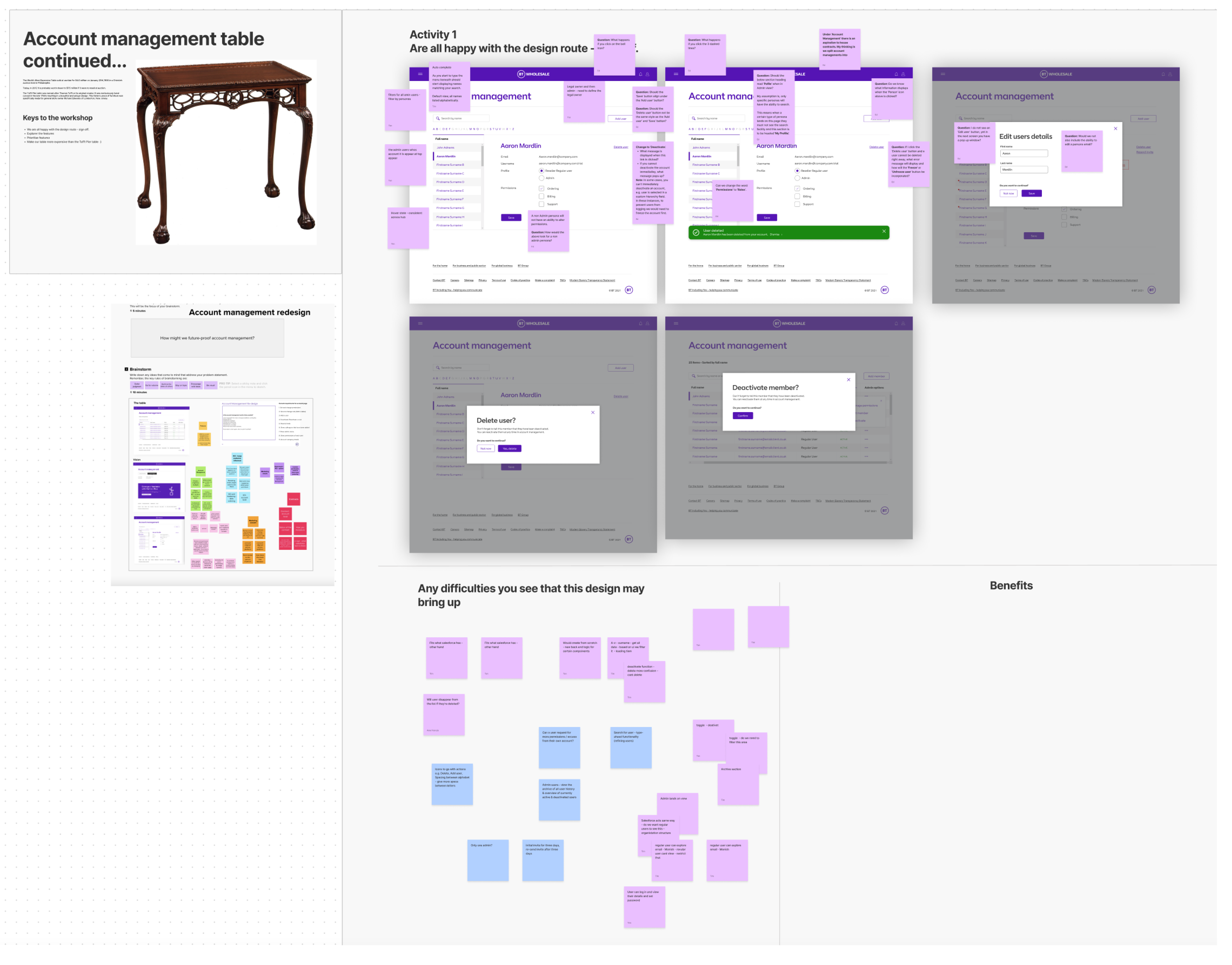
The first job was to not focus on a new website IA but to create a new product hierarchy that was agreed by both Marketing, Product, and Proposition teams. This was done by creating a number of workshops with the teams and running through the existing website and making notes and re-ordering the products when needed.
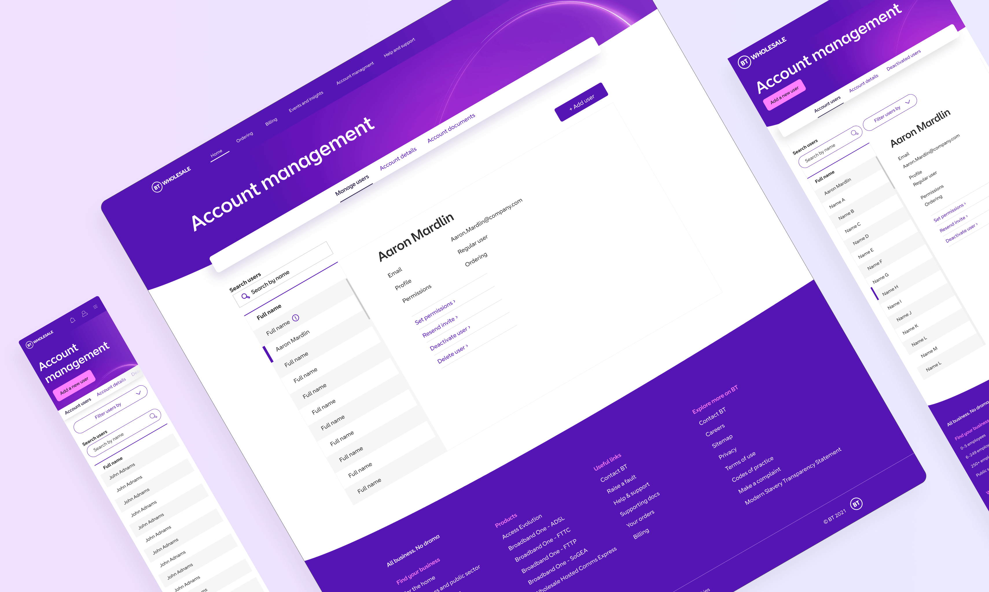
Final designs
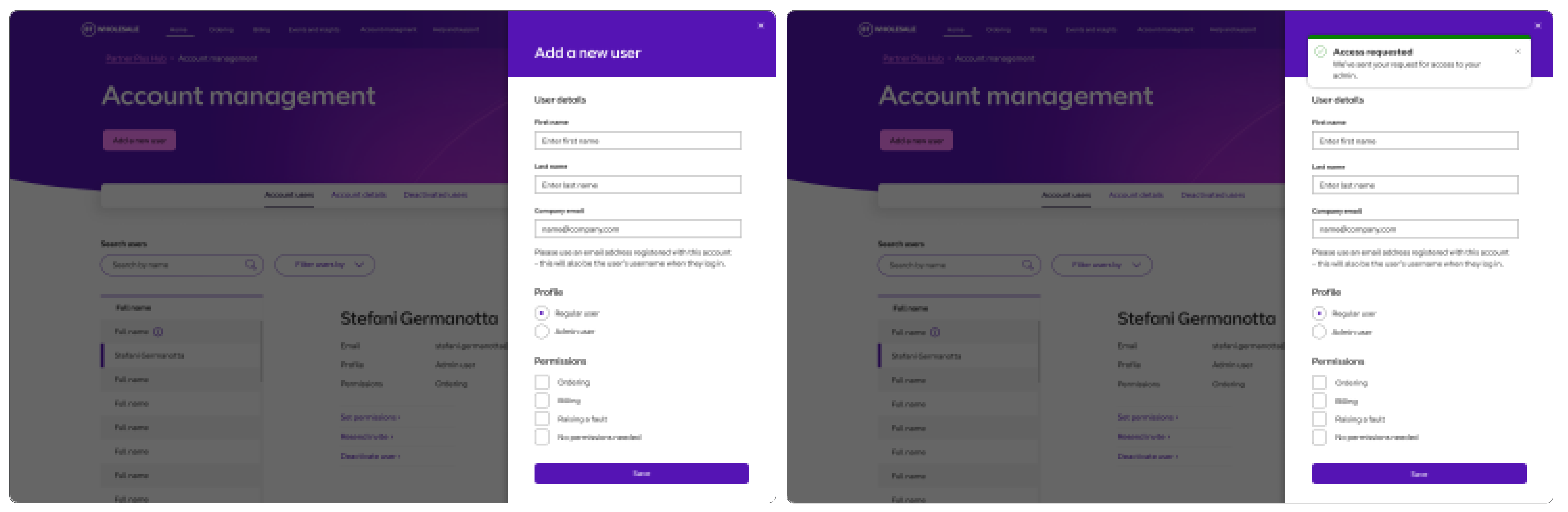
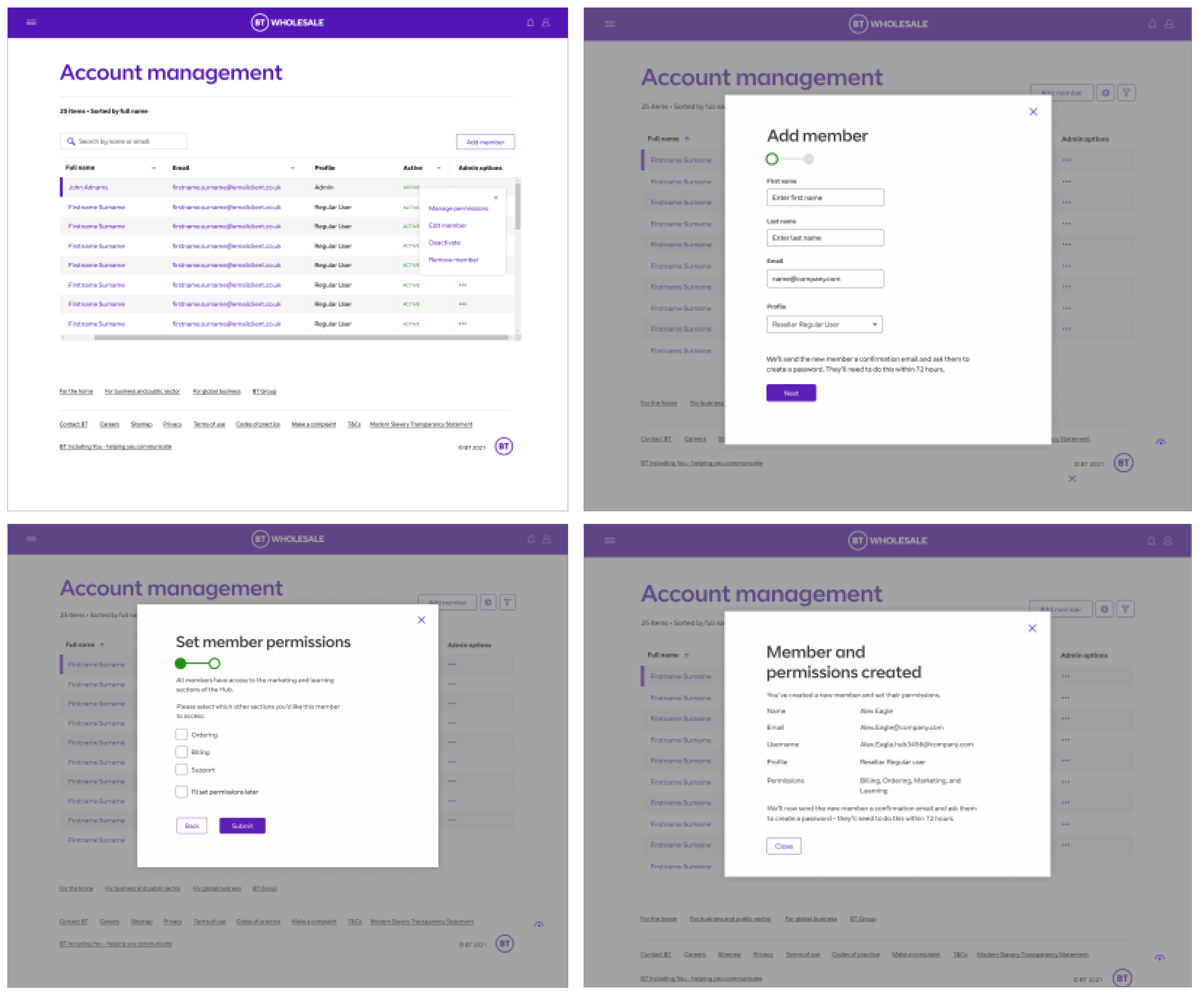
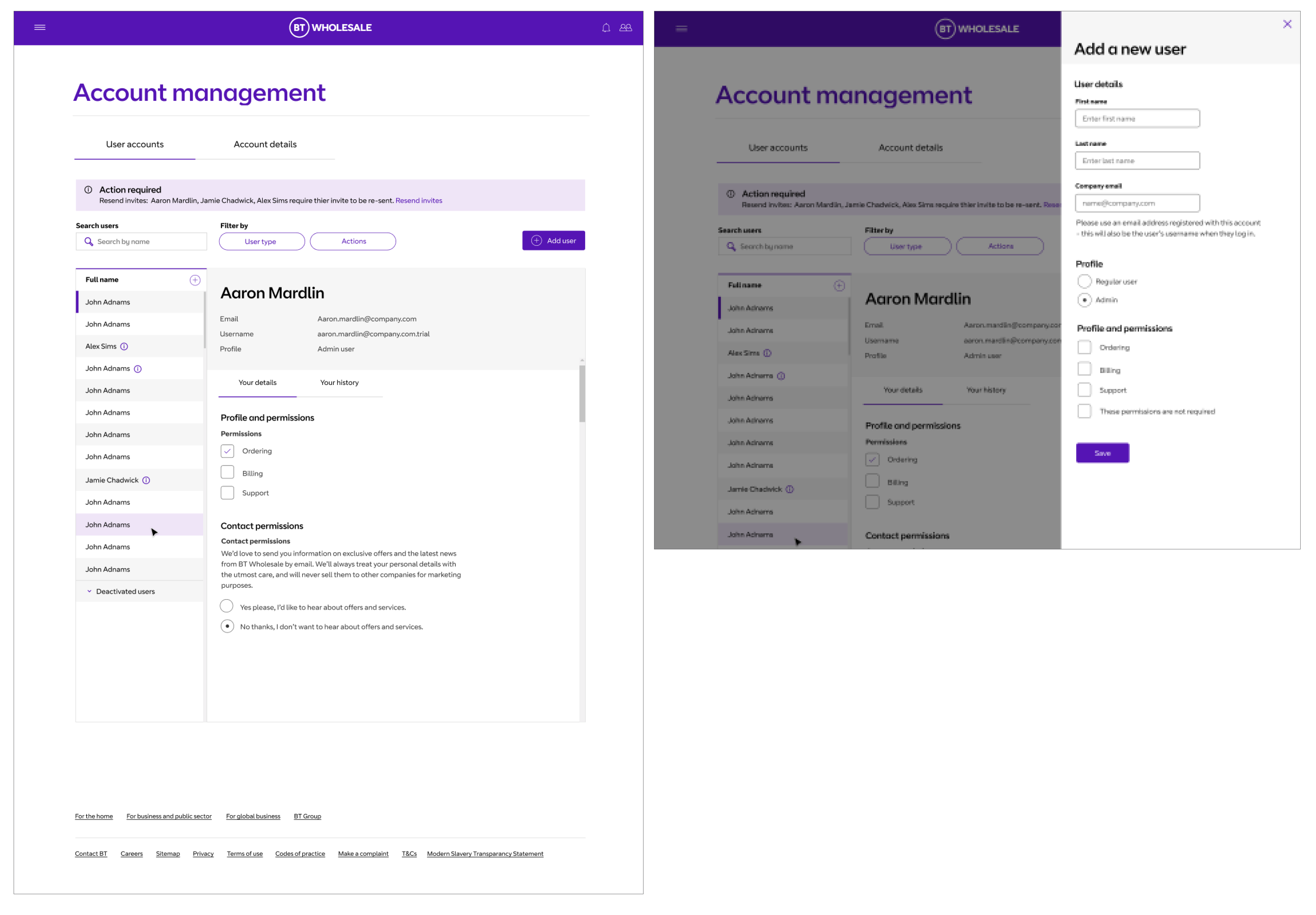
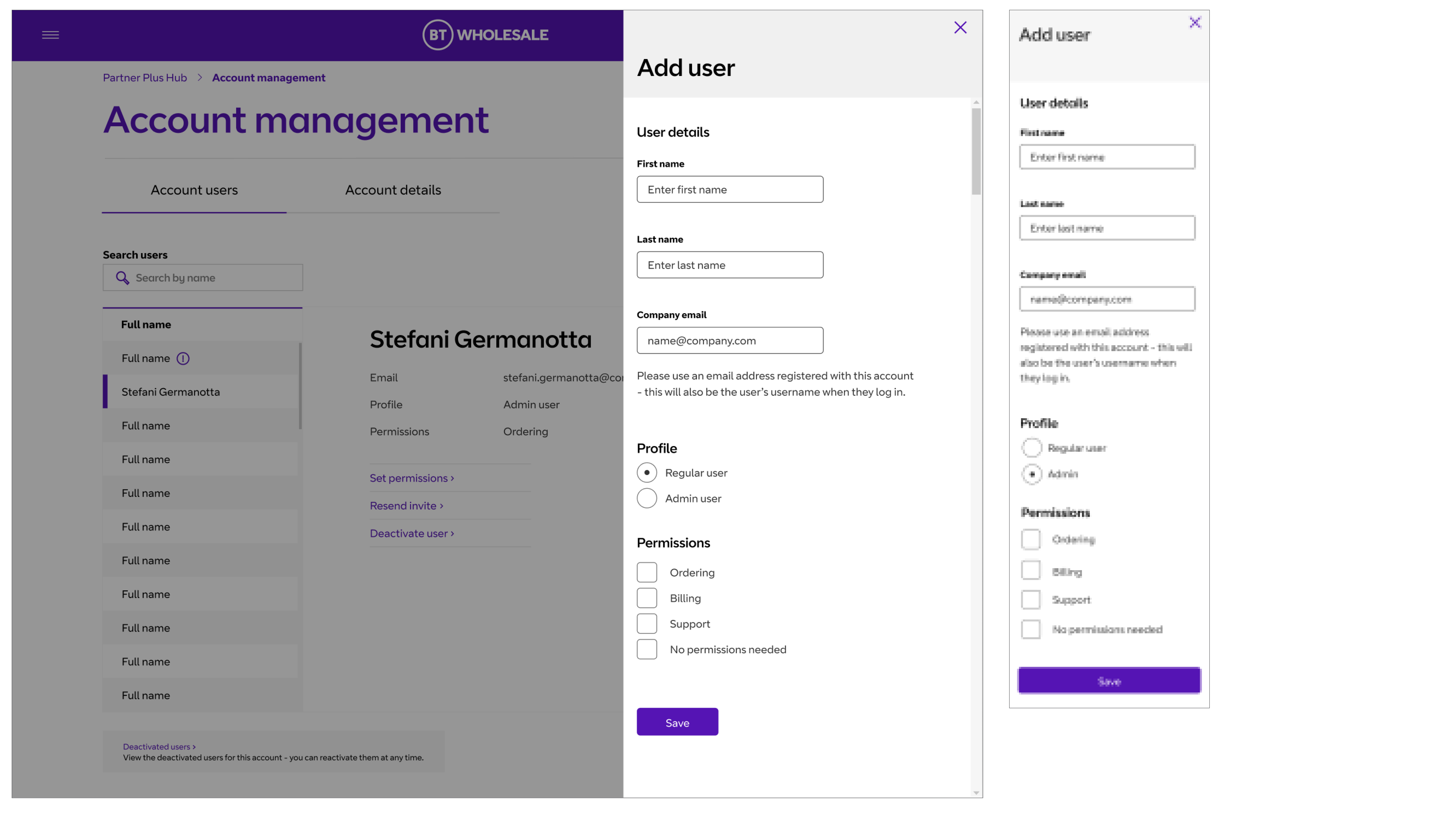
Within this we started to include a right hand slide in. What this would help us to do is allow these certain bits of functionality to be used in other areas of the site. Allowing our users to perform actions, without having to navigating away from a task that they are currently doing. Such as placing an ordering or browsing downloadable marketing material. This pattern could then be introduced across different areas of the site.
Presenting the changes made to the Tribe and wider BT teams
Development
Here I worked with the developers in sprint to help visualise these designs in build, helping them to understand how these should be built so that the pattern could be used across from hub. This also included QAing the dev work and giving feedback to make sure the build was correct to the designs, but also amending designs to help with the challenges developers may have faced.
Future thinking
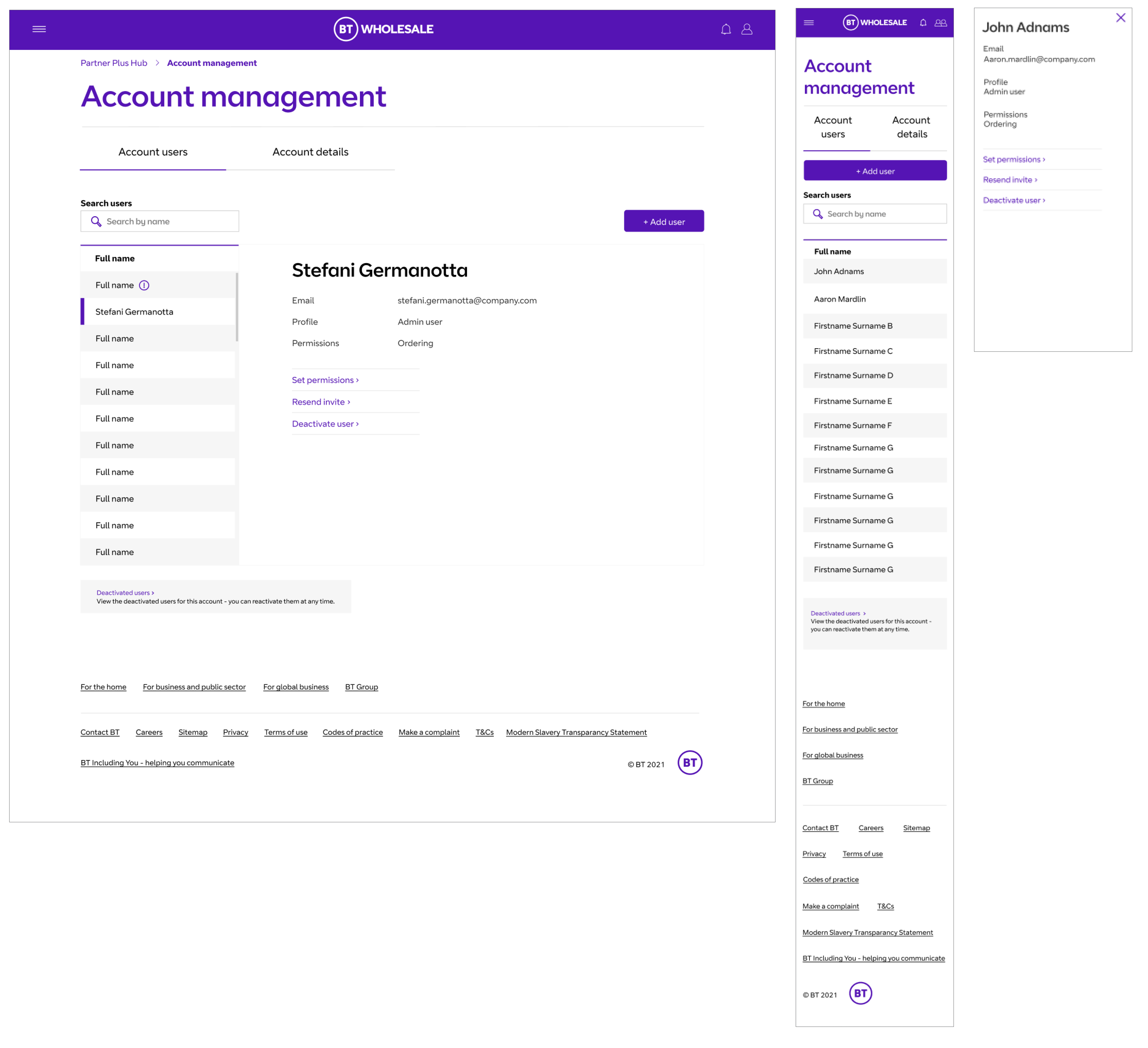
When a new style guide was brought in, we used the Account management page as an example of showing how adjusting the header and footer with the new designs could completely transform the look of the page.