
An AI project exploring how emerging tools can accelerate brand, UX, and delivery from idea to iOS.
Kaiku, For a world of story tellers

Problem & Opportunity
It’s not just famous people who have stories worth telling. People keep journals, reflect on life, or want to capture memories, but most tools either feel too private, too overwhelming.
The opportunity
Create a cosy, story-first experience that supports people who struggle to start writing, while still letting confident writers publish quickly.
Research caveat (keep this honest but confident)
This project wasn’t driven by interviews or usability testing, it was primarily an exploration of using AI tools to speed up ideation, synthesis, brand exploration, and build execution (a workflow increasingly common in teams I’ve worked in).
Kaiku is a space to:
write short personal stories (like a journal, but lighter)
share them with the world (if you want)
read other people’s stories before bed, less doom-scroll, more calm curiosity
Tools used: ChatGPT · Builder.io · Supabase · Figma · GitHub · Fly.io · Stark · Midjourney · Pika · Runway · Typescales · Foundation: Colour Generator
Brand & Atmosphere
Name & logo exploration
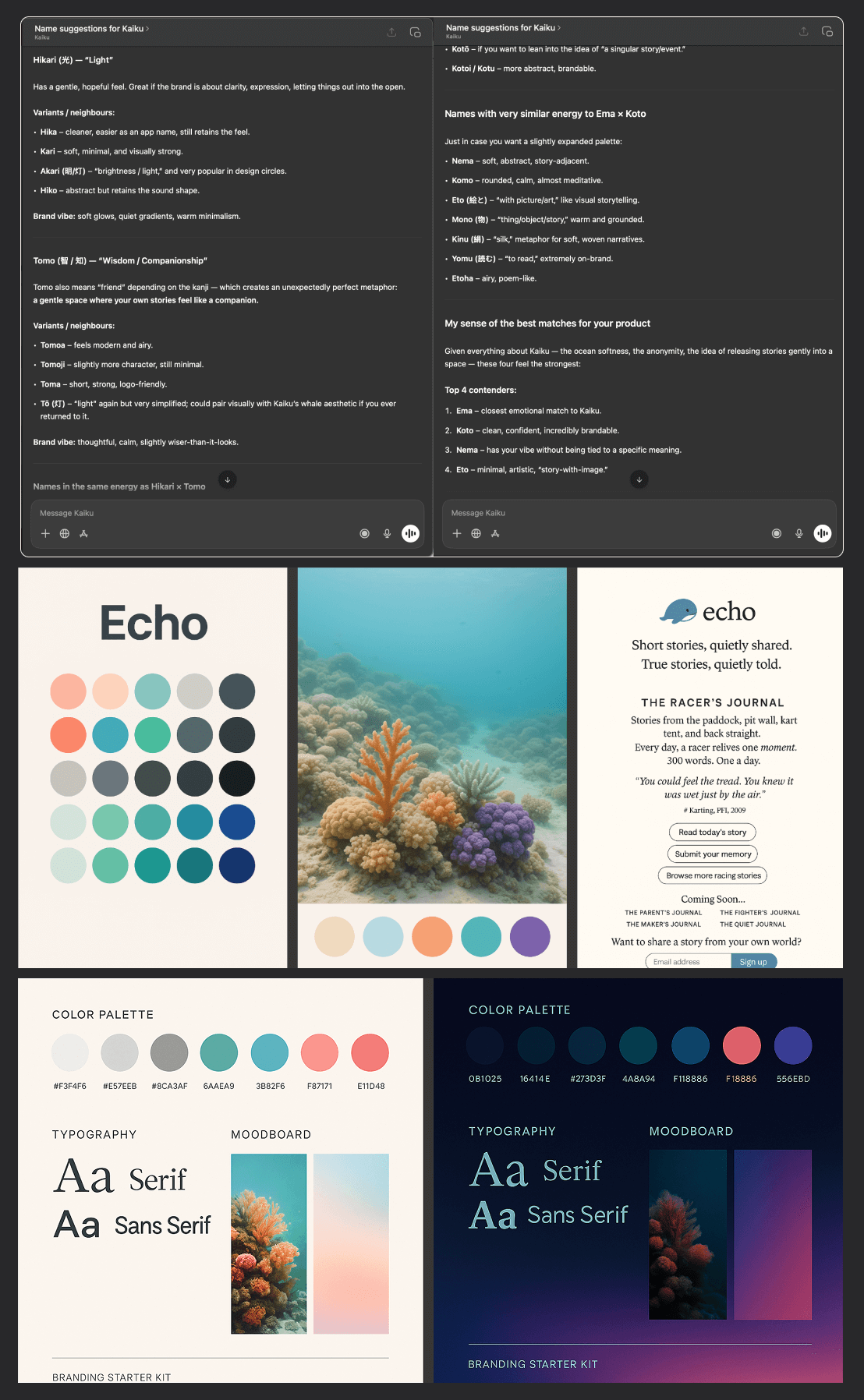
I started by describing the idea and an early persona to ChatGPT, then explored names and visual directions.
A key spark: whales pass knowledge down through generations, which led to the early concept name Echo, and a friendly whale mark (a bit like a “Twitter-simple” mascot).
But Echo felt oversaturated and slightly corporate. I wanted something cuter and more ownable, so I explored options (Hikari, Tomo, Ema, Koto…) and landed on Kaiku, the Finnish word for echo.
Brand identity
With a rough whale sketch and a name, I needed a world around it.
Using Midjourney, I generated underwater / coral scenes to explore a bright, warm palette, then mirrored the vibe into a dark mode version. That quickly gave me:
core colours + accents
an atmosphere for UI backgrounds
colour directions to bring back into the logo
The logo (bringing it back to craft)
AI got me a starting point, but the output felt dated and not aligned with modern app branding.
So I returned to Figma and designed a cleaner, more contemporary whale mark, keeping the friendly “mascot” feel while making it app-icon ready.
Discovery (lightweight, intentional)
Rather than jumping into screens, I defined Kaiku through intent.
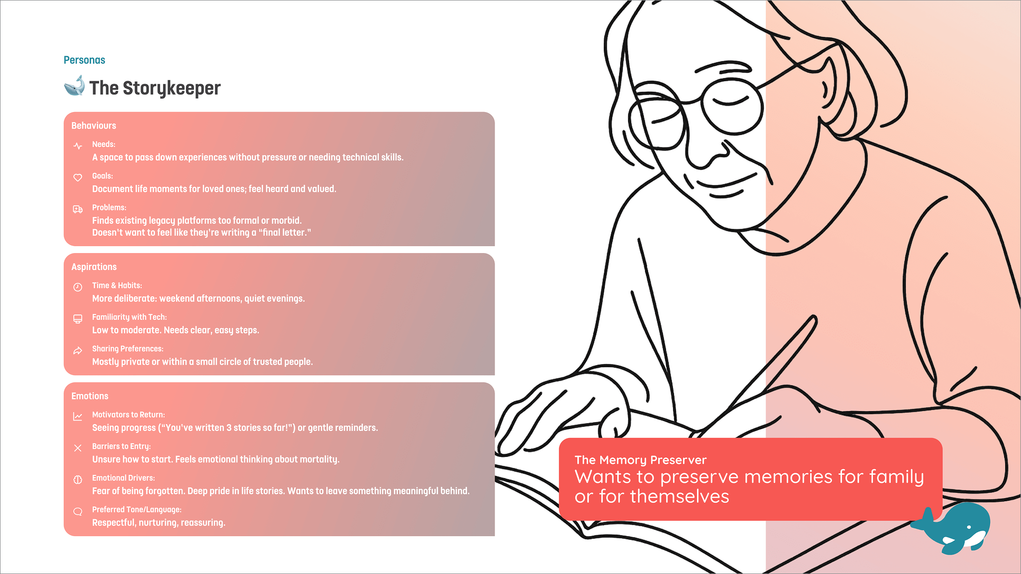
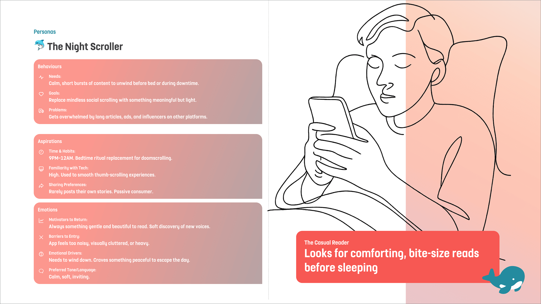
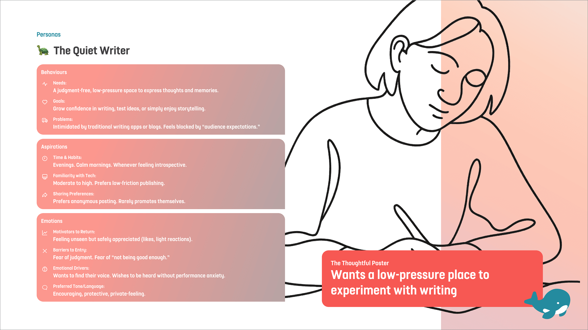
I created lightweight personas and user stories to anchor the MVP around emotional needs, especially for people who struggle with the blank page.
UX Discovery to Wireframes to UI
Personas (AI-assisted, designer-led)
I started with a persona based on a real vibe: friends sharing old racing/karting stories around a campfire, which made me realise there must be endless “small but meaningful” stories everywhere.
I then described to ChatGPT where Kaiku could fit:
creative writing prompts
“reading instead of consuming”
parents recording memories for kids
capturing moments from a newborn’s early years
ChatGPT produced structured personas fast, filled gaps I’d missed, and suggested a few I hadn’t considered. It wasn’t one-click perfect, but the back-and-forth still saved a lot of time.

I used the same approach: I fed AI my initial thoughts, let it expand, then I curated and adapted the output in Figma into:
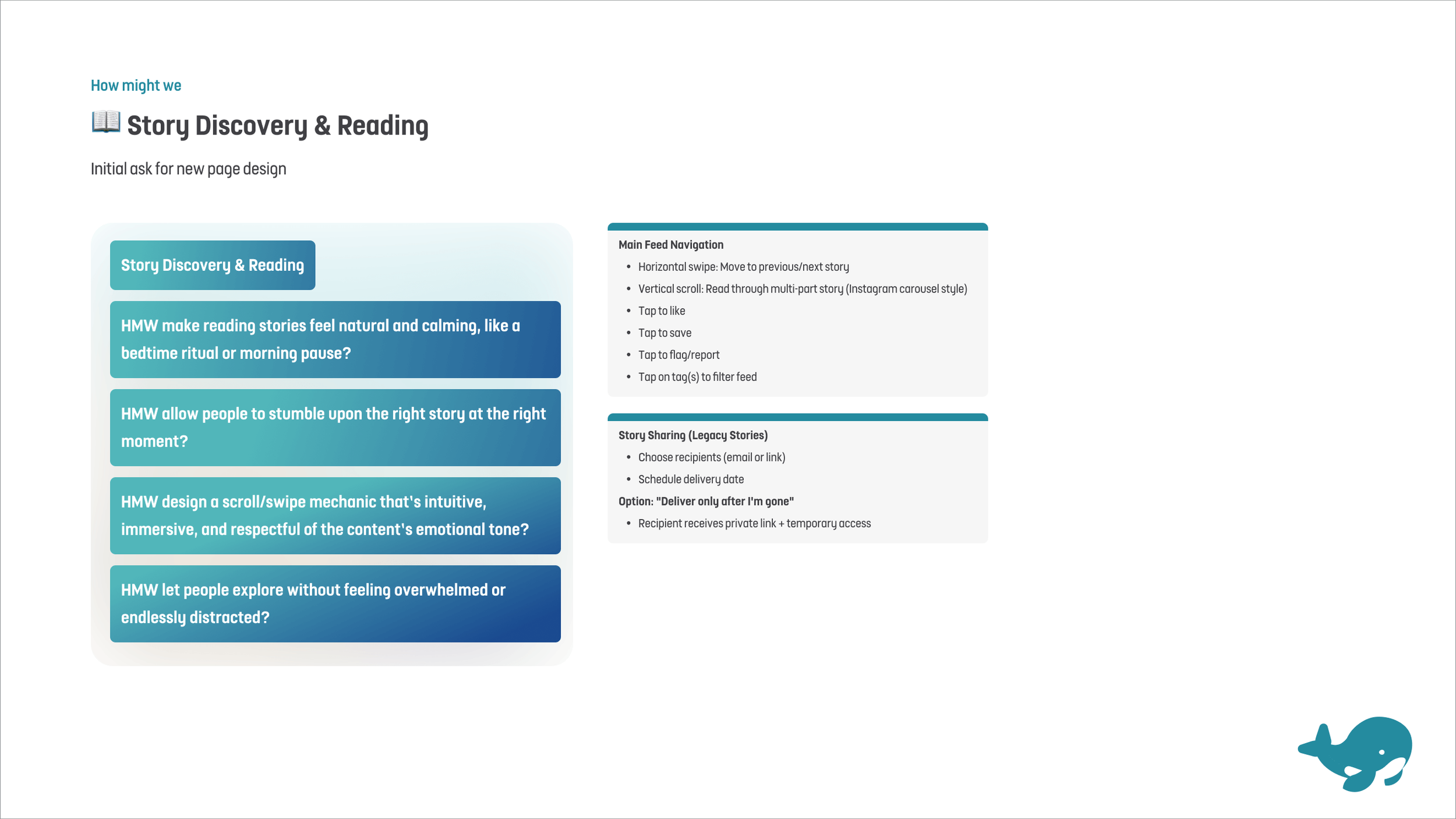
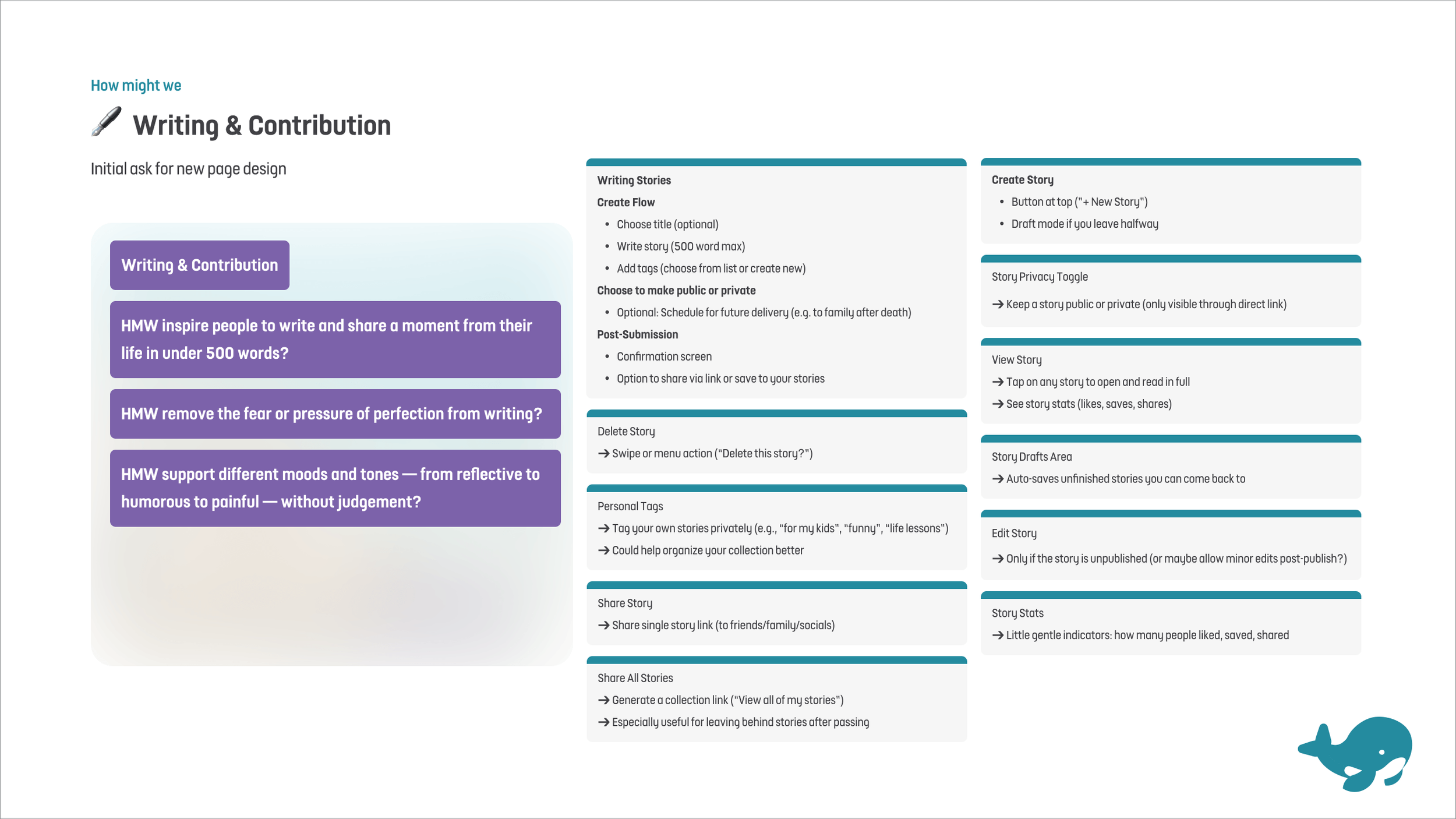
a small set of How Might We statements
user stories for the MVP
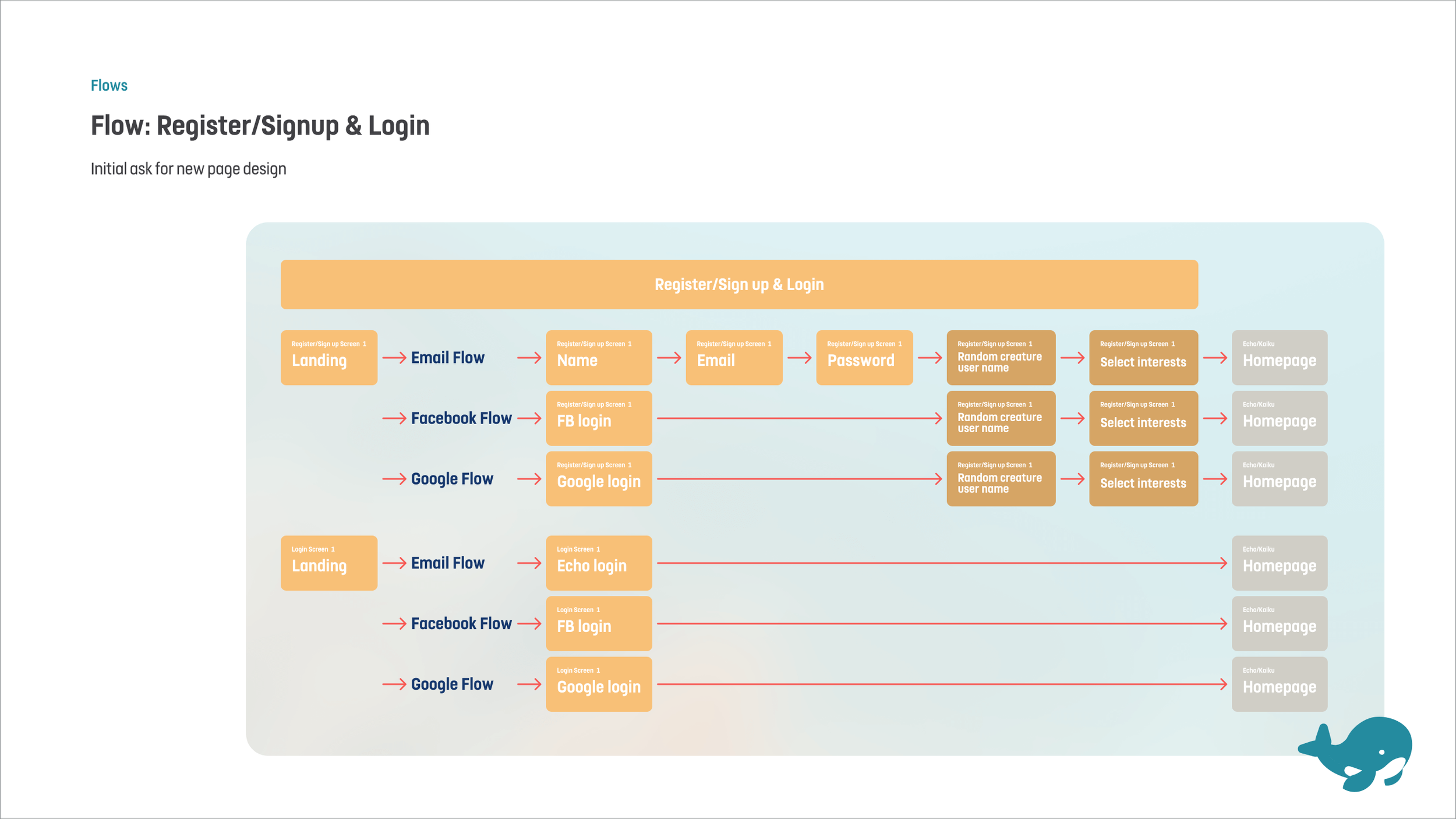
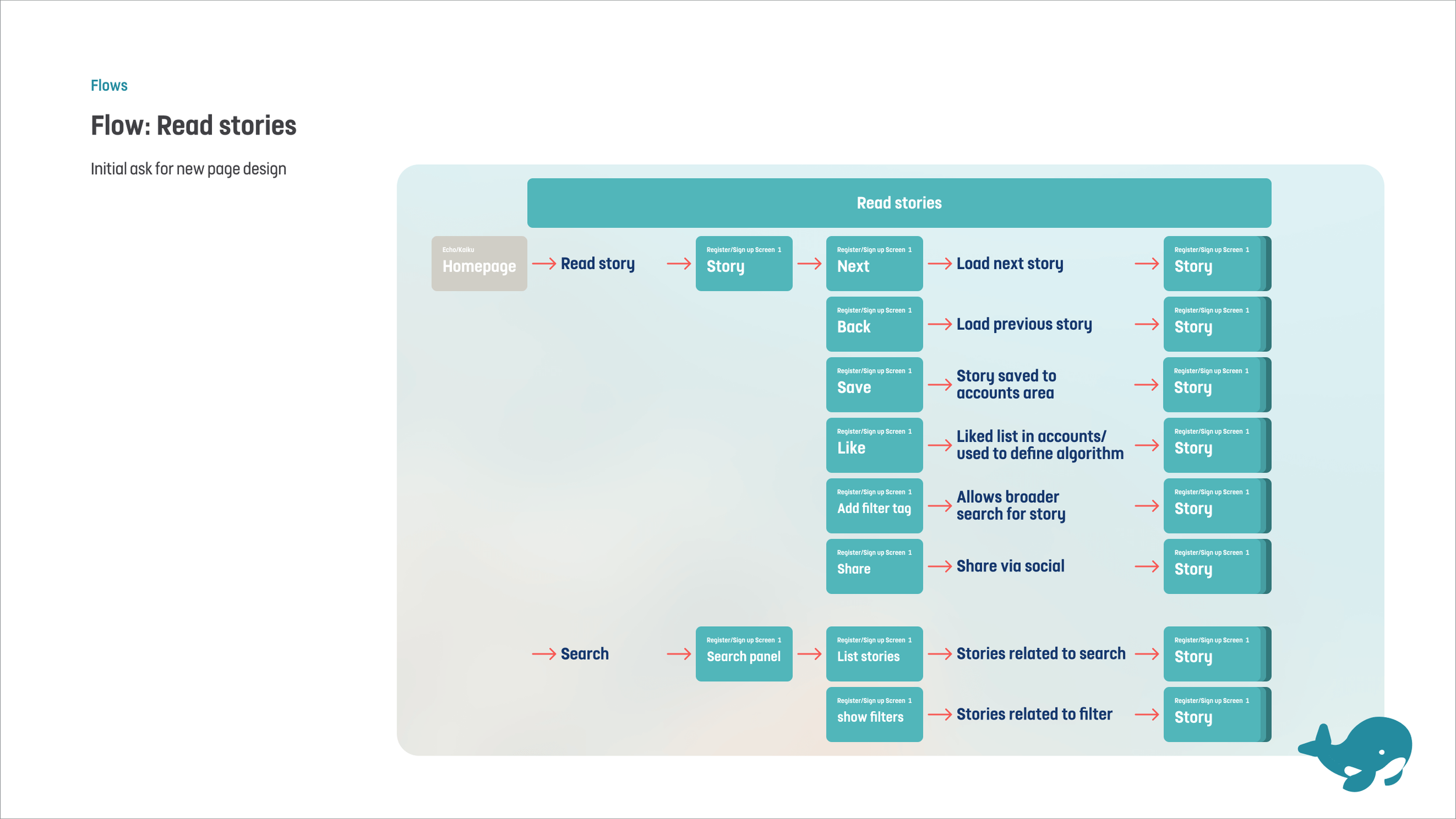
core flows I could keep checking against during design
HMWs, user stories, and flows
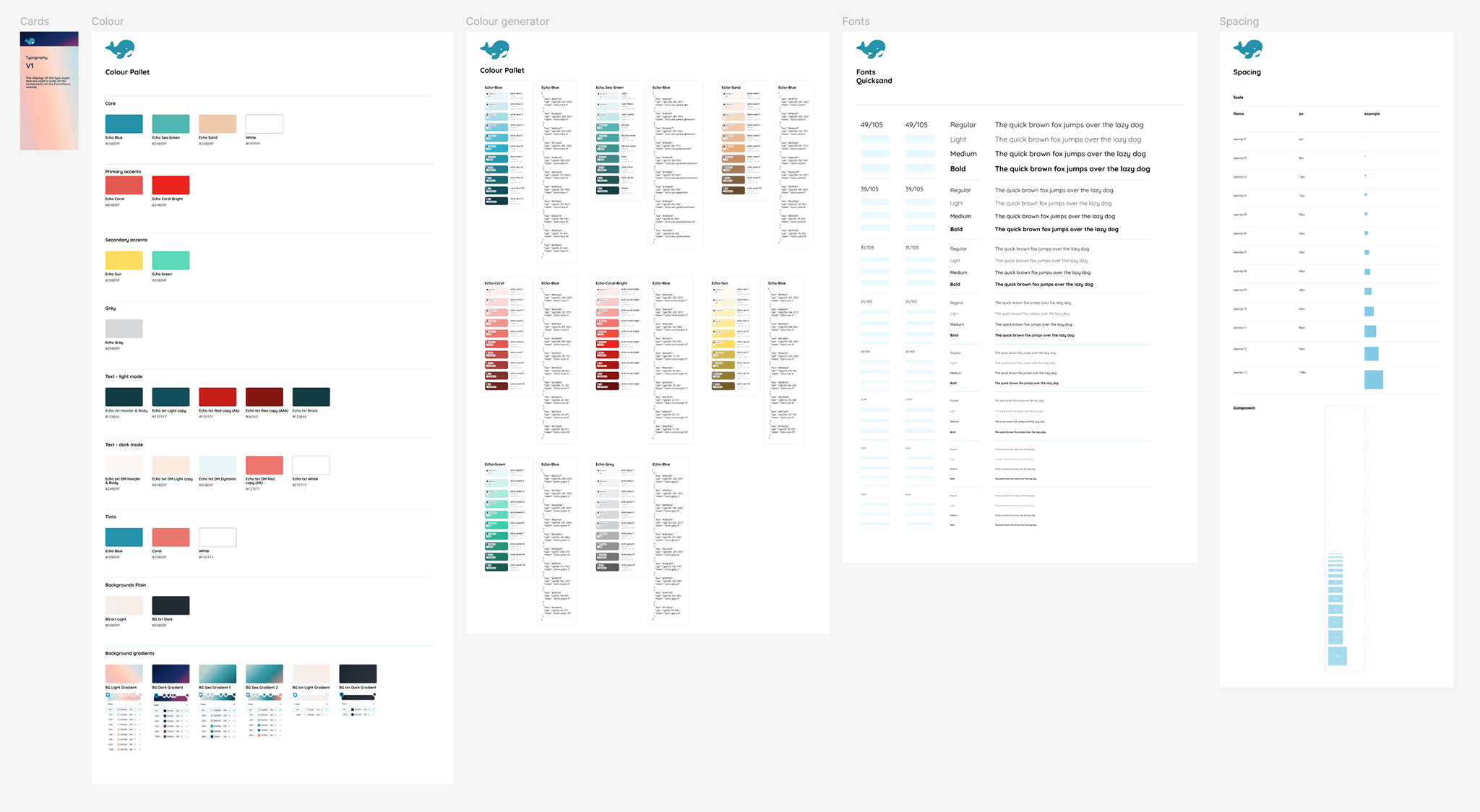
Style guide / design system
Using my palette + Figma plugins, I quickly built:
colour ramps
type scale
core components + variants
auto-layout driven templates
I used the same approach: I fed AI my initial thoughts, let it expand, then I curated and adapted the output in Figma into:
a small set of How Might We statements
user stories for the MVP
core flows I could keep checking against during design
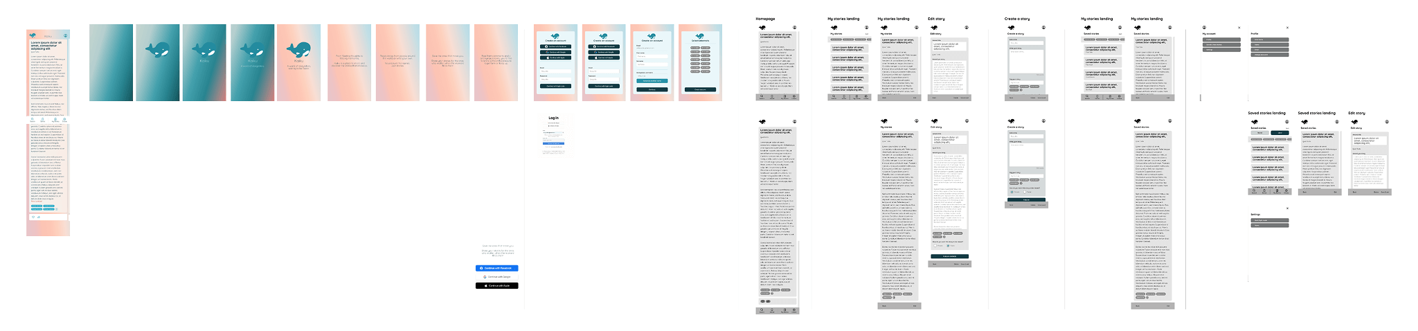
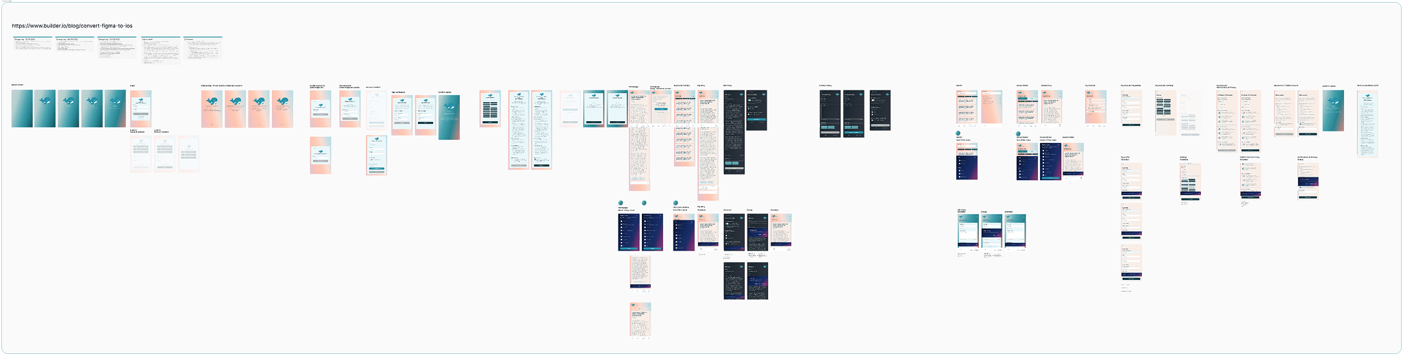
Wireframes to UI design
Making it real
Why Builder.io
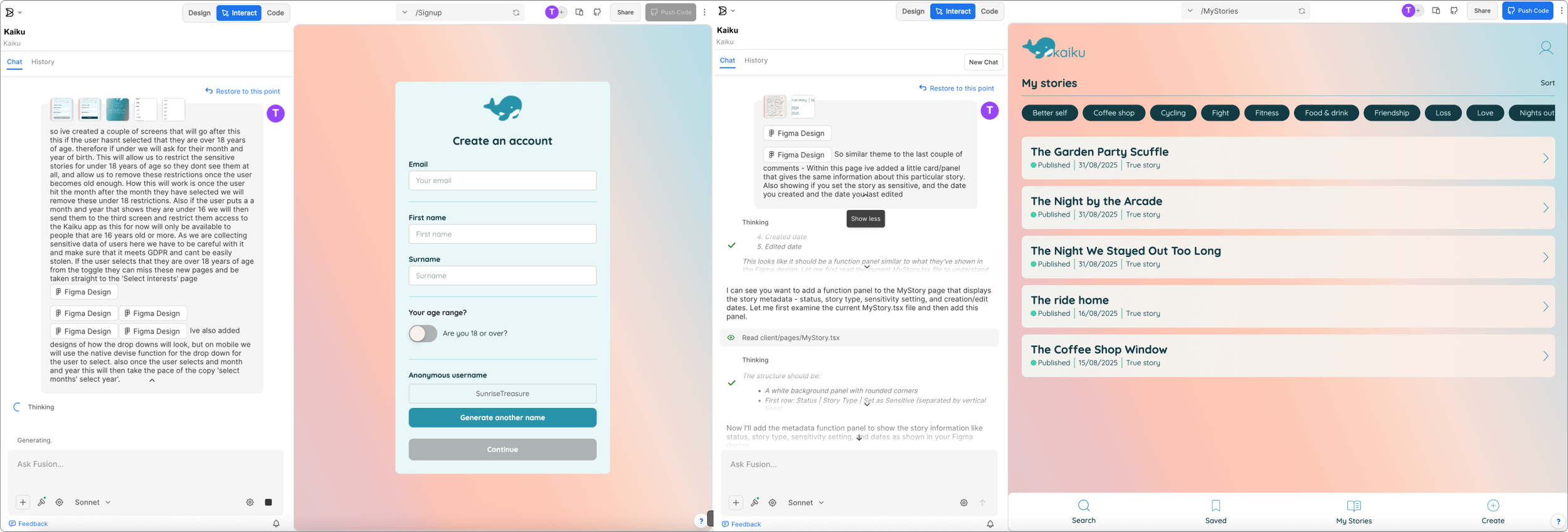
I explored a few approaches (including Make + Firebase ideas), then landed on Builder.io because it let me translate Figma designs into a working product quickly.
I still had to adjust layouts at times — but overall the screens stayed close to the original design.
The “wow” moment
This was the most fascinating part: watching the idea become functional, filters, swipe interactions, accounts, saved stories, not just a prototype.
Stacking and shipping
Builder.io also helped bridge the scary bits (for me):
database + auth via Supabase
code + version control via GitHub
deployment via Fly.io
guidance written in genuinely beginner-friendly language (and it could interpret screenshots from other tools to unblock me)
Learnings
Why Builder.io
I explored a few approaches (including Make + Firebase ideas), then landed on Builder.io because it let me translate Figma designs into a working product quickly.
I still had to adjust layouts at times, but overall the screens stayed close to the original design.
Even with AI and no-code, the classic dev/design mismatch still appears: spacing and layout polish took a lot of time, just like real product work.
1. The familiar padding problem
To get the AI to build what I’d designed, I had to explain:
intended behaviour
edge cases
how changes affect other screens
what “good” looks like This made me wonder if design roles will blend more with BA-style communication as AI build workflows mature.
2. Writing like a BA
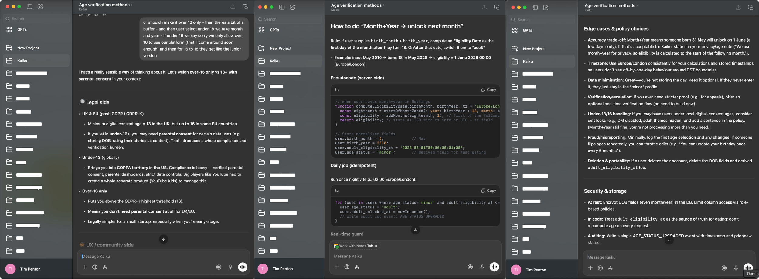
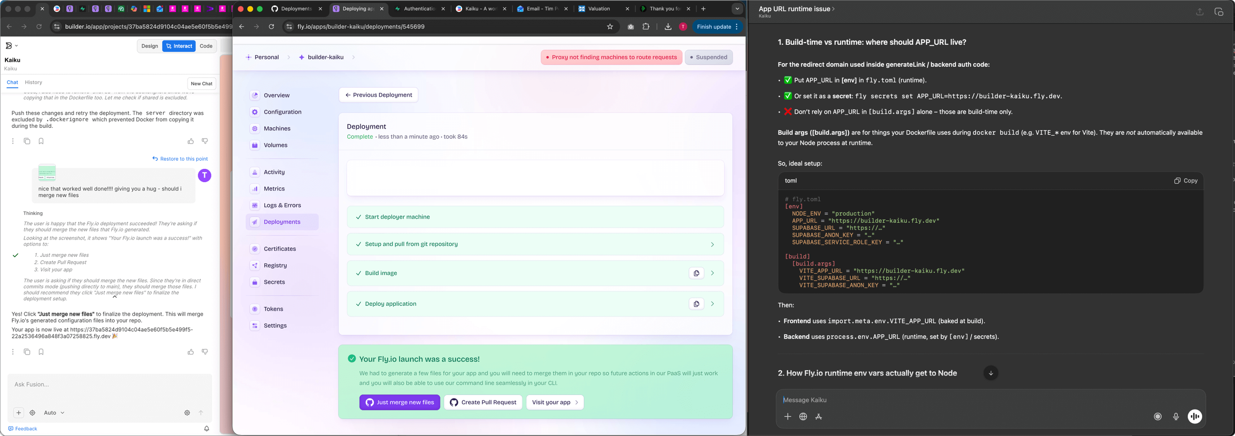
Sometimes the AI forgets what you’ve already tried and sends you in circles.
My workaround: bring in a second AI, summarise the situation clearly, and paste the improved prompt back into Builder to break the loop.
3. Getting stuck in loops is real
4. Third-party + database setup is where AI helped most
This is where my project would usually stall. AI guidance made it possible to:
set up the database
wire up auth
deploy
understand what’s needed for an iPhone app release
5. Quality assurance as a design responsibility
As the build progressed, it became clear that the designer’s role expands even further in AI-assisted workflows. Beyond acting as a BA, explaining page intent, interactions, and edge cases. A core responsibility becomes QA and systems thinking. Small fixes or changes can have unexpected knock-on effects elsewhere in the product, even in areas that don’t appear directly connected.
In a traditional squad, this shared understanding is easier to build through conversation, artefacts, and agreed business priorities. In a “vibe-coded” app, that mental model is harder to maintain. It can be difficult to fully see or trust what has changed under the surface, and I imagine a developer opening the codebase might feel a similar sinking feeling to the one designers sometimes have when reviewing AI-generated strategy or design output today.
That said, using these tools is genuinely exciting. They act as a major leveller, allowing designers to bring ideas to life in ways that simply weren’t possible before. Without first needing to find, convince, and align front-end and back-end developers. For me, this unlocks a new kind of creative momentum: the ability to explore, validate, and ship ideas independently, while still understanding the trade-offs and craft required to take them to a higher production standard.
For next time
Reflecting on the build, there are a few process and mindset shifts I’d apply if I were starting again. Particularly around security, prompting discipline, and maintaining system-level oversight.
Set clearer guardrails upfront
Early on, I’d be more explicit about what the AI should actively look out for and flag to me, especially around security and state management.
For example:
auditing session handling when defining routing flows
checking what data persists in localStorage after failed or incomplete sign-ups
verifying auth state cleanup during page transitions
flagging incomplete sessions as a potential security risk early, rather than reactively
These are areas that are easy to miss in a “vibe-coded” build, but critical in a real product context.
Keep a living prompt reference
I’d maintain a persistent reference prompt that explains page functionality and system behaviour, updating it as the product evolves. This avoids important decisions getting lost in long conversations and makes it easier to change direction without re-explaining everything from scratch.
Alongside this, I’d document all key flows in text, mirroring the naming used in Figma files, so changes to order or scope can be made with a clear, shared reference that can be fed directly back into the AI.
Test whether AI understands flows, not just screens
Next time, I’d experiment with submitting full flows (in text form) alongside designs, to see whether this improves build accuracy and reduces unexpected side effects. My hunch is that giving the AI a stronger mental model of the system. not just individual pages would lead to better results.
Shift mindset: designer to director
Using AI effectively requires switching hats:
Direct and precise when writing build prompts
Loose and exploratory when ideating
Editorial and critical when reviewing output
It feels less like pure making, and more like directing, understanding the processes well enough to guide them, without needing to execute every detail yourself.
Build in regular “project summaries”
At regular points, I’d ask the AI to summarise:
tasks completed
tasks in progress
key decisions made
lessons learned
This acts a bit like a combined PO / Scrum Master snapshot. Over longer projects especially, it helps preserve context that AI models don’t reliably retain, and creates something you can paste back into the build later to avoid repeating months-old conversations.