Project: Website re-design
Company: Nexus by the Workers
Date: August 2017
Brief
Hired by a small agency (The Workers) to help wireframe a new website for the production studio Nexus Studios, who produce and direct films for clients such as Audi, UEFA, and Google.
Within the brief the clients wanted a more streamlined approach to the pages that are currently on the site with focus on the studio and the directors. Showing that they possess the skills in house.
The agency we worked with also wanted to create an editorial feel to the site where users would be able to explore the work that is produced.
Personas
User- Marketing Manager
Responsibilities:
- Planning implementation of marketing material
- Establishing strategies to meet goals
- Project management
- Staying current with industry
Challenges:
- Understaffed
- Unrealistic deadlines
- Wanting to see broad range of work, and clients to gain confidence in the company. May need to forward work onto people within team to gain support to start talking with particular agencies.
- Doesn’t want to waste time getting lost or have to work out how to use aspects within the website.
- Wants to see good quality work that excites them that gives them ideas for their own company marketing plans.
- Saturation of talent within the industry – How do they find the right fit?
User- Directors
Established directors:
- Looking for the next role that brings good clients for CV, along with excitement of being able to push boundaries in their work.
- Wants to see a company where they feel they can have likeminded people to work with and be excited by.
Graduate producers directors
- Straight out of uni, or moving into second role.
- Wants to see if it’s possible to learn off peers,
- Looking to the future – seeing if there is progression with the company
Deconstruct existing website
First we took apart the existing website, looking at areas that should be improved
What we found:
- News section within homepage didn’t have headers allowing the user to know the context of the content block. Eg whether it was news, social or work.
- Not enough space between content, not allowing the work they produce to breathe.
- When viewing the directors and work pages it was quite easy to get lost within the different sections as the work took you to different areas of the site
- Inconsistencies across site with video player and format
- Could be doing more with social being pulled into site to help keep content fresh within site.
- Nowhere to allow users to share content
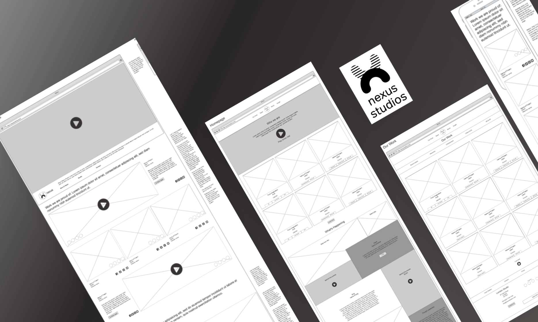
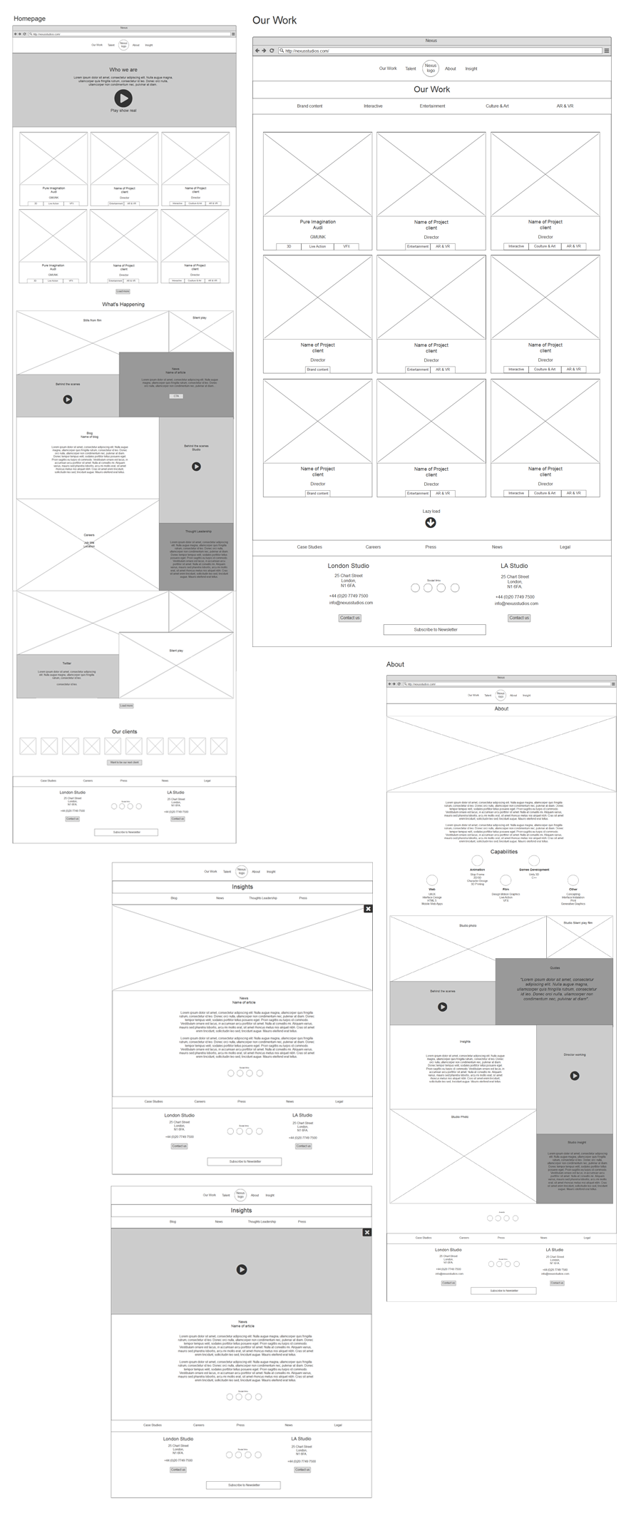
Sketches
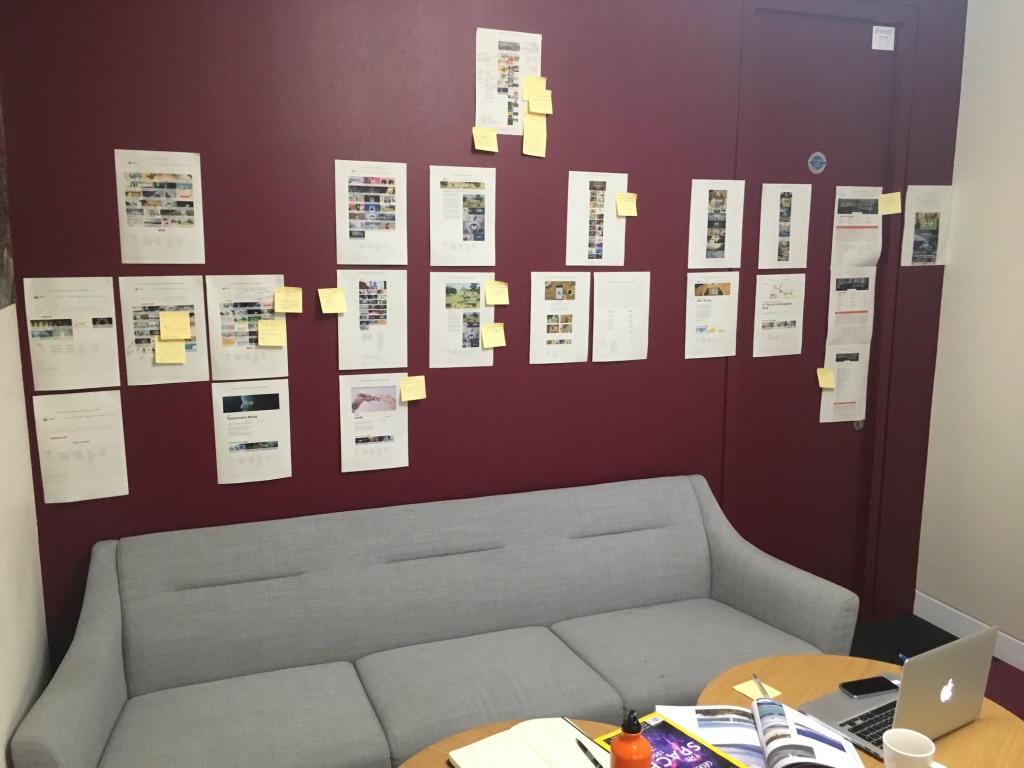
Initial wireframes
Below showing initial concepts and building into wireframes
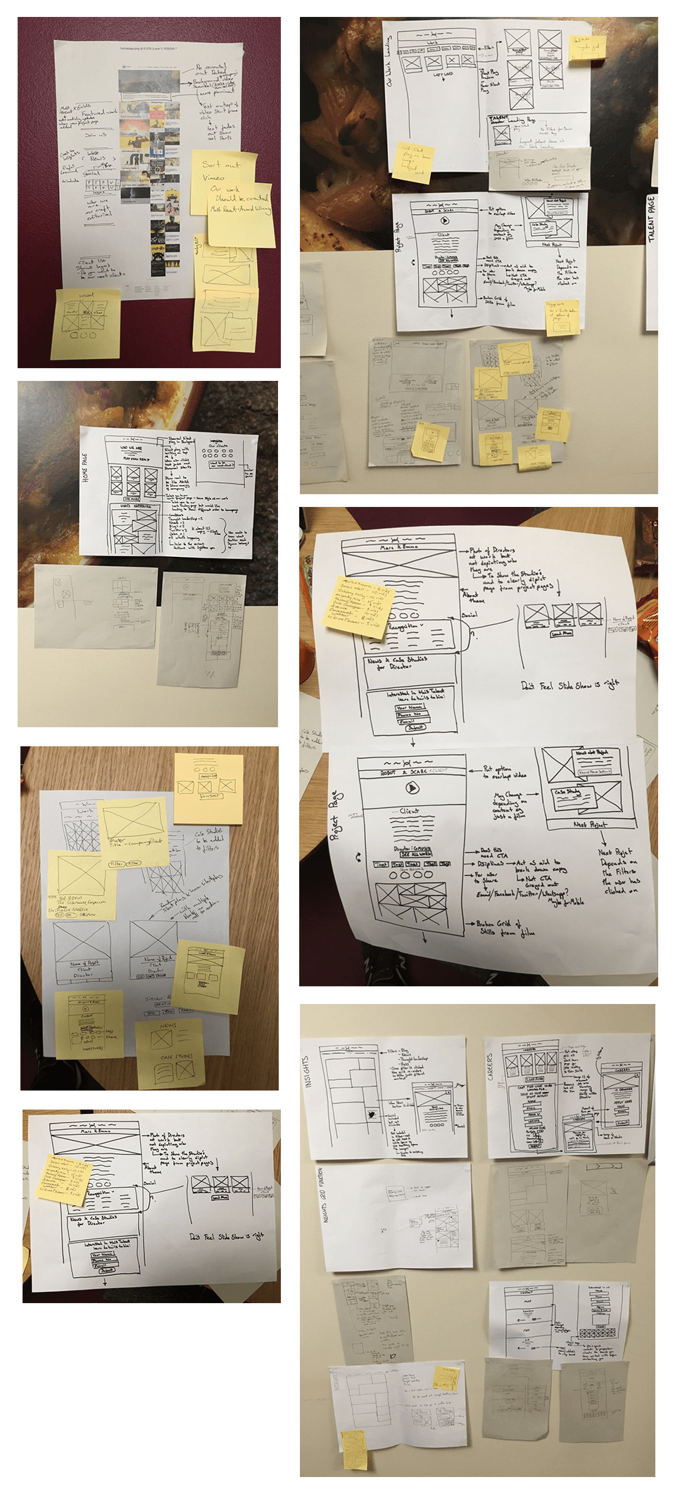
Client feedback
Here we sat down with The Workers to discuss our initial ideas. From this we were given a number of points to focus on when reiterating our original concept.
Initial thoughts from meeting:
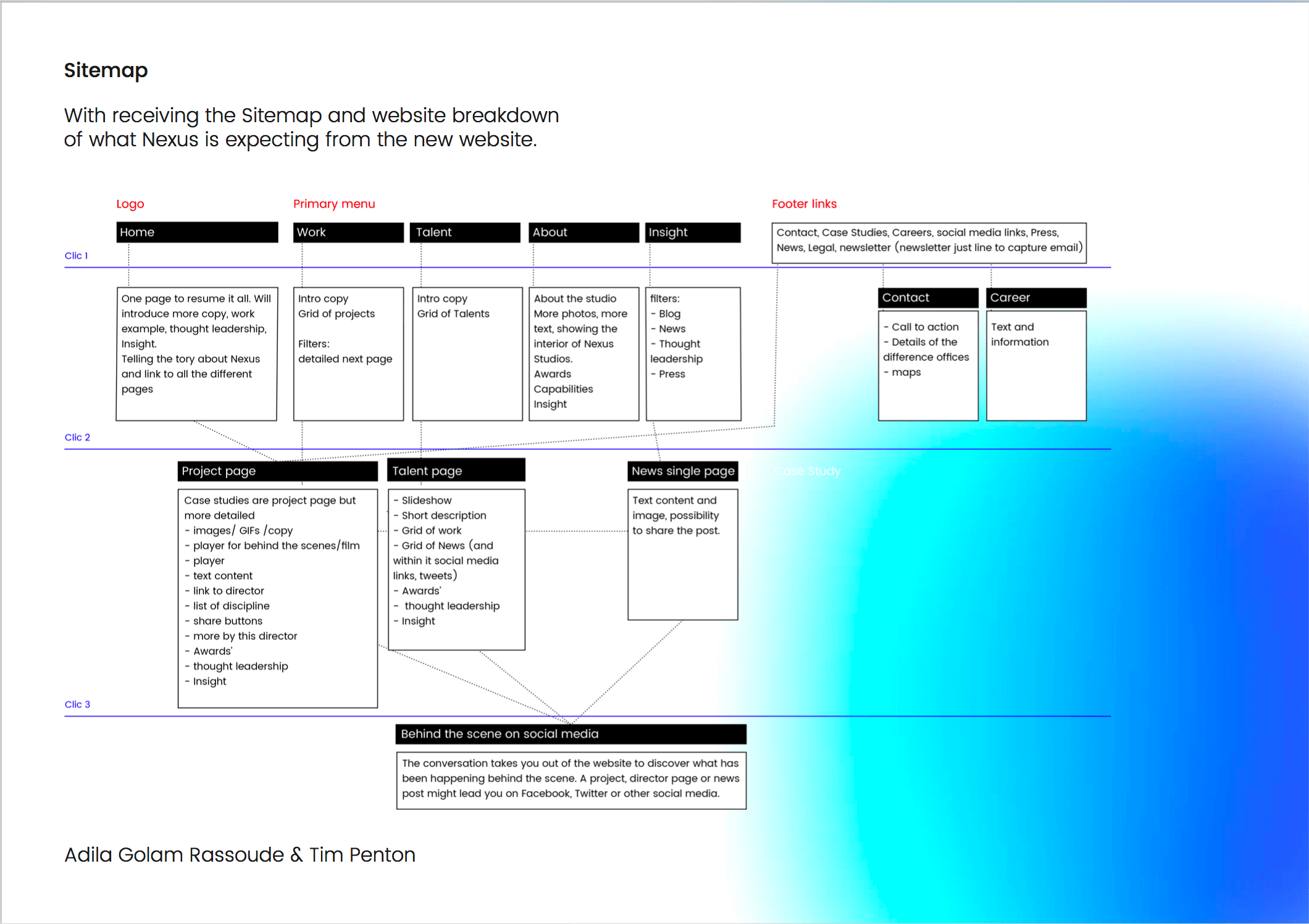
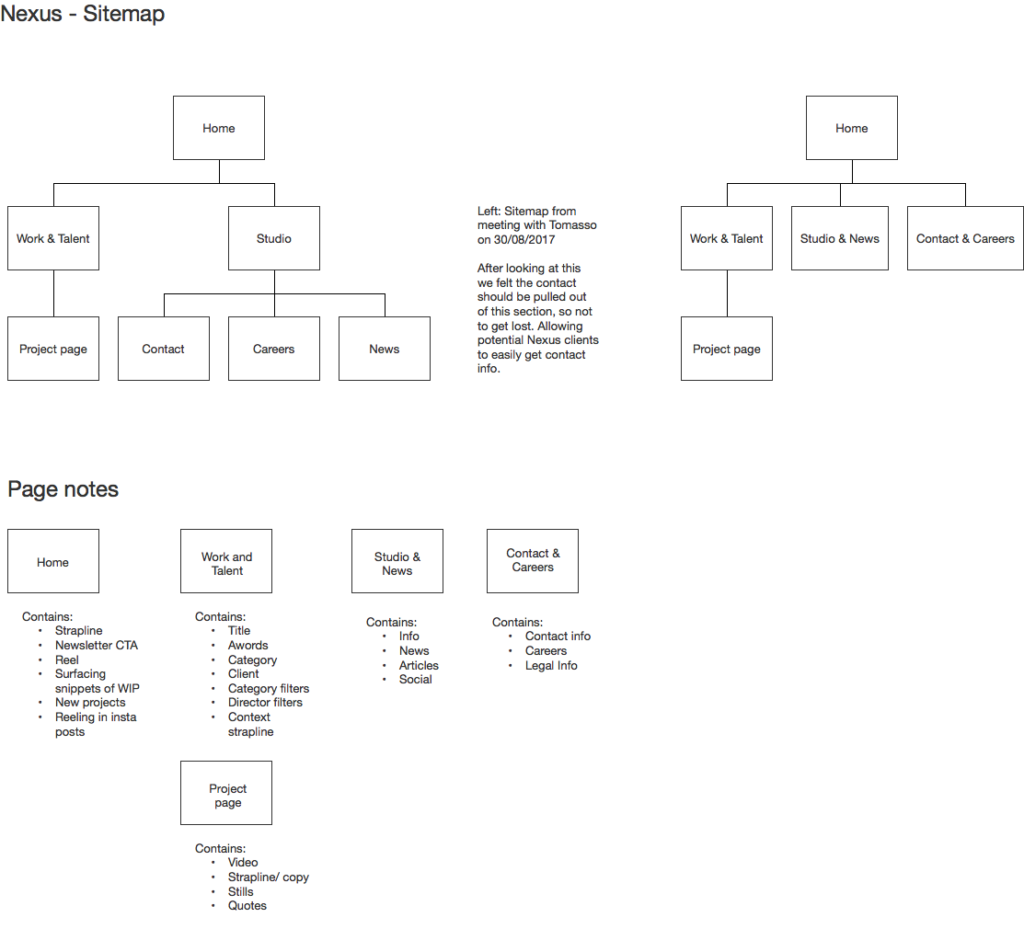
- We were given more freedom to adapt the site map where we felt the site content could be reduced to ease user journey.
- To open up the initial filters to allow user to explore the site more.
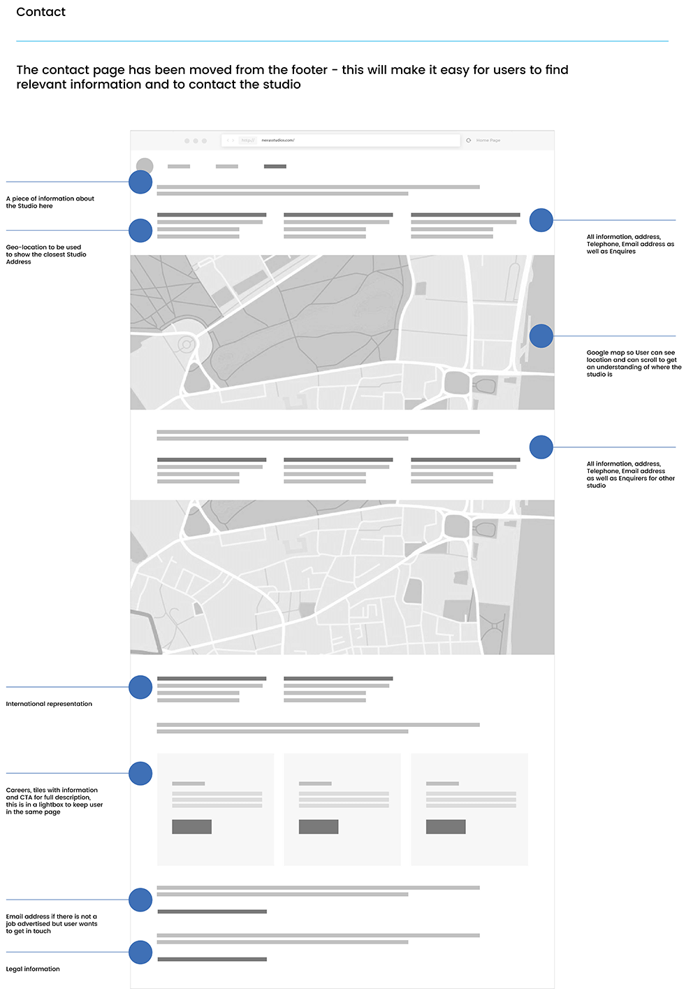
- See if there is a better way to serve the contact information to the user other than the footer.
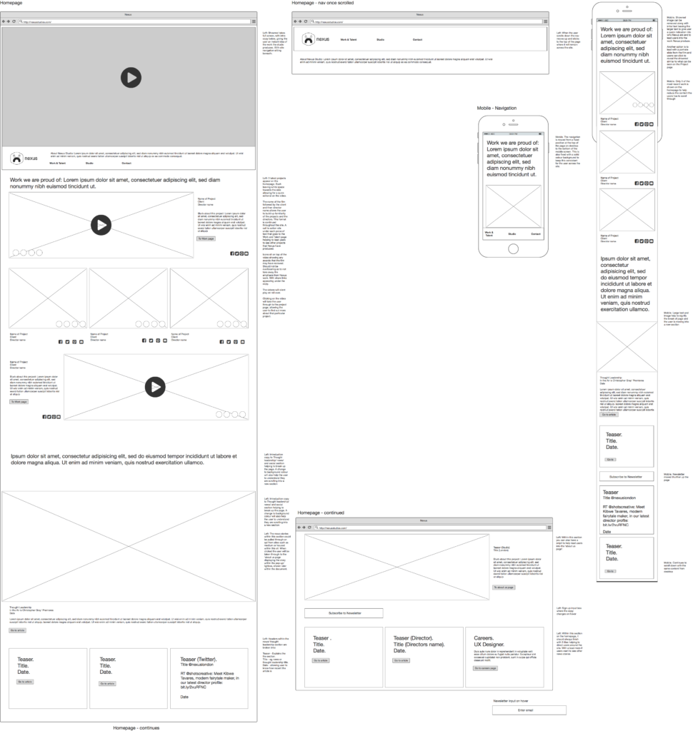
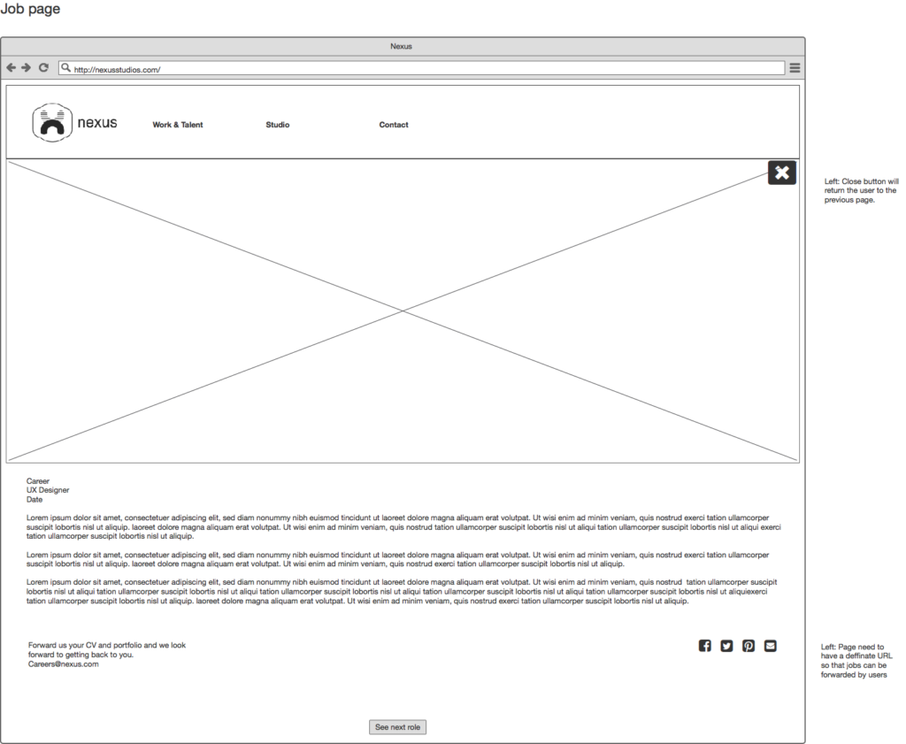
Final wireframes
From the initial wireframes we made a few modifications to the site
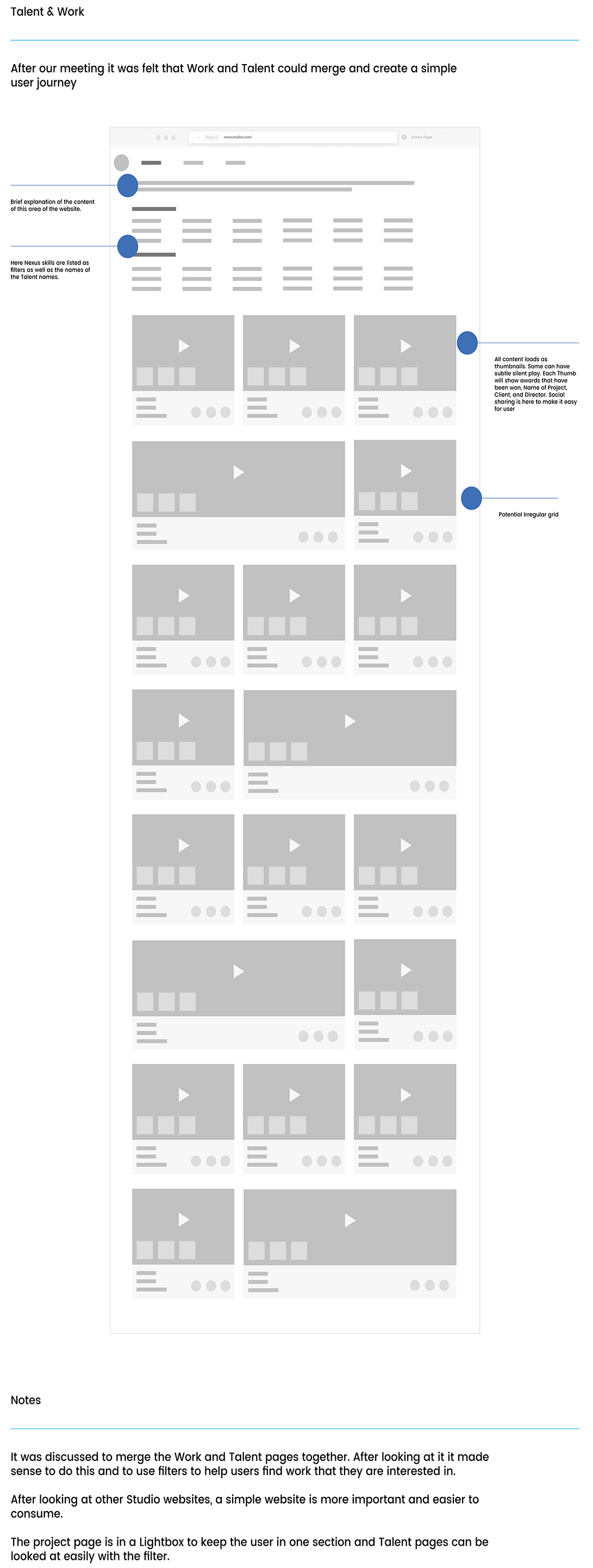
- Combining Work and director page that then both lead the users to the project page.
- The Individual client page moves and becomes a filter within work and Talent. The Videos then reshuffle with text above giving a short description to the director. Helping to not navigate the user away from this initial browsing/filter page.
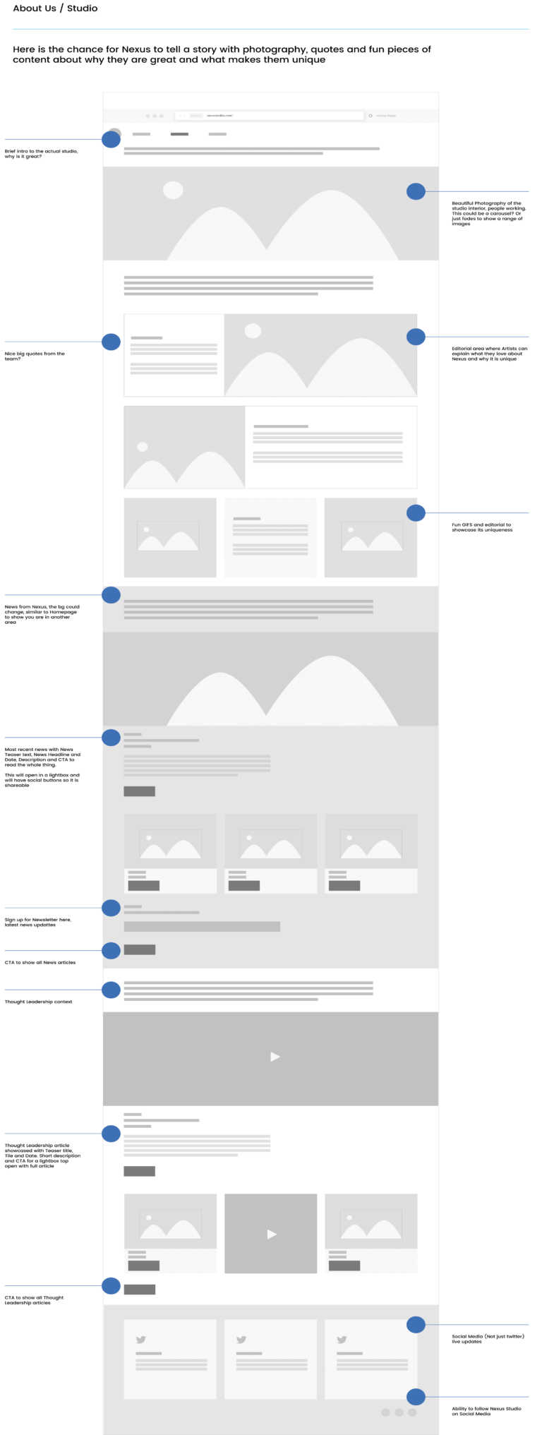
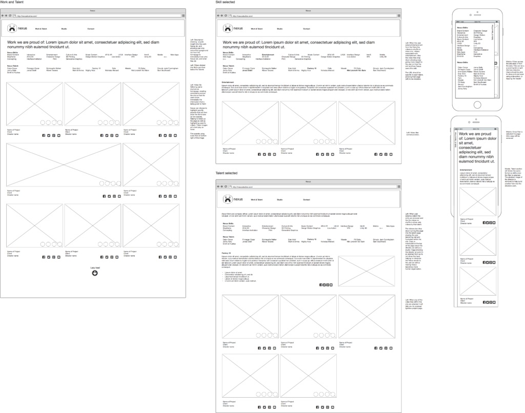
- Moving the skills out of studio page and into the Work and Talent as filters. This allows the user to browse the work depending on filter, as well as giving a short description of the skill at the top of page to help give more insight into the Nexus Studio.
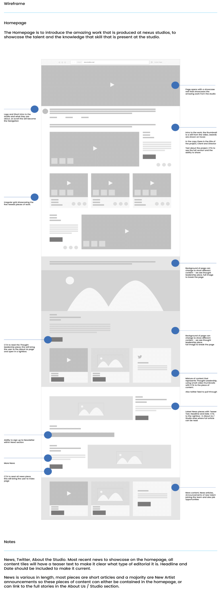
- The use of larger text in short sentences as a page break and help give more insight into the Nexus studio as well as introducing new the users to a new section within the page.

Presentation