Project: Occupier Platform
Client: Knight Frank
Company: TH_NK
Date: January – May 2019
Skills used: Information Architecture, Wireframing & Prototyping, Usability testing
Project intro: What with the rise of companies like WeWork, Knight Frank needed to compete by having their own platform where they can add flexible office spaces.
Brief
To design and build a hub that would allow Knight Frank to create an online presence to display their flexible office spaces, allowing them to compete with the likes of WeWork, and Hubble.
As a new client to TH_NK, successfully completing this project allowed us to unlock further streams on work, including the main Knight Frank website.
Foundation Design
A process in the design stream that lets us focus on key problems and to create a base of work, allowing us to move into the sprints with a good starting point in content, UX, and design.
Within this phase of work I worked with a Senior UX designer to create the site map, low fidelity wireframes, and user flows to help us understand the framework of the website.
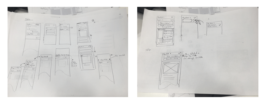
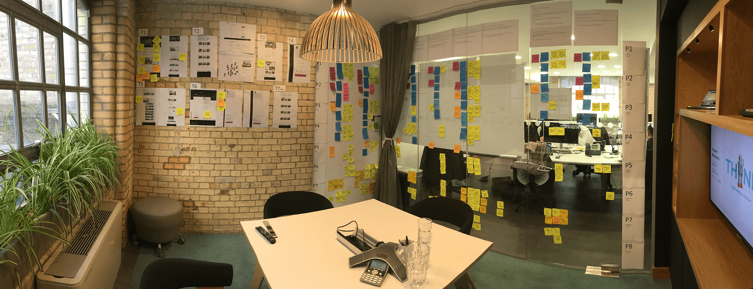
Below shows how a colleague and I used the Back log to determine what sections and pages were required on the site, and started to map these out before moving this to a digital format.
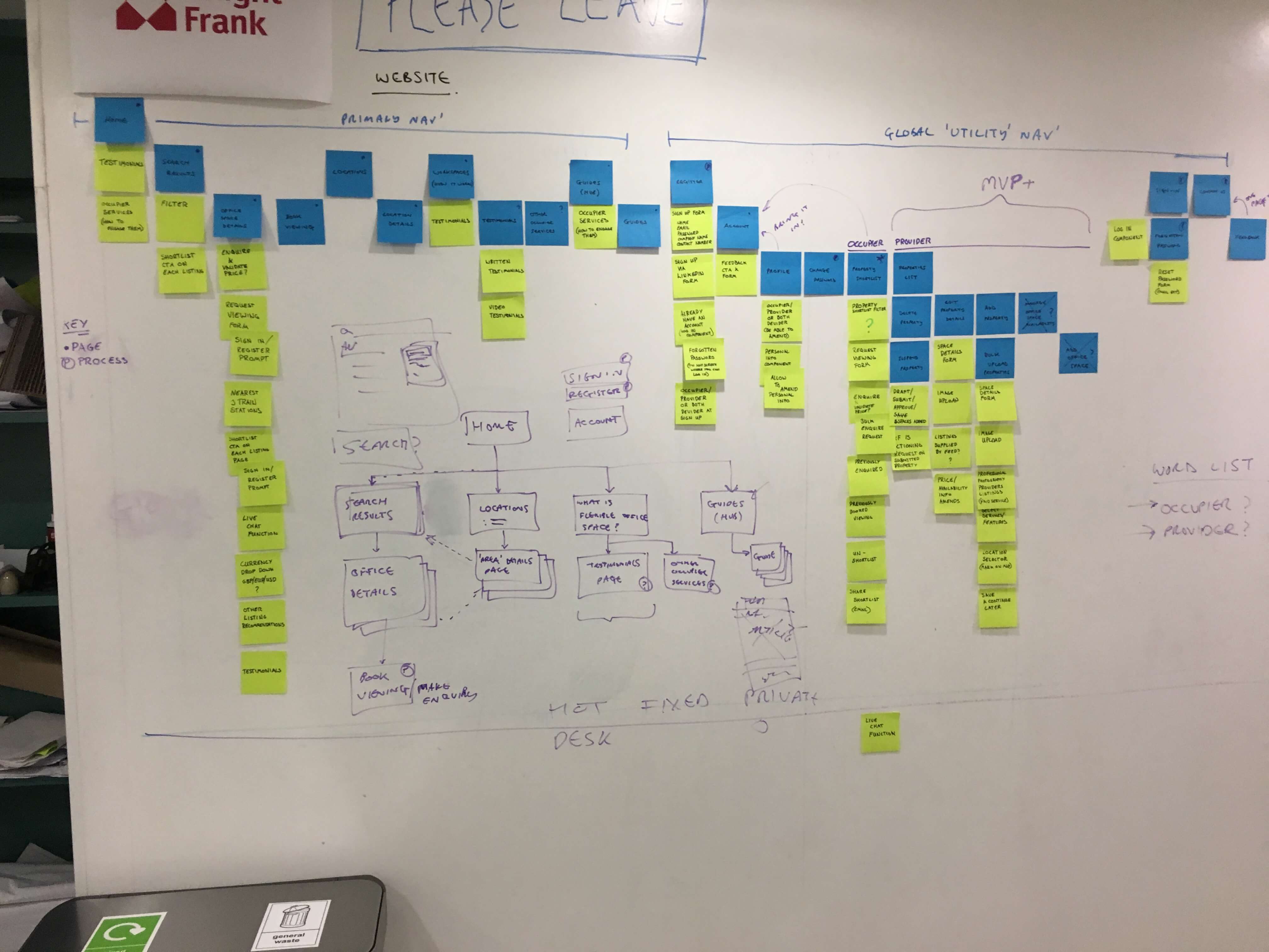
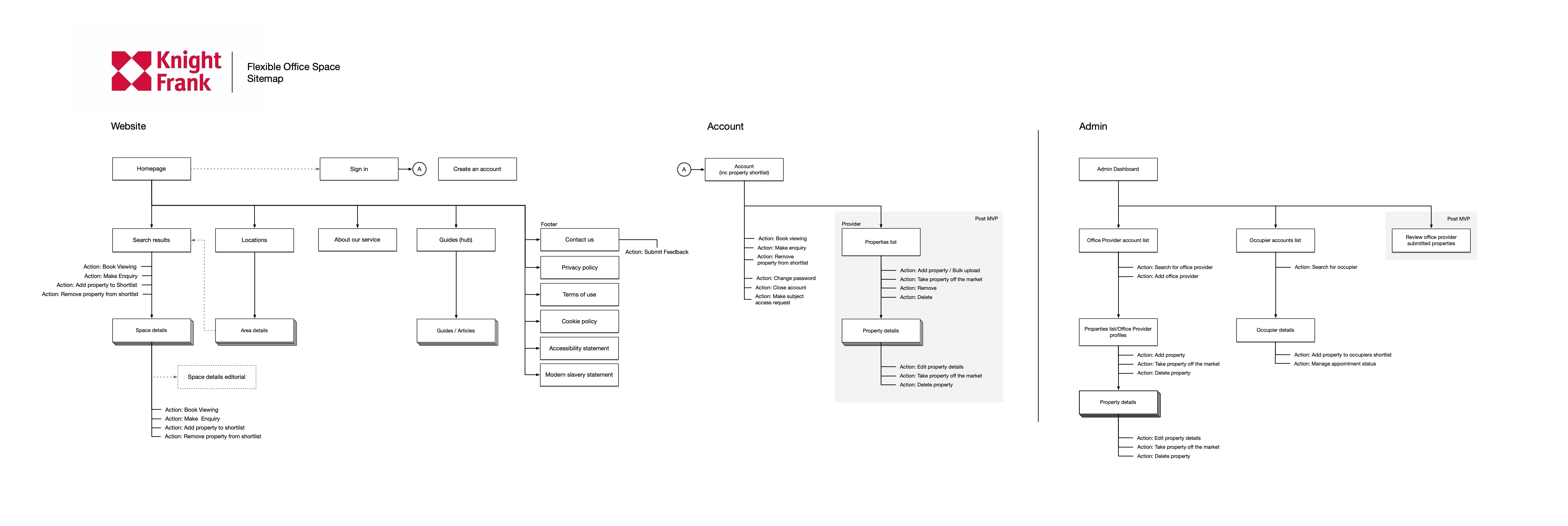
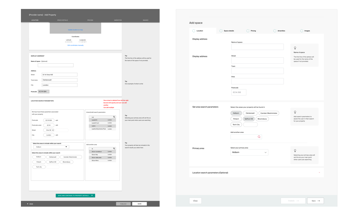
Here we fleshed out the structure of the website and how certain functionality like slide ins, and overlays should work giving consistency across the website.
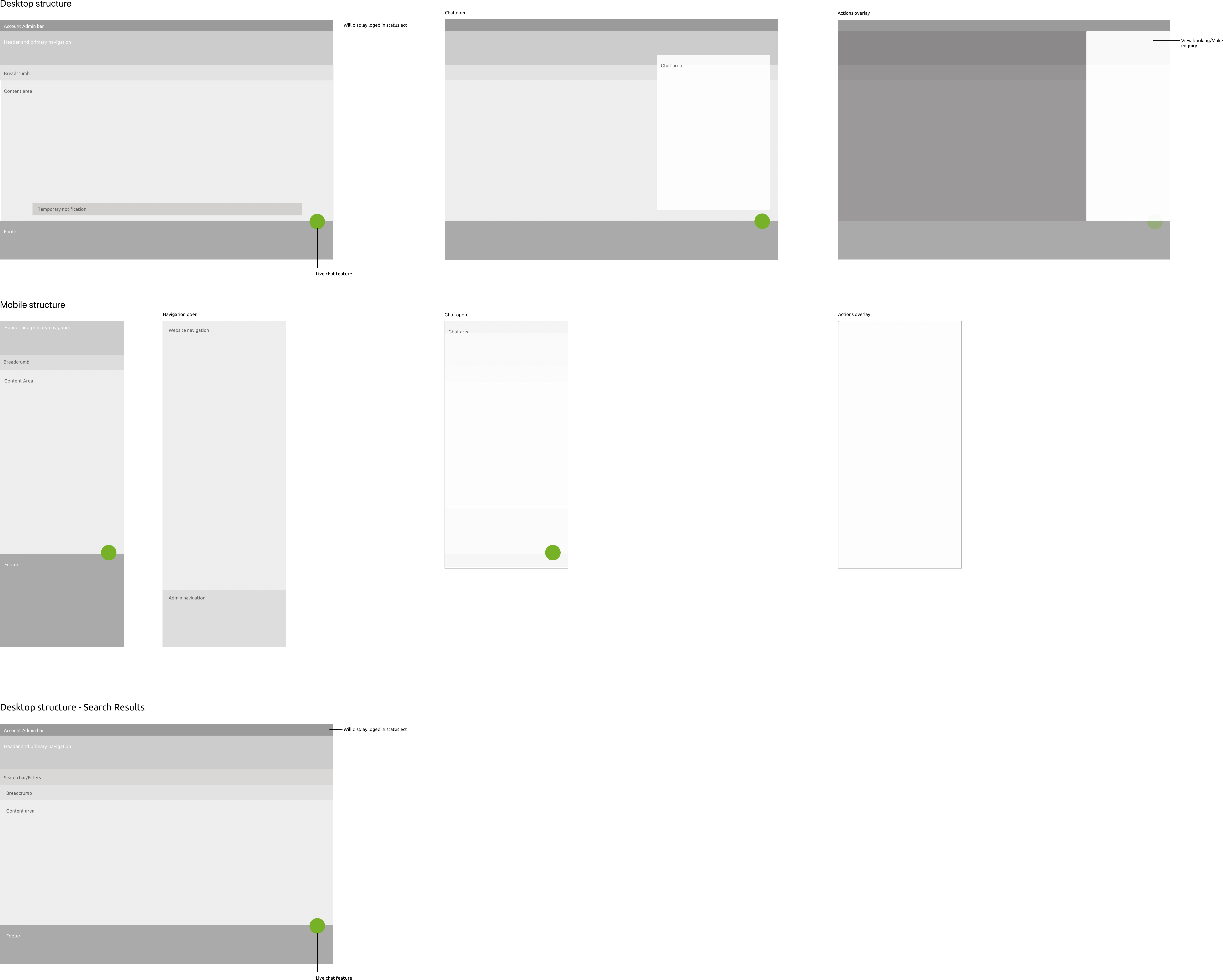
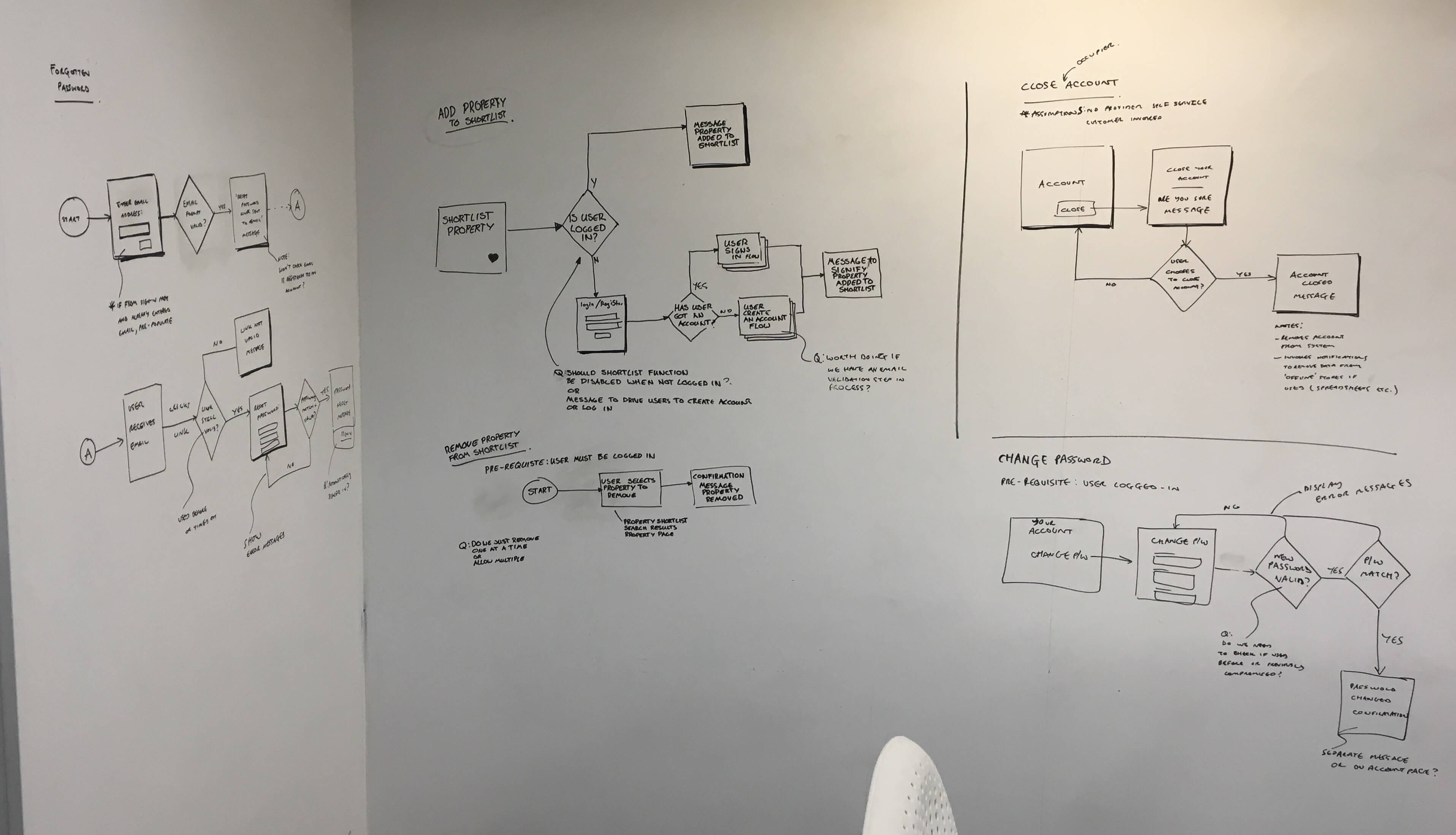
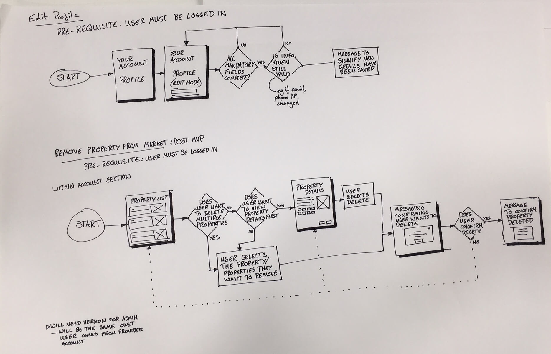
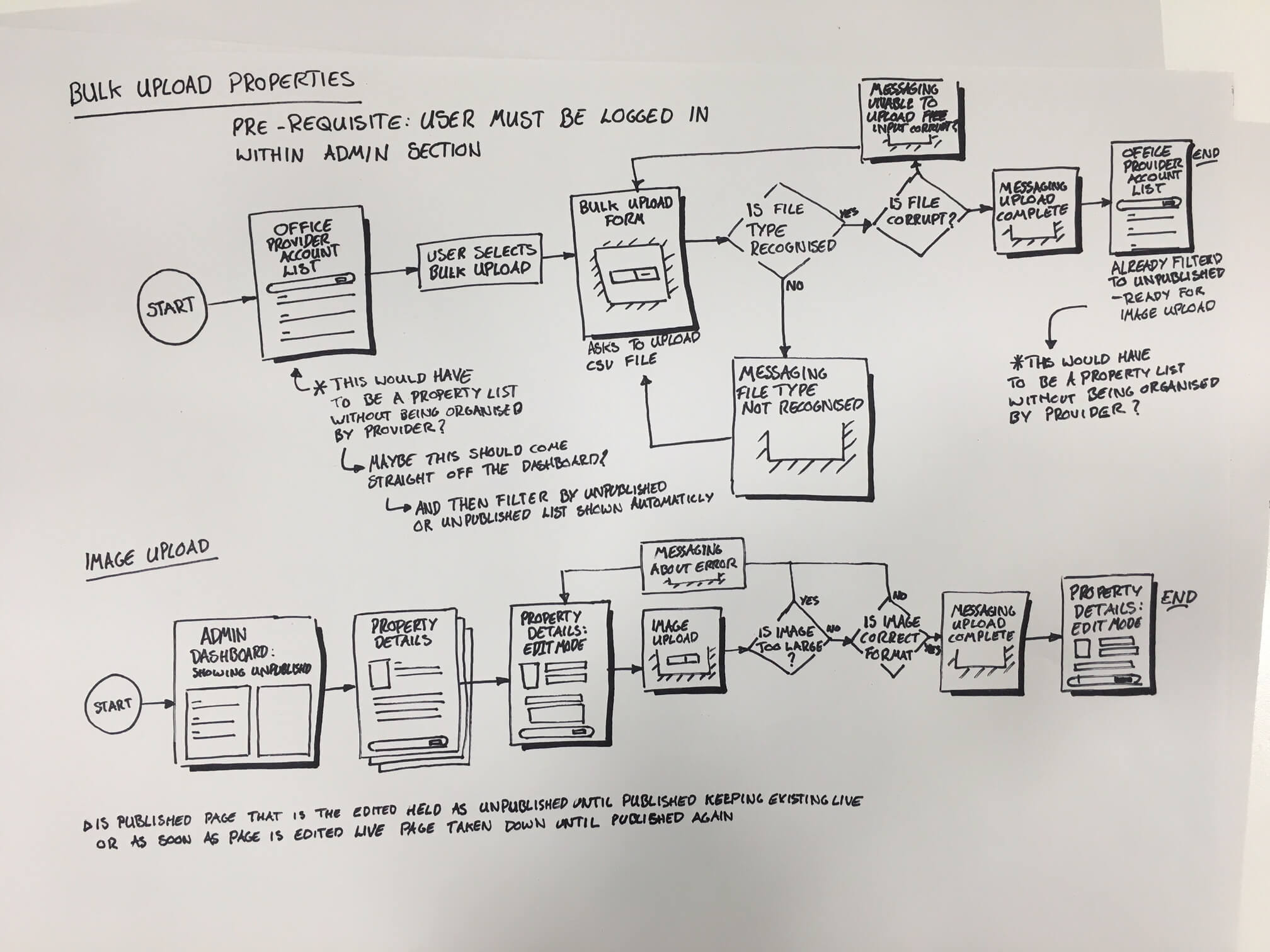
With what we had learnt from working with the client, content, and consultancy teams, we put together the certain flows of the site. This was used to give to the Engineering teams. To see if there were any areas that may be a problem, and to highlight any pages that may be required that hadn’t been thought of.

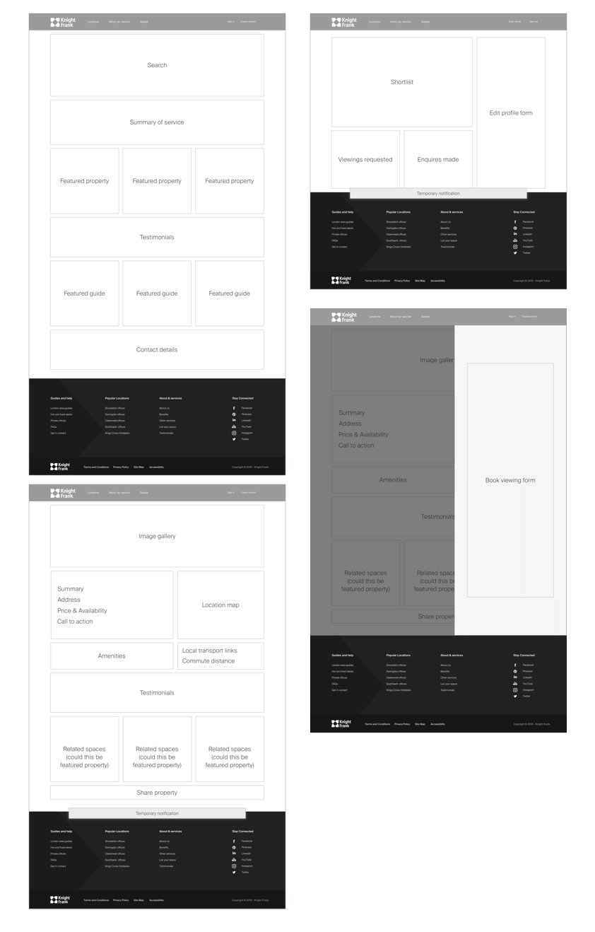
Initial wireframes
Starting to think about the content areas and components that would be used on the different pages.
Sprint,
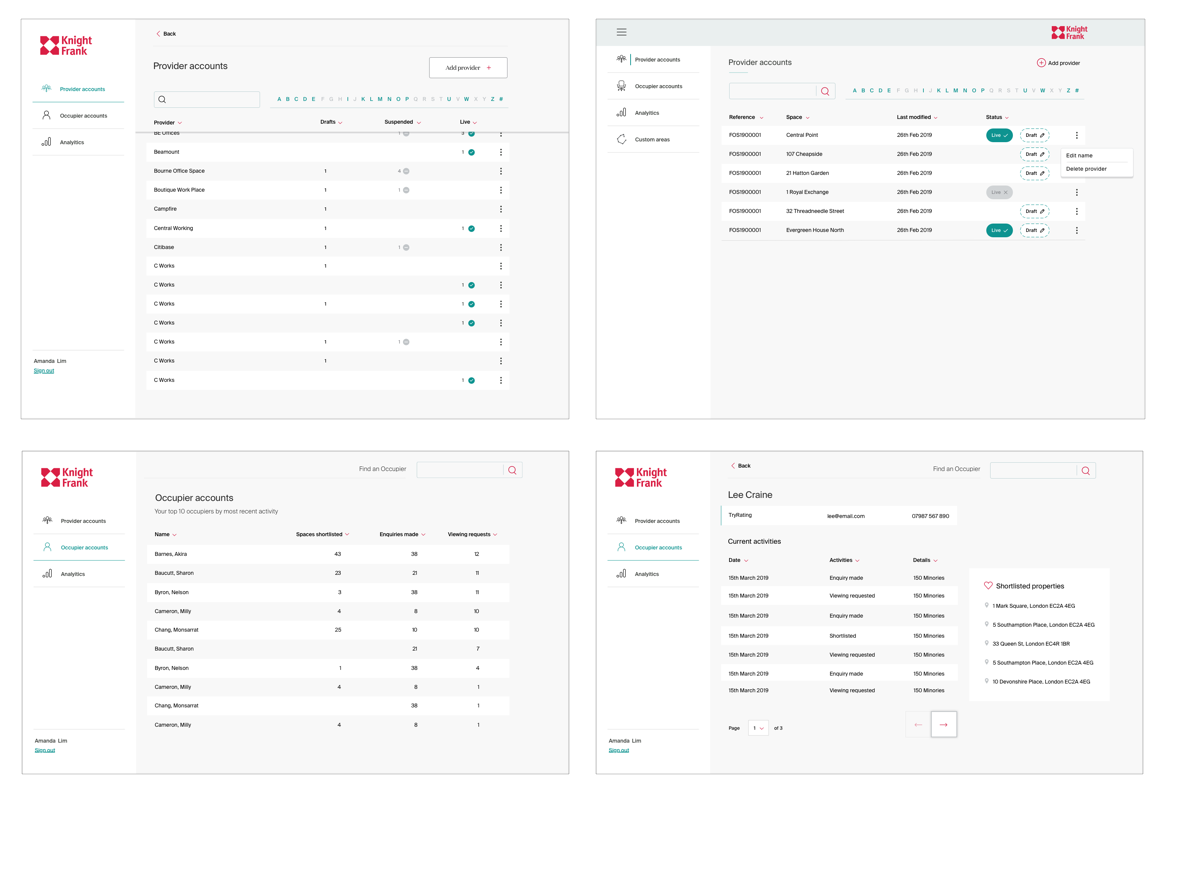
User Account
After foundation phase where we had set out the main structure and patterns of the website, we moved into the Sprints where we would focus on particular problems.
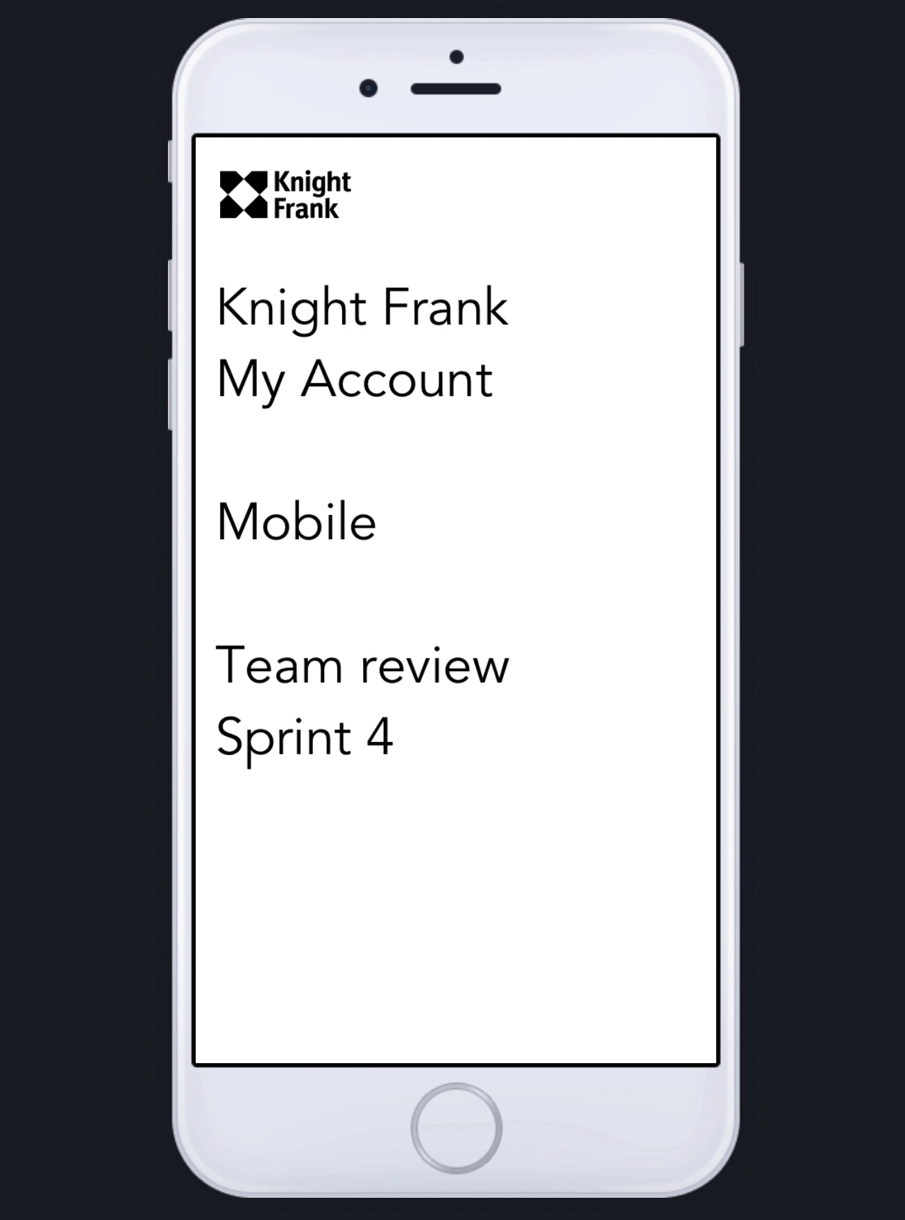
Sprint 4 was focused on designing the account area of the site, Here I mainly focused on how the user would interact with their shortlist. A number of options were drawn up, but between the teams it felt that a consistent look and feel to what was shown on the property search results page would work best.

Quick InVision prototype, top help explain to the client the functionality of this particular area.
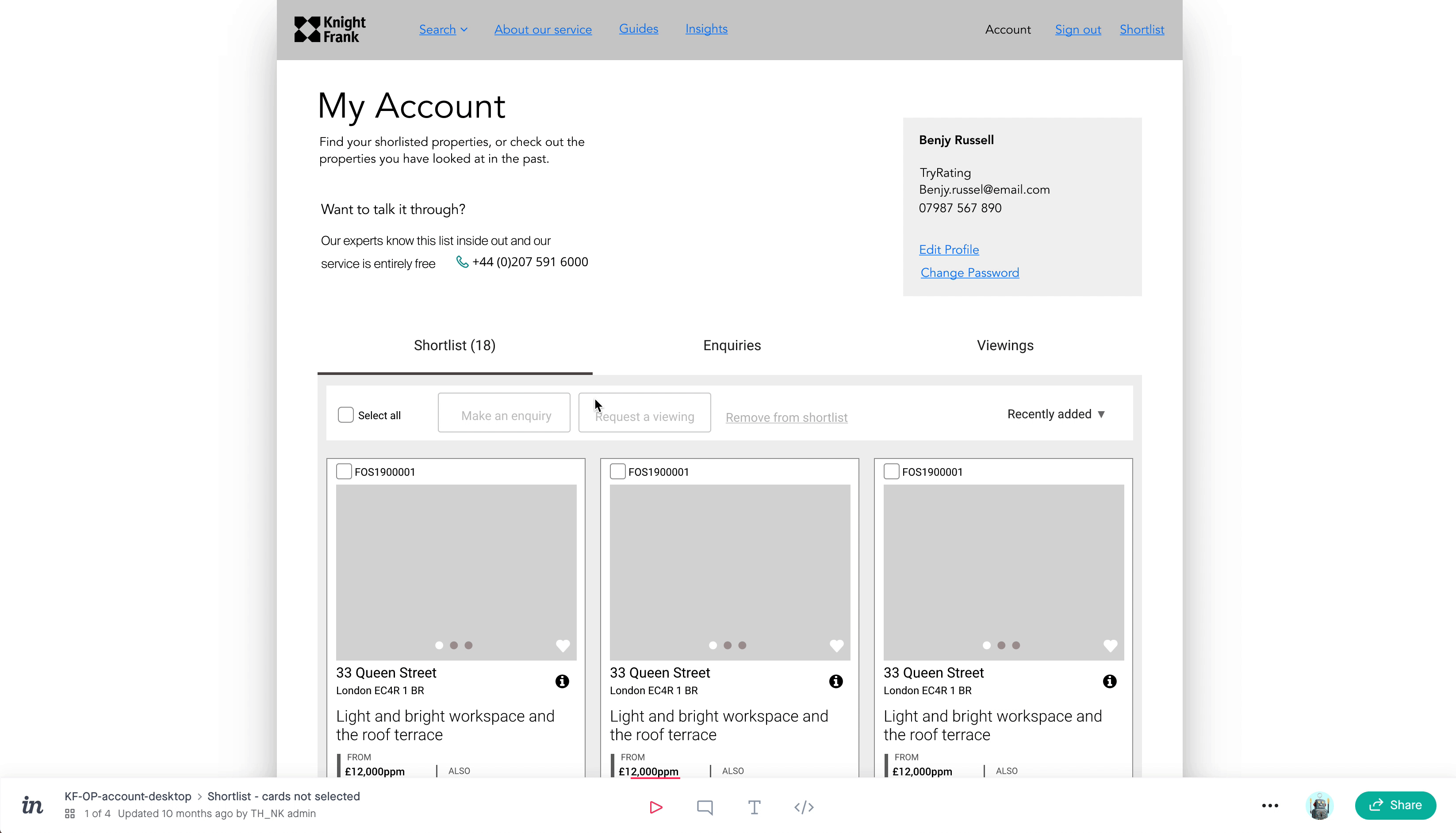
Showing some of the designs for the account page.

Sprint,
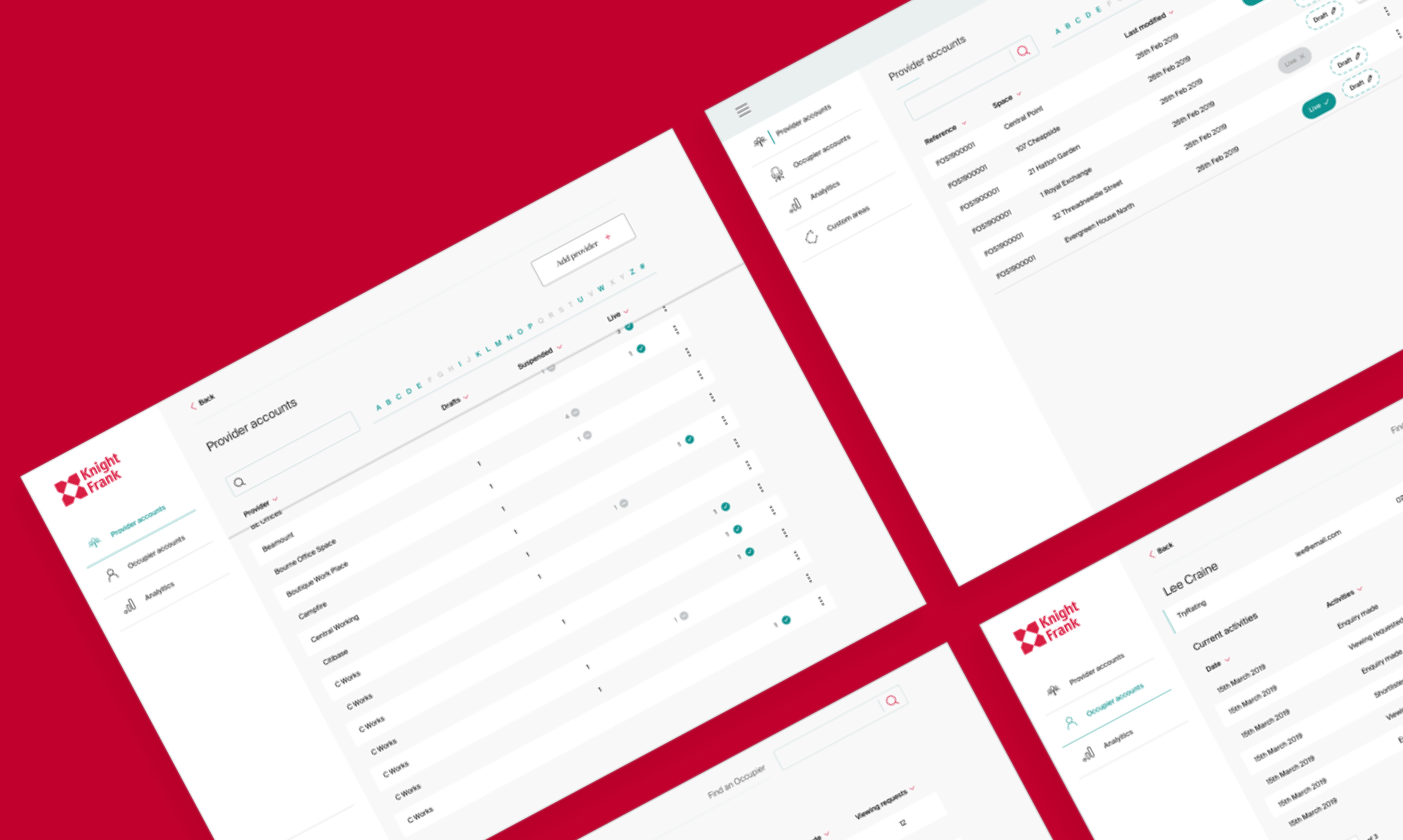
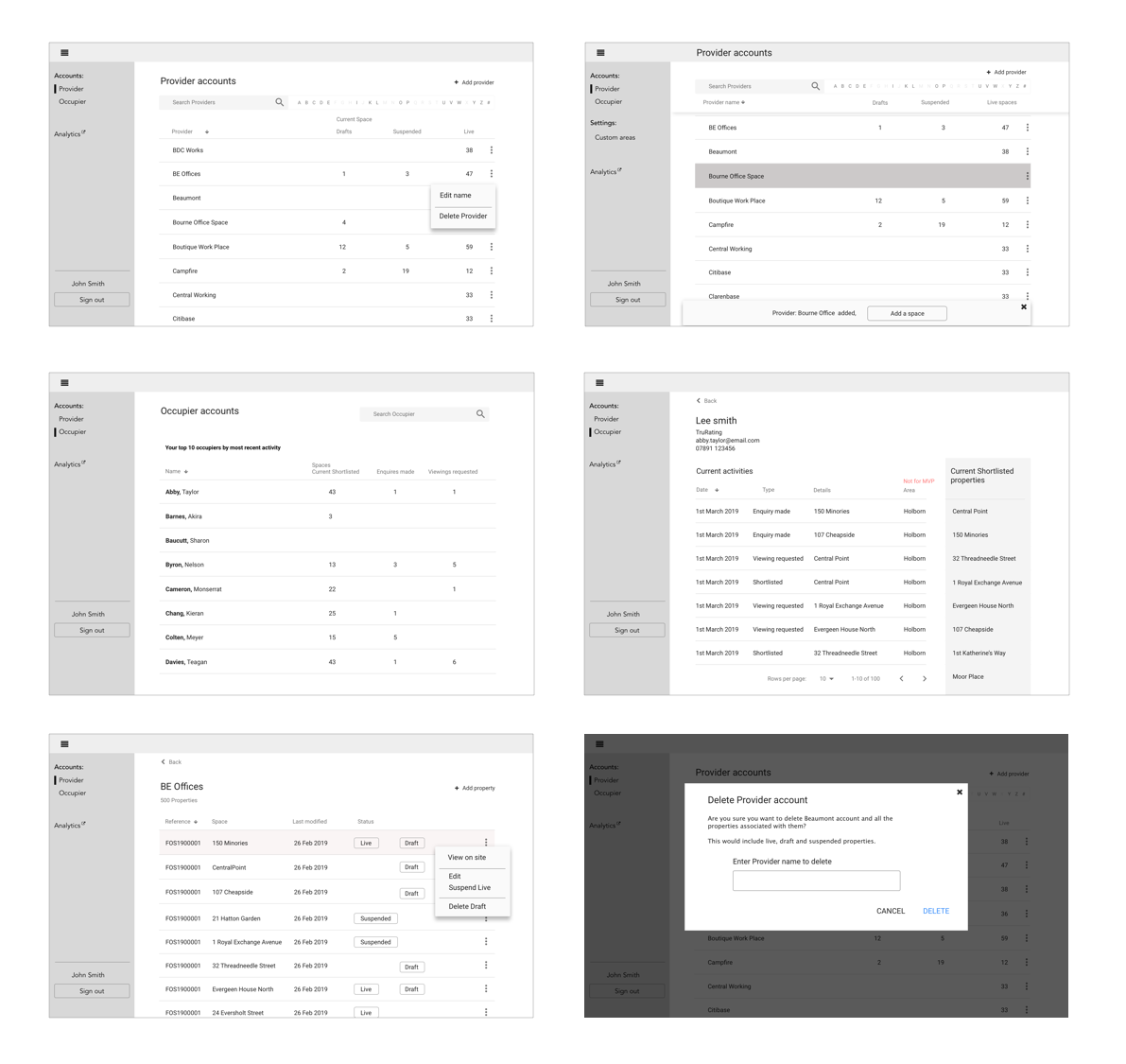
Admin
One of the sprints was dedicated to designing the admin area, so that the team at Knight Frank would be able to upload new properties onto the website, as well as keep up to date with the contacts that have made enquiries.
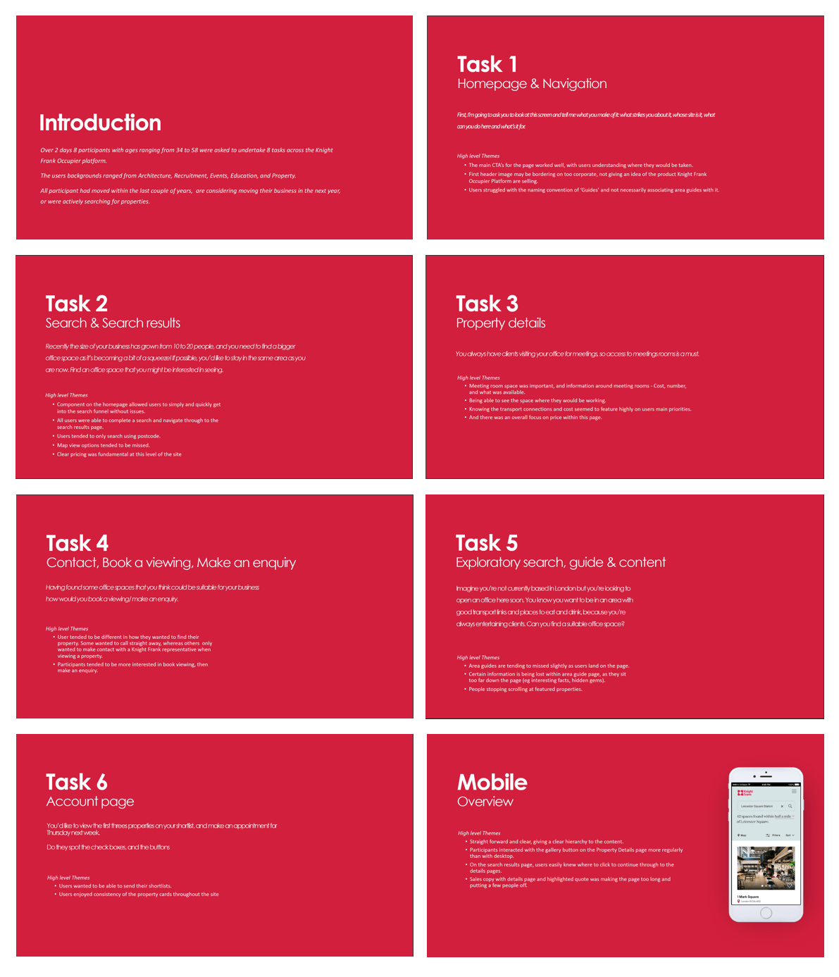
User testing
Once we had completed the sprints the initial build was taken into user testing, Here I helped plan, observe, and interview participants.
The session was conducted with an observer room, where the client was invited to join and add to the note taking. With 9 participants carrying out a short interview, and a few tasks to see if there were any issues when trying to find a property, and then making an enquiry.

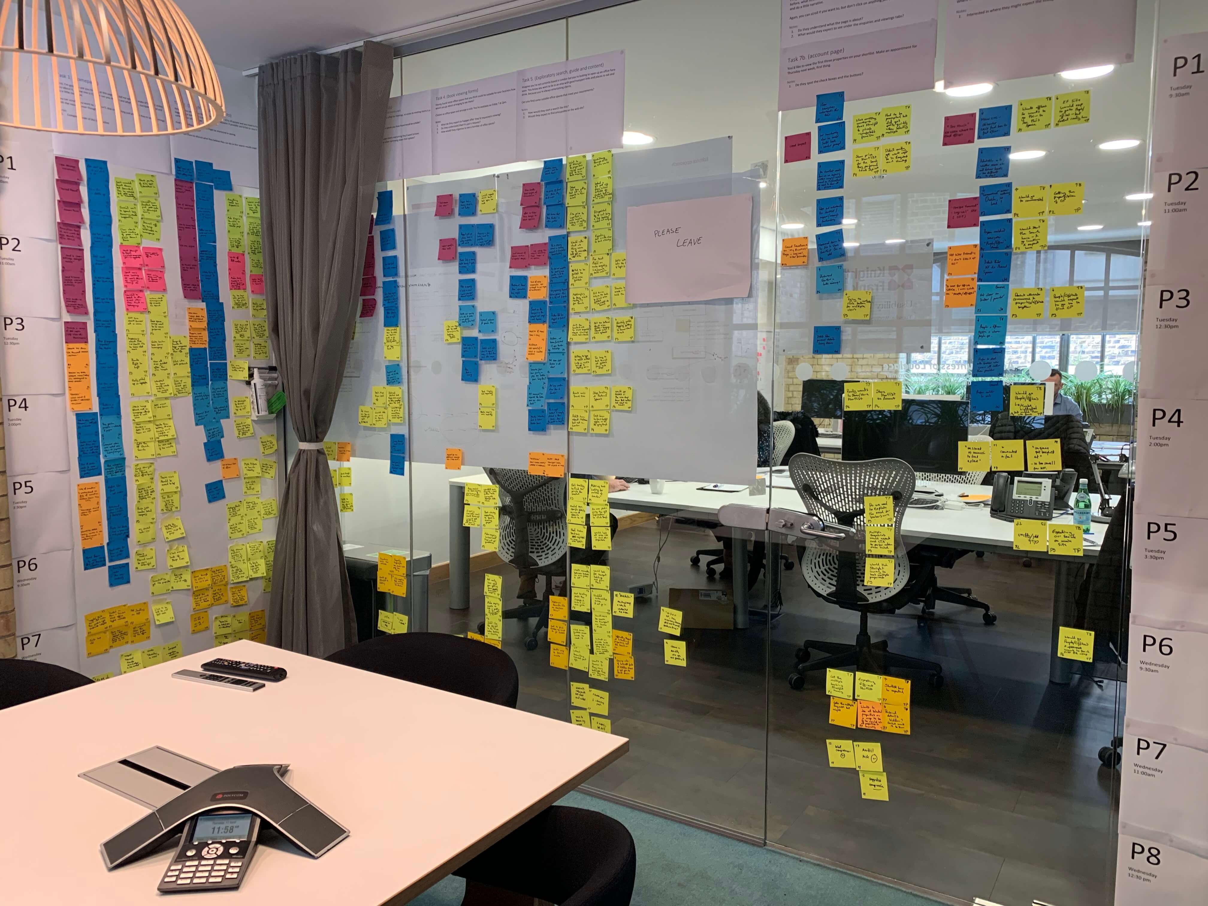
Once the user testing was completed the notes were then synthesised and presented back to the client, as well as reworked into the designs before launch.