Penalty Points tracker
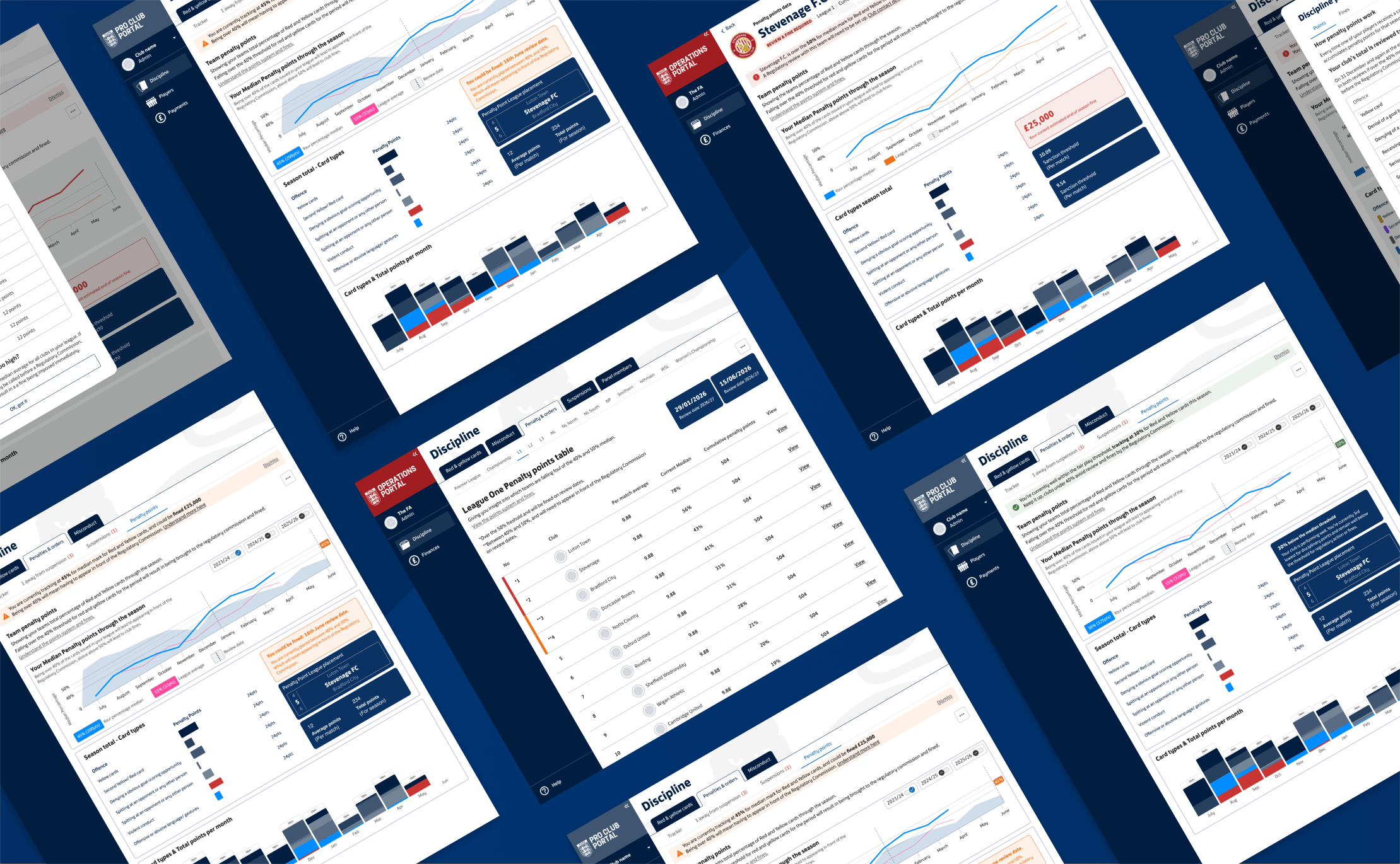
Reworking a page nobody used so it finally made sense.
The Challenge: Clubs weren’t using the portal’s penalty points page. It showed cumulative totals and threshold numbers but never answered the question that matters to clubs: are we at risk of a fine? The task was to redesign it around how fines actually work, for both clubs and The FA’s own staff.
My Role: UX designer covering on the Pro Club Portal squad, from rules research through design, testing, synthesis and MVP handover.
Impact:
Going in, 0 of 4 club secretaries understood penalty points. Coming out, all four could explain what triggers a fine.
Operations view approved on the spot by stakeholders.
Club MVP scoped and handed over to build, with proposed success measures.
A new accessible colour palette for data visualisation, filling a gap in the design system.
Timeframe: May to mid-August, one of nine projects I worked on in that time.
Skills used: UX research | Usability testing | Research synthesis | Data visualisation | Information design | Accessibility | Service design | MVP scoping | AI prompting | Figma
A page nobody used
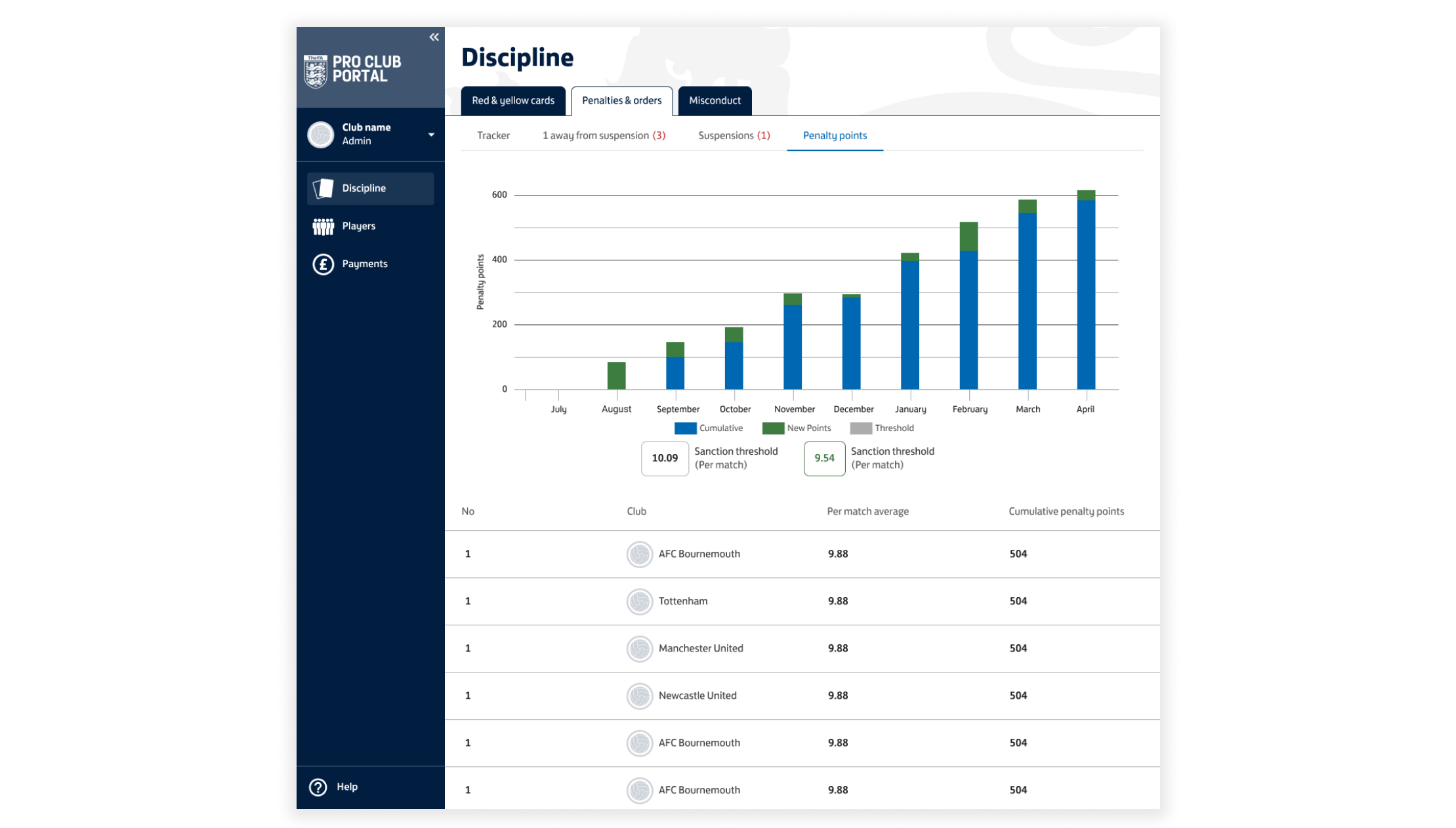
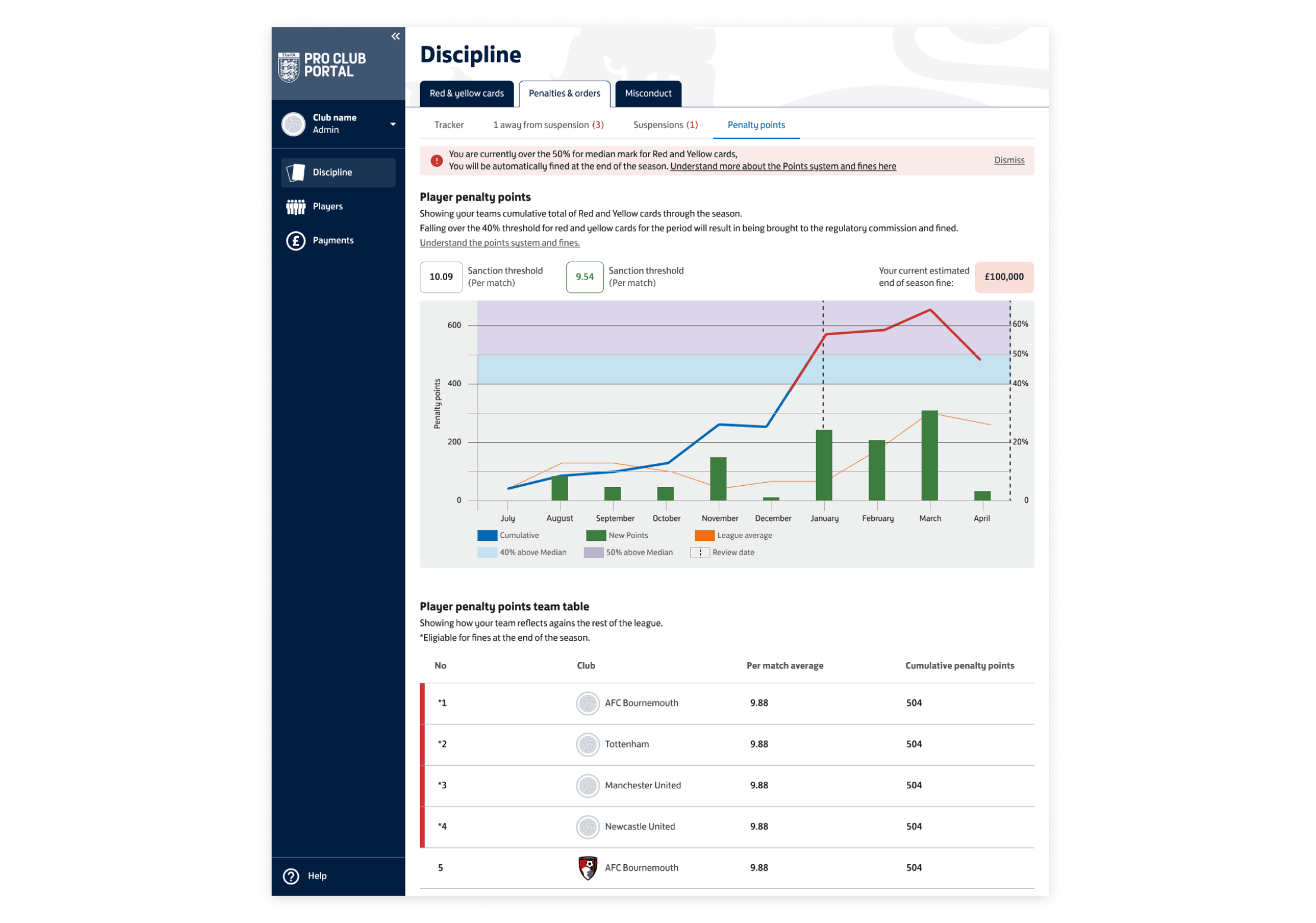
I was covering for another UX designer on the Pro Club Portal squad. The portal already had a penalty points page on desktop and mobile, but clubs weren’t using it. It showed a stacked bar chart of cumulative points per month, two sanction threshold numbers and a league table. Nothing told a club what any of it meant for them.
Starting before the rules arrived
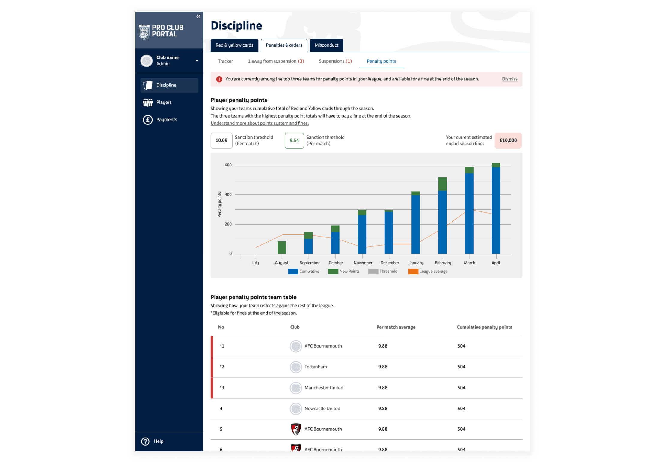
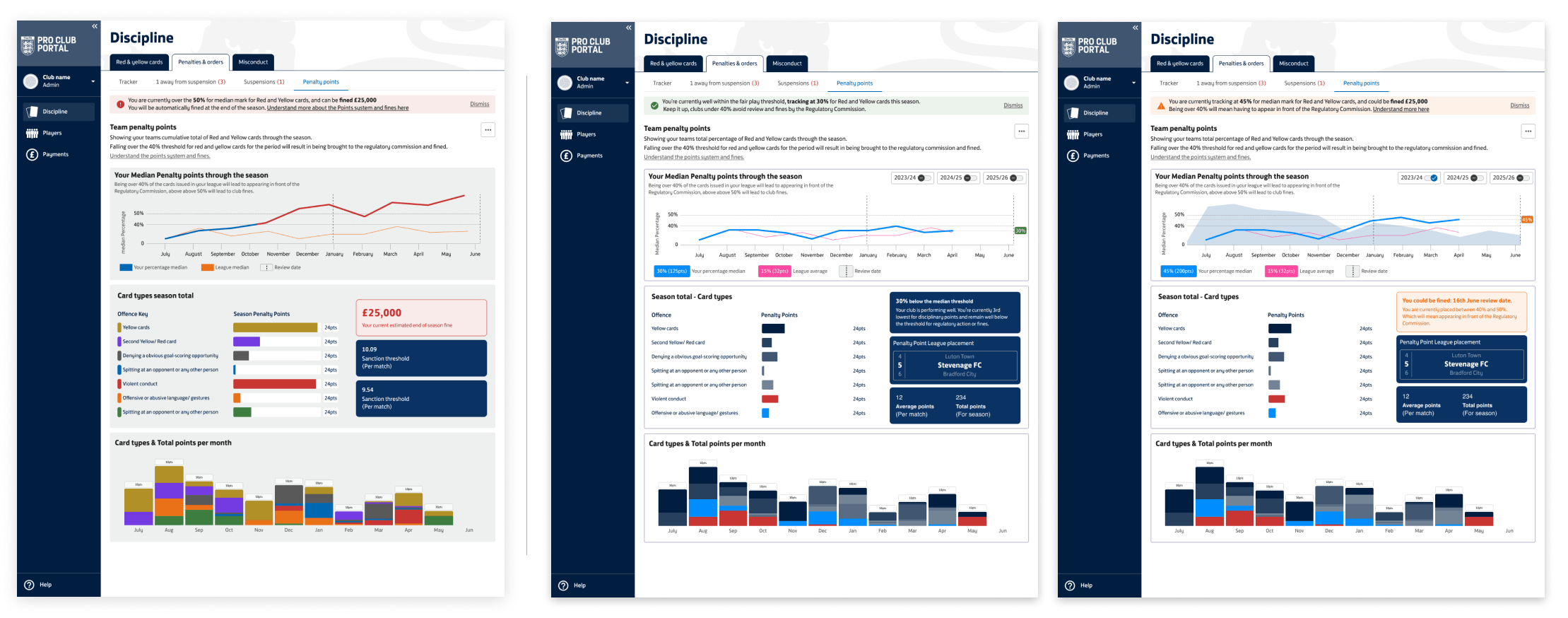
The business hadn’t yet given us the rules behind fines, and that could have taken weeks. Rather than wait, I did a first pass to get the project moving: clear headings, descriptive text, an alert banner, an estimated fine and the top three teams highlighted. It was cleaner version of the original that users would be able to understand, and it gave the squad something to react to. It was also built on assumptions from the original built page, that I knew would need checking.
Designing around the real threshold
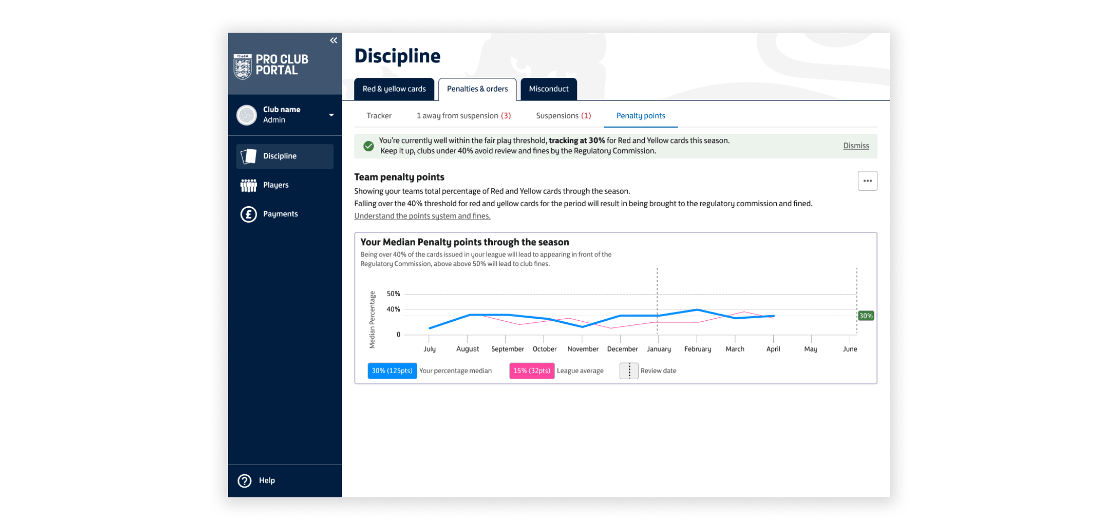
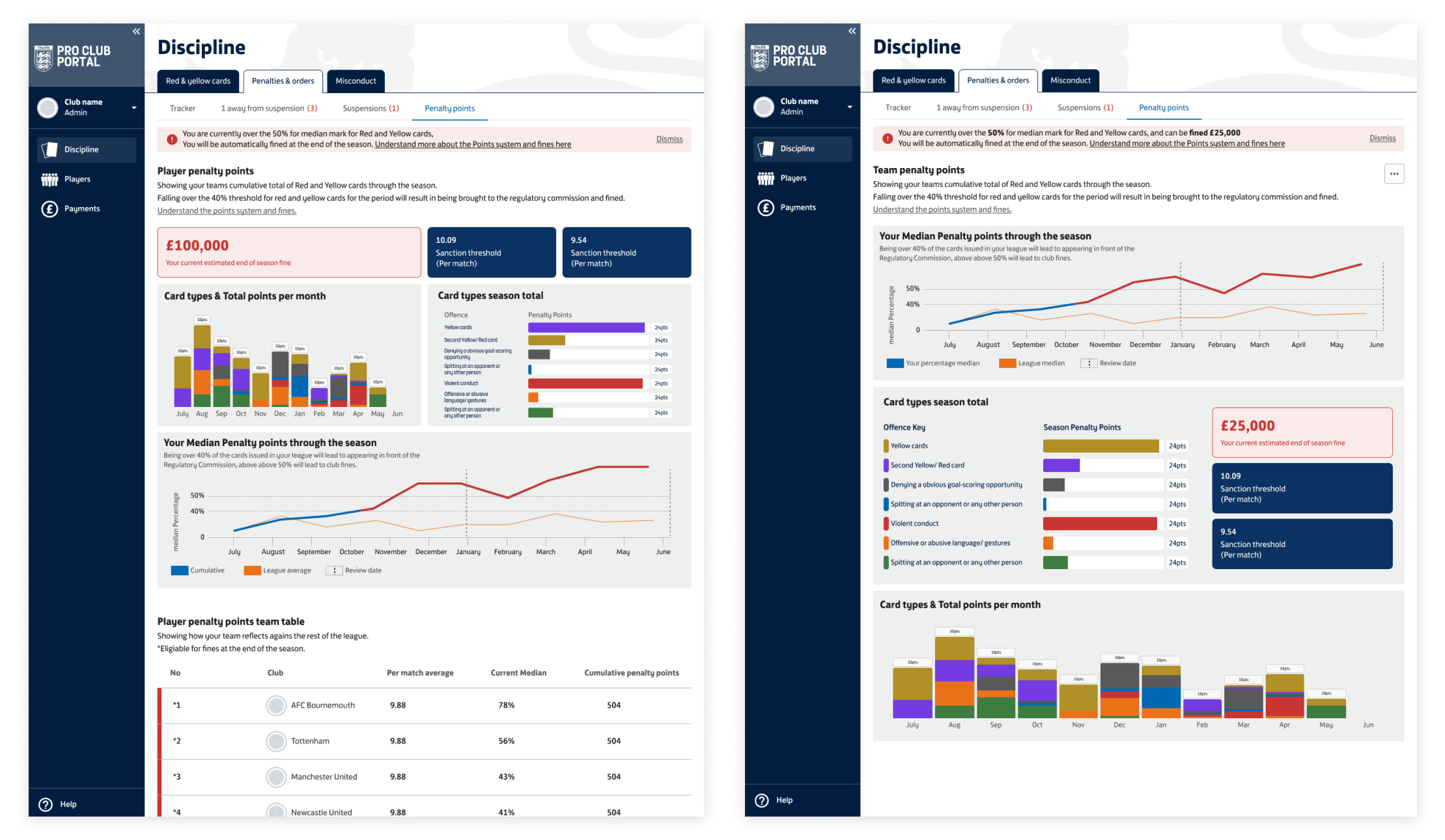
Version 1 plotted the club against the 40% and 50% bands, with review dates and the league average marked. It gave the squad something concrete to talk around. We then stripped it back to a line tracking the club’s percentage above the median, supported by card breakdowns, an estimated fine and in-page explanations of the rules.
One dataset, two audiences
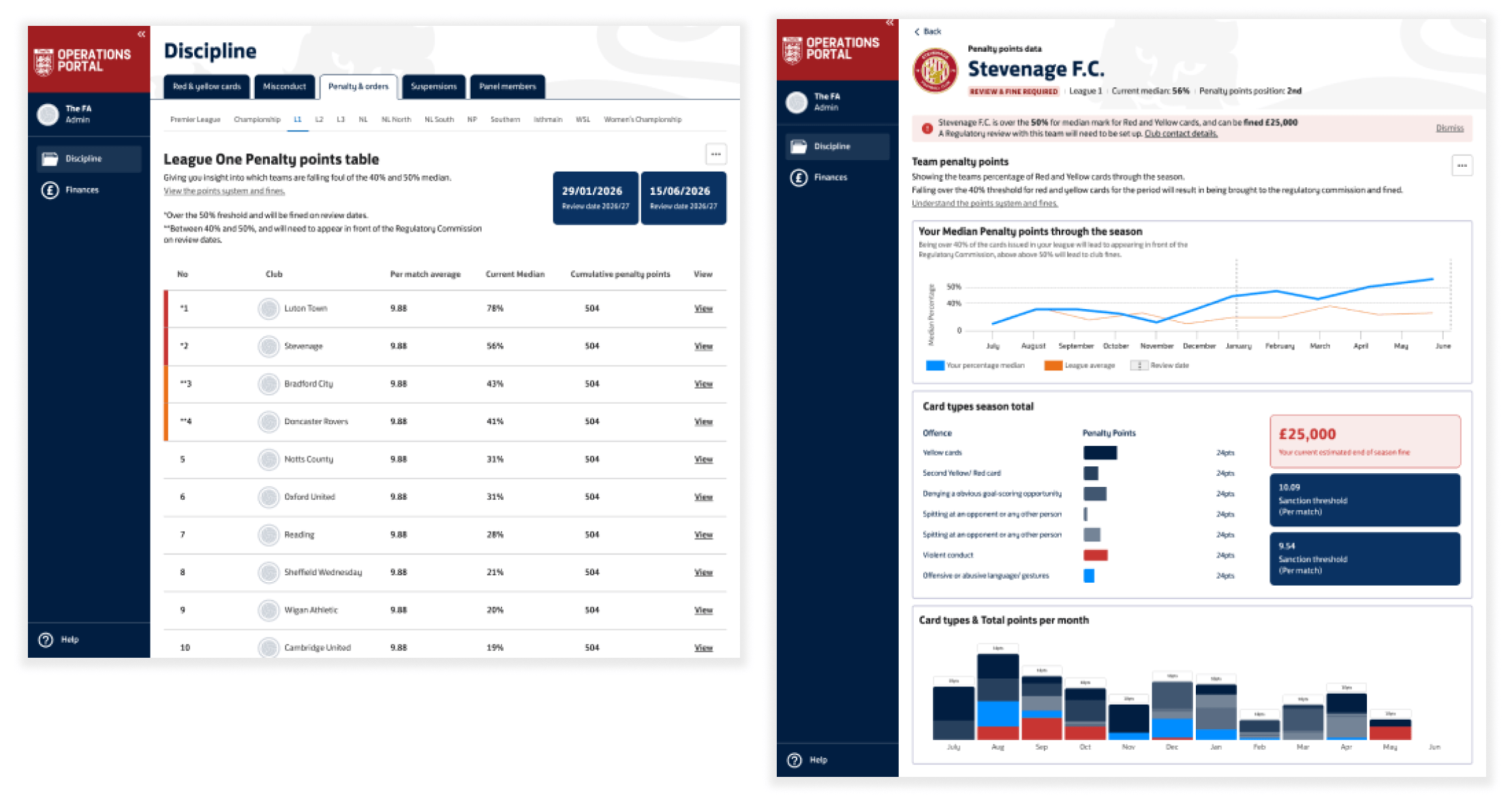
For stakeholder approval, I also designed the operations side for The FA’s own staff. Staff see each league’s table with review dates and clubs flagged at 40% and 50%, and can drill into any club. Clubs watch themselves, and The FA watches the league. It was approved there and then. Stakeholders also asked that the club banners highlight good news as well as warnings, and that went into the build.
Testing with club secretaries
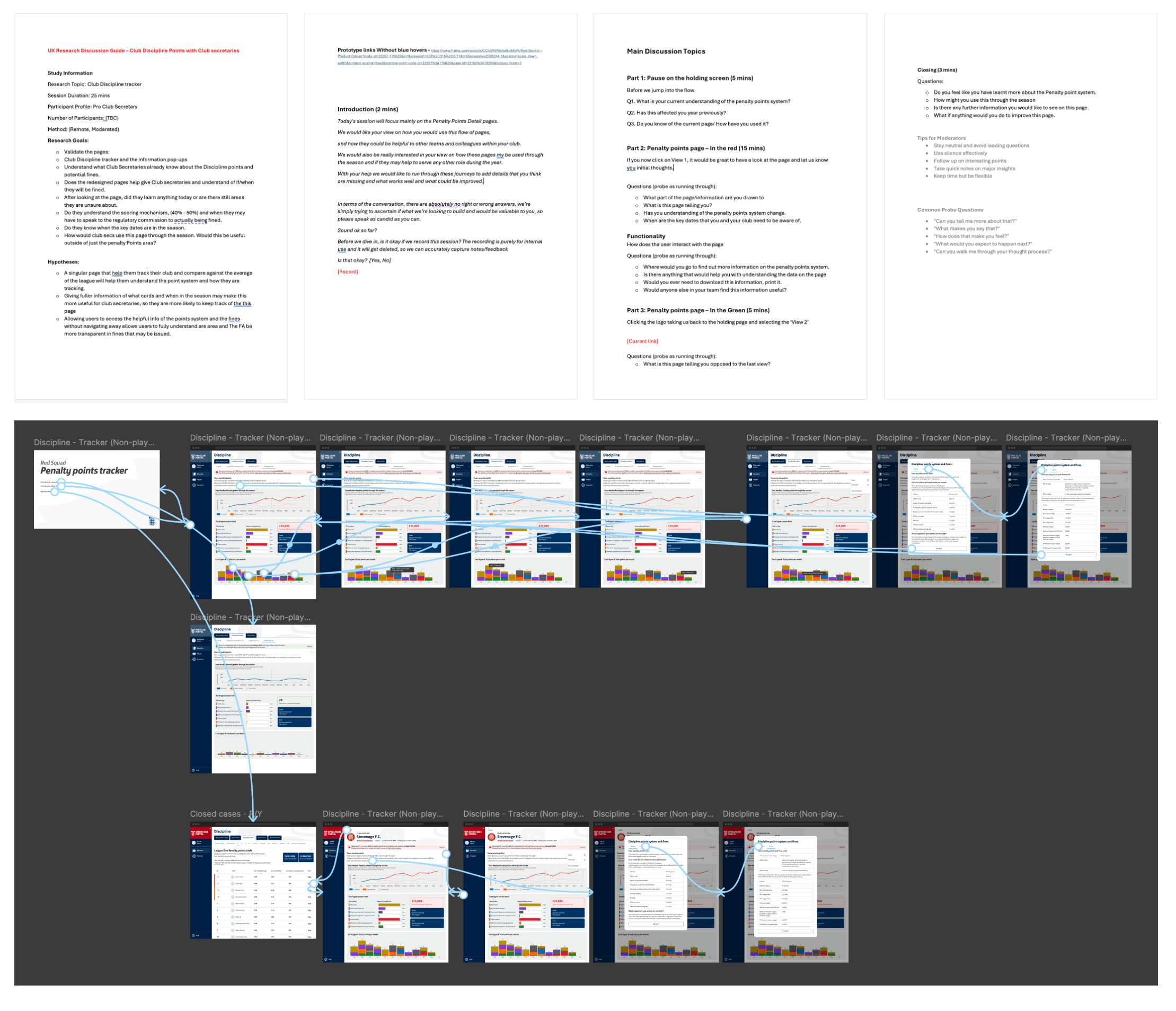
I ran remote, moderated 25-minute sessions with four club secretaries from semi-pro and grassroots clubs, working from a discussion guide with stated hypotheses. Each saw two states: a club over the threshold and one comfortably within it.
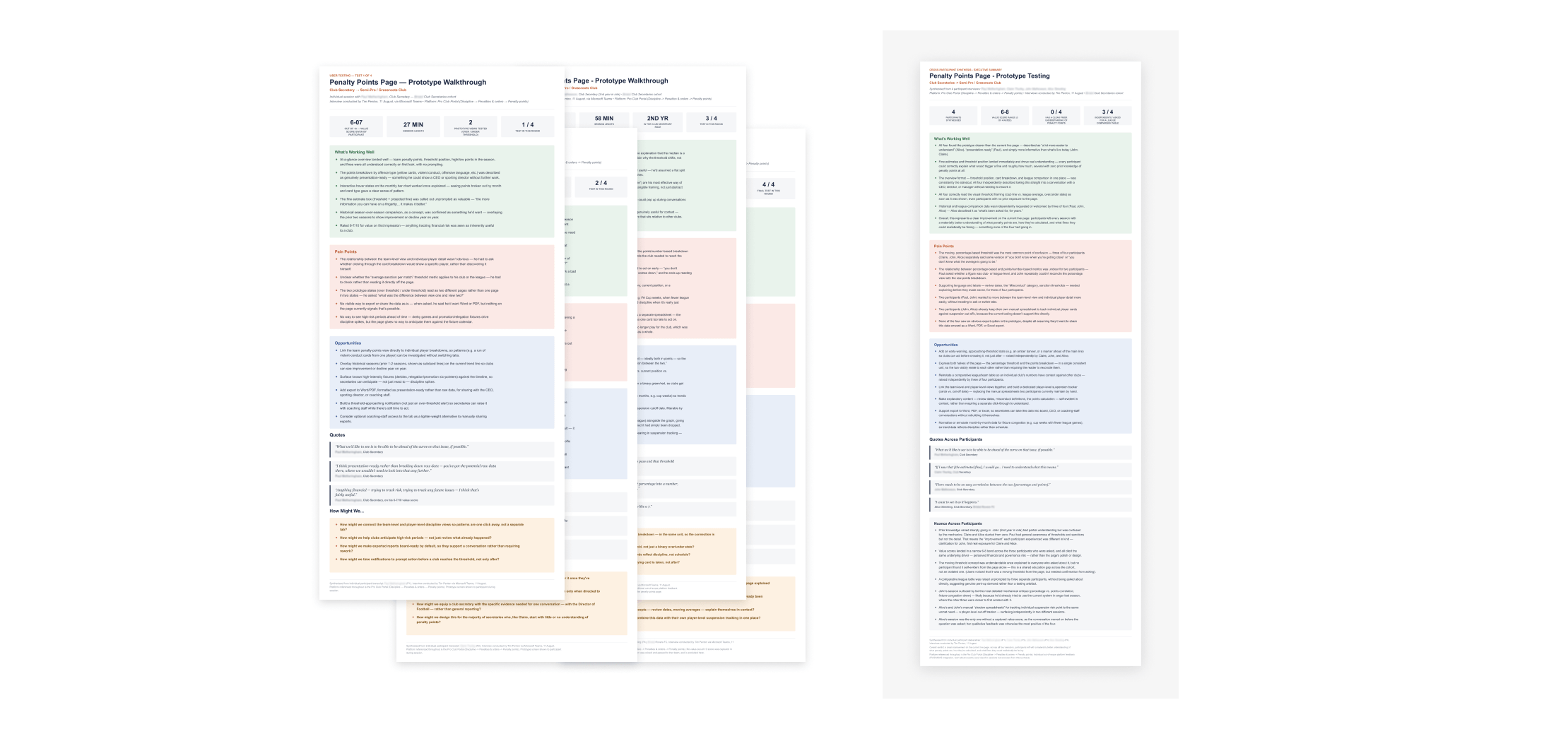
I synthesised the sessions, with help from Claude, into individual reports and a cross-participant summary. The three who scored the page gave it 6 to 8 out of 10. The less comfortable findings were more useful:
Three of four asked independently for a league comparison, which we’d simplified away.
The moving, median-based threshold confused three of four, as did how percentages related to points.
Secretaries wanted a warning before crossing the line, not after.
“What we’d like to see is to be able to be ahead of the curve on that issue, if possible.”
A gap in the design system
Building the charts, I used the colours in the design system, but they didn’t work for data. When I raised it, it became clear that neither the team nor the wider business had any guidance on colour for data visualisation. Working with the UI designer, we dug deeper and defined a palette with accessibility in mind. It alternates warm and cool colours next to each other so charts hold up for people with colour blindness. The palette is useful well beyond this page.
MVP and handover
As a squad, we agreed the fundamental piece was the line chart showing where a club sits against its league average, because that tells them whether a fine might be coming. It also answers the league comparison secretaries asked for. The MVP became that chart and the status banner. The card breakdowns, league placement and fine estimate mainly helped clubs understand their team’s discipline, so we held them for later releases.
I handed back the synthesis, the MVP scope and proposed success measures:
Adoption: monthly visits to a page whose baseline was close to zero.
Comprehension: a secretary can tell within seconds whether they’re at risk.
Fewer surprises: fewer “why are we being fined?” queries to The FA.
The synthesis also flagged opportunities beyond this page, such as a player-level card tracker to replace secretaries’ own spreadsheets, and export for sharing with boards. The longer-term test is clubs in amber reducing their discipline points before a review date, though that’s the hardest to attribute to the page. It went into build after I left, so there are no live results yet.