Royal Mail Navigation
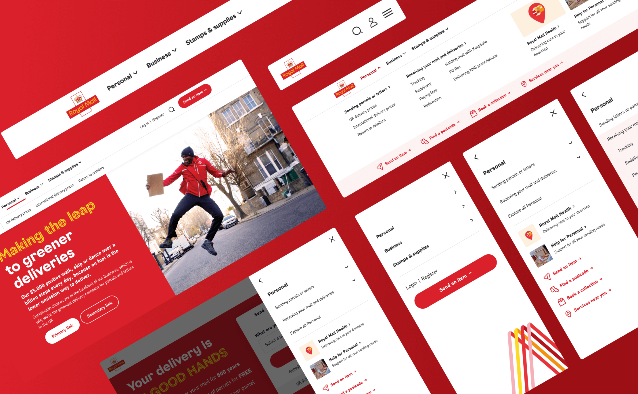
Redesigned Royal Mail’s navigation for a clearer, scalable structure. Helping users navigate confidently across the site.
The Challenge: Transform fragmented navigation across 6 Royal Mail domains. Navigate internal politics, work within technical constraints (no IA changes allowed), and prove EPAM could be a strategic partner.
My Role: Led discovery, IA design, usability testing | Facilitated stakeholder workshops | Managed sprints and client relationship
Impact:
£600k annual revenue increase (0.6% conversion lift)
Navigation framework now used across all 6 Royal Mail domains
3-month project → 7-8 additional projects over 3 years
Ways of Working: 2-week sprints | Daily stand-ups | Weekly client reviews | Discovery → Alpha → Beta → Live
Timeline: 3-month brief → 18-month engagement → 3+ years of ongoing partnership
My Role: Led discovery, IA design, and navigation framework creation. | Facilitated cross-functional workshops. | Collaborated with UI designer through to final implementation. | Directed usability testing and iterative refinement.
A "light UX review" that became a 3-year partnership
Royal Mail hadn't done strategic design work in 4-5 years. This was our audition.
Three months to prove EPAM could be more than a dev shop. The catch: six teams fighting for nav space, couldn't touch the broken IA, had to work now and scale for the future.
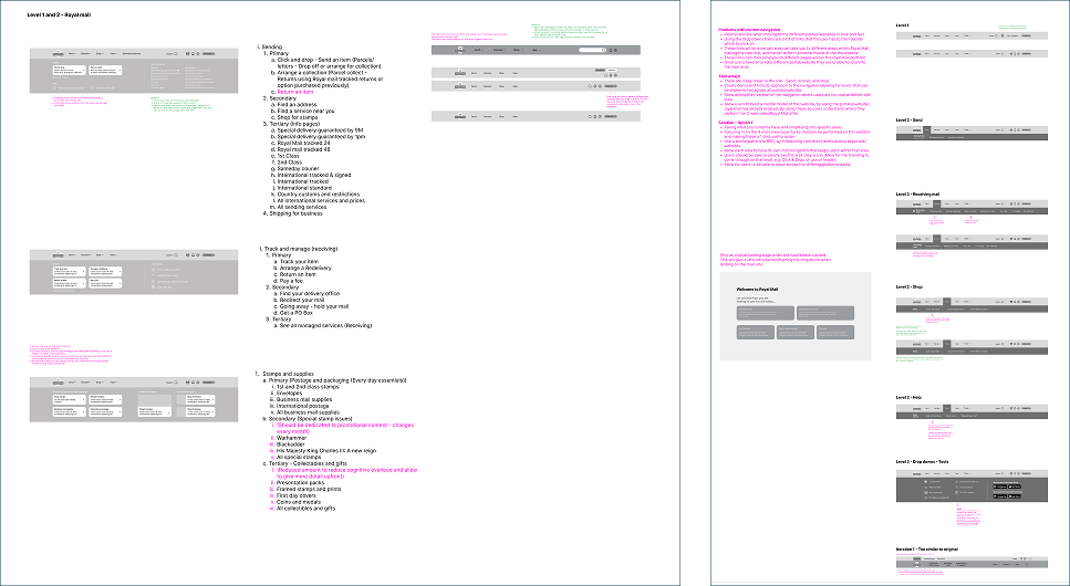
What we found (week 2 of discovery)
Brief: "Light review to match brand guidelines."
Reality: Years of organic growth. No structure. Users lost. Six stakeholders playing politics over user needs.
The constraints:
Can't restructure content, only rearrange access
Must satisfy competing teams
Must work with broken IA today, scale when fixed later
Not a design problem. A political and technical one.

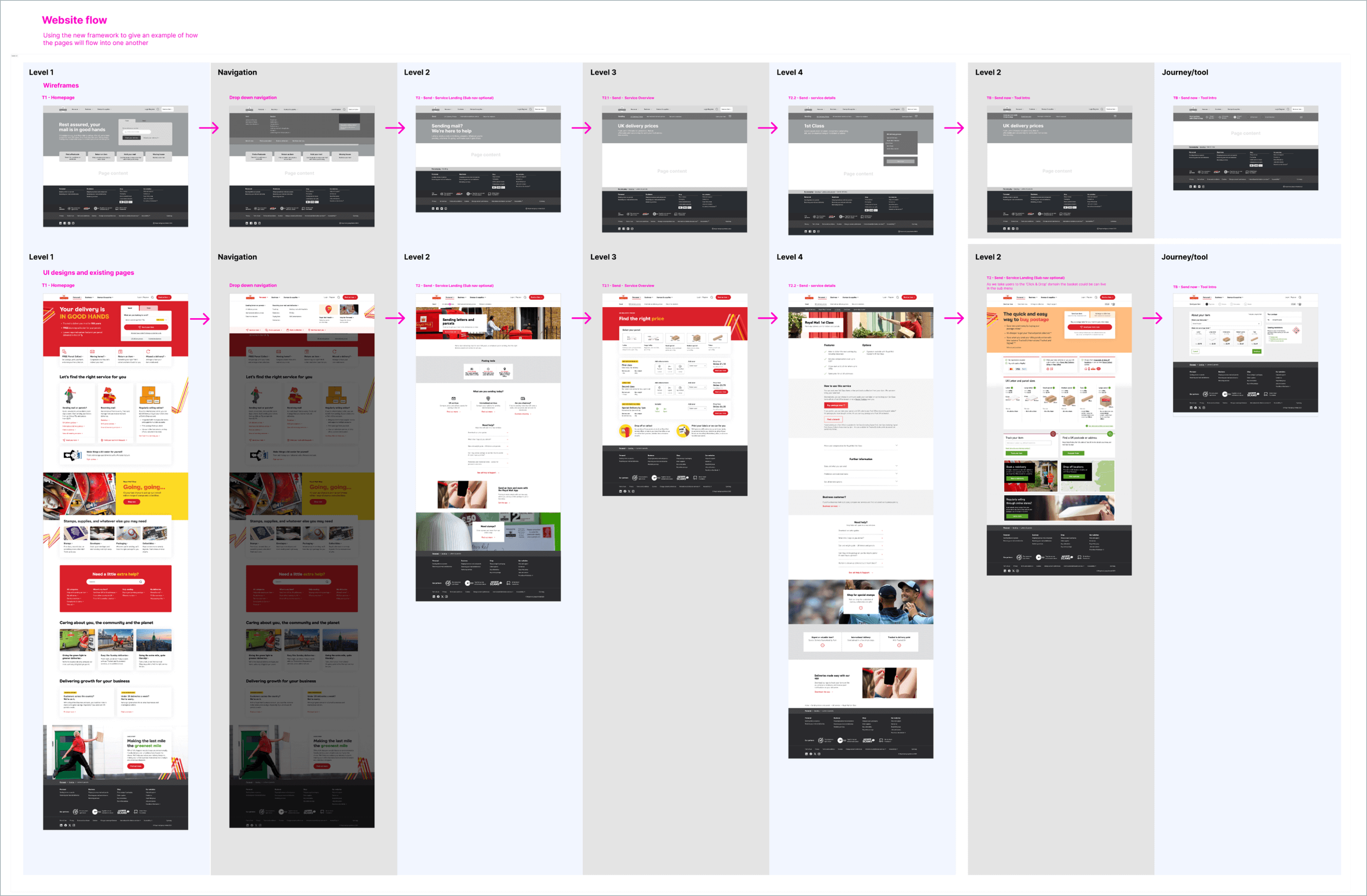
The solution and how we worked
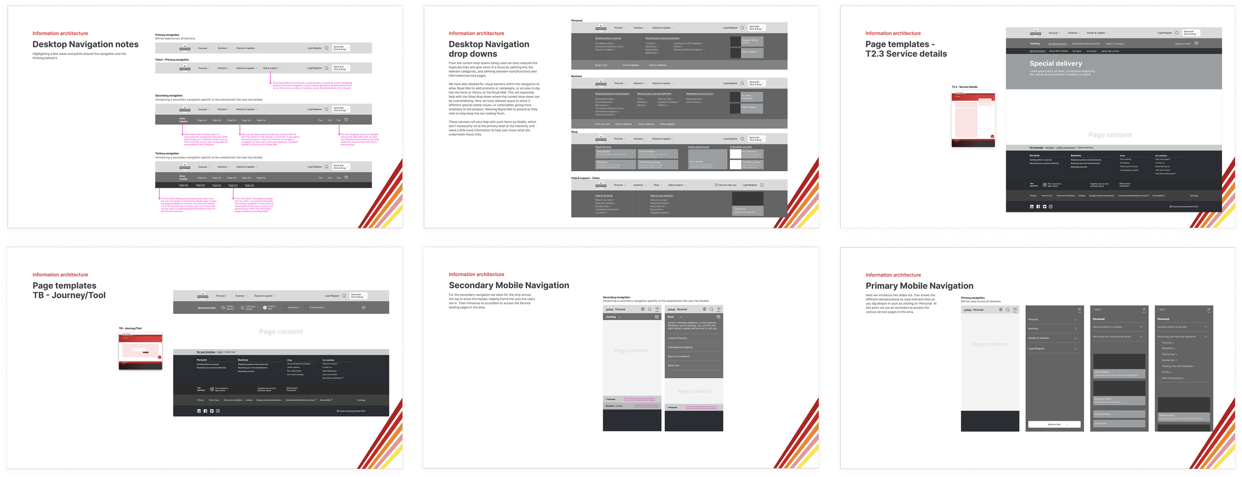
2-week sprints. Daily stand-ups with designers, researchers, developers. From day one: "CMS only handles three levels—how do we make this work?"
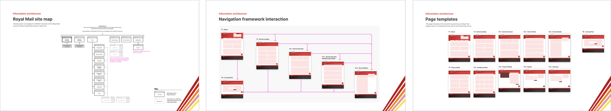
Studied BBC and Apple's hierarchies helped show how navs can build the mental model of the website:
Primary: Business vs Personal (the political divide)
Secondary: Category navigation
Tertiary: Contextual multi-step flows
Each team gets visibility, only when contextually relevant. No more homepage battles.
Sprint planning: Week 1 = framework + stakeholder validation. Week 2 = dev-ready components with accessibility (WCAG 2.1 AA).
Weekly Notion reviews: What shipped, what's blocked, what's next. Transparency = trust.
Breaking the rules
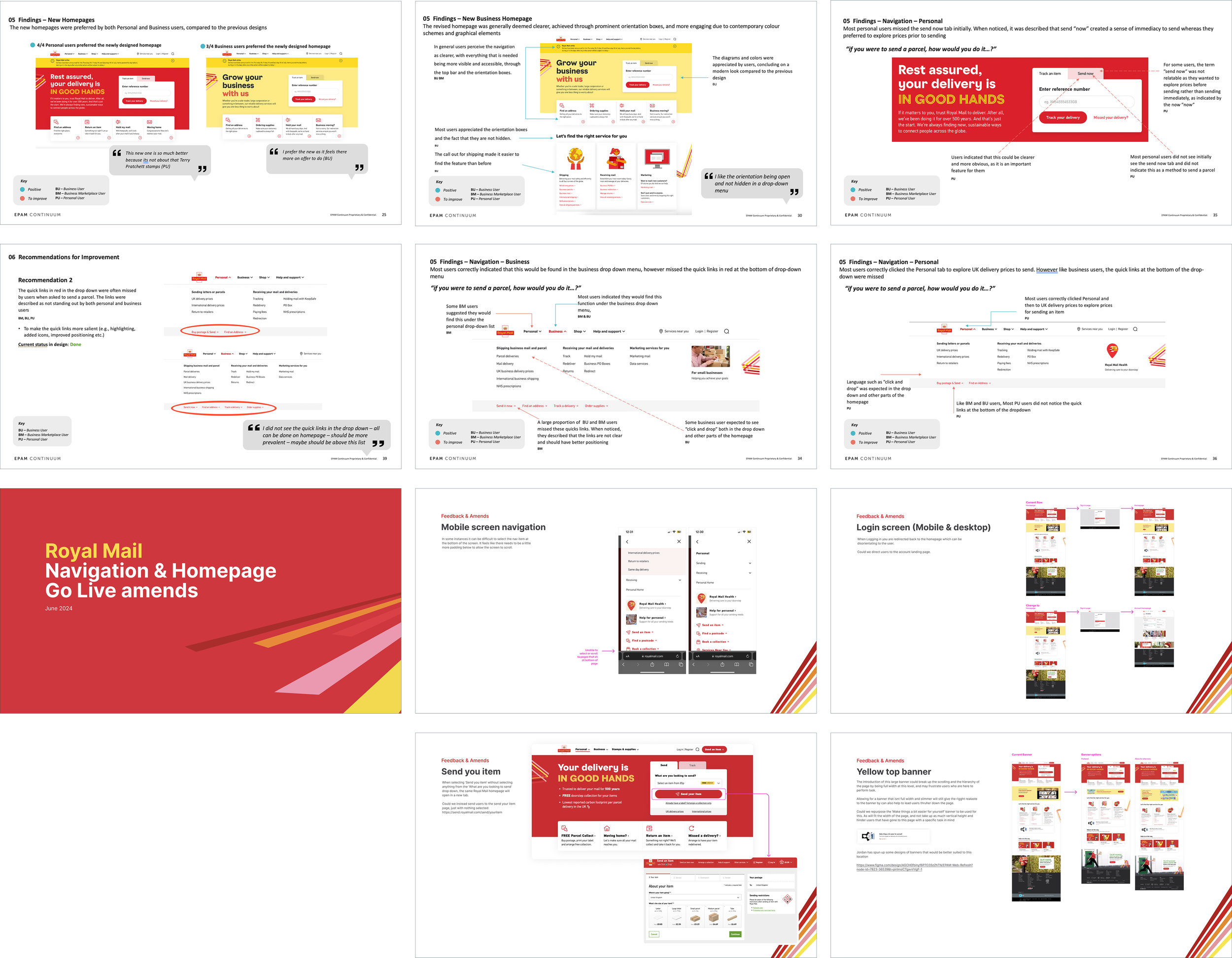
Navigation tested well. But three users in a row struggled with background colors. Got confused.
Standard approach: Document. Analyze. Iterate next round.
My call: We have five more sessions in two days. Why waste their time on something we're fixing?
Changed the colors between sessions 3 and 4.
Next sessions: users focused on what mattered. We learned faster.
Sprint retro consensus: Sometimes process blocks progress.
Other lessons
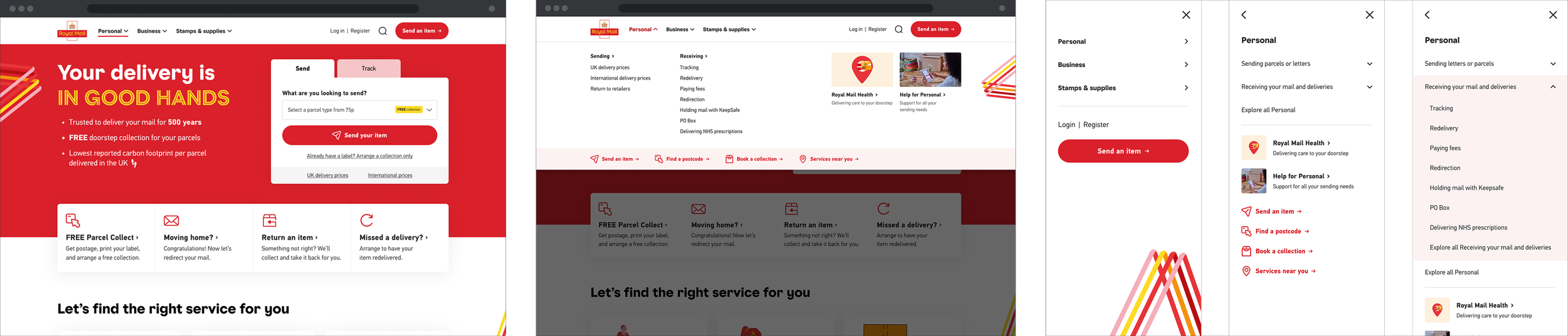
"For Personal" vs "Personal": Tiny word change. Massive perception shift. "For" created a stumbling block as people paused to understand it. Without it, user didn’t acknowledge and flowed into the next part of the journey.
What we delivered
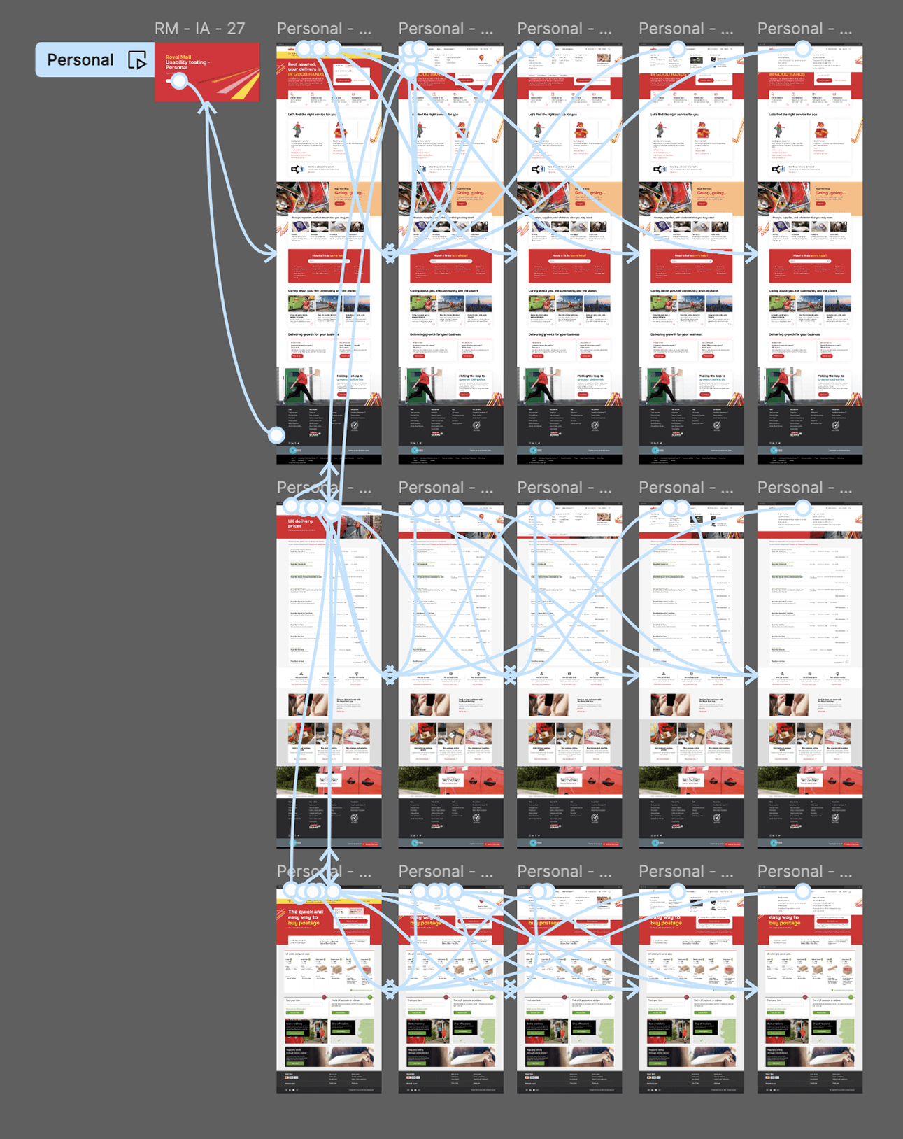
Navigation across all 6 Royal Mail domains
Hierarchical framework showing where each level appears site-wide
Accessible, reusable components for their design system
£600k annual conversion increase
Real win: Proved EPAM could be strategic. Built trust through sprints, feedback loops, treating clients as teammates.
“Excellent expertise in UX, Design and Analytics... great levels of challenge”
What I'd do differently
Frame as Phase 1 of two-phase work upfront
Document political dynamics systematically
Better handoff docs for future teams