Project: Sales and Marketing
Client: BT Wholesale
Company: EPAM
Date: Januray 2021
Skills used: Leading workshops, Information Architecture, Wireframing & Prototyping, Usability testing, Discovery and MVP, Sprint feature prioritisation, Synthesise user interview research, Briefing Developer, Copy writers, UI designers, UX Researchers on design and business goals, Requirement gathering, Stakeholder management
The problem: How to allow BT customers (Resellers) market the BT products to their customers
Solution: To create an area where Sale and marketing teams for BT customers can go and browse and download the latest blogs, and templates to help them with their campaigns.
Brief
Here I was tasked in creating a place where BT customers can go to download assets that would help them market BT products to their customers.
Here I worked as a Product Designer/UX designer within a squad consisting of PO, Scrum master, Content strategist, developers, and subject matter experts running 2 week sprint cycles.
Discovery
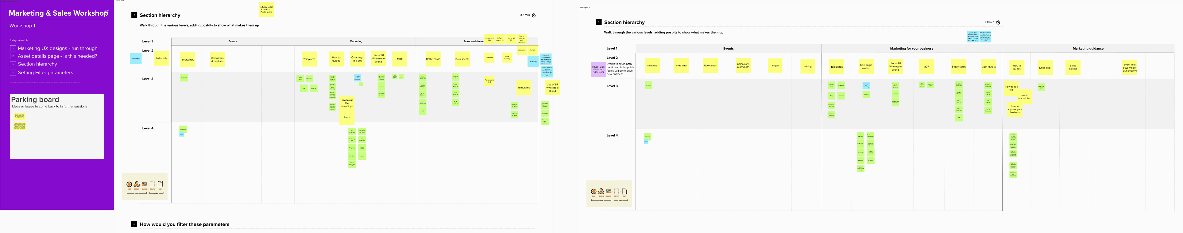
Working with the BT Marketing teams and another external agency who would be putting together the assets we put together a number of workshops where I put together a card sorting exercise to understand where the assets should sit and how to structure the content using Mural.
Then once we had an idea of the of the content, we looked at the key competitors to BT Wholesale including 8×8, Gammer, and others to understand what are the consistent patterns being used.

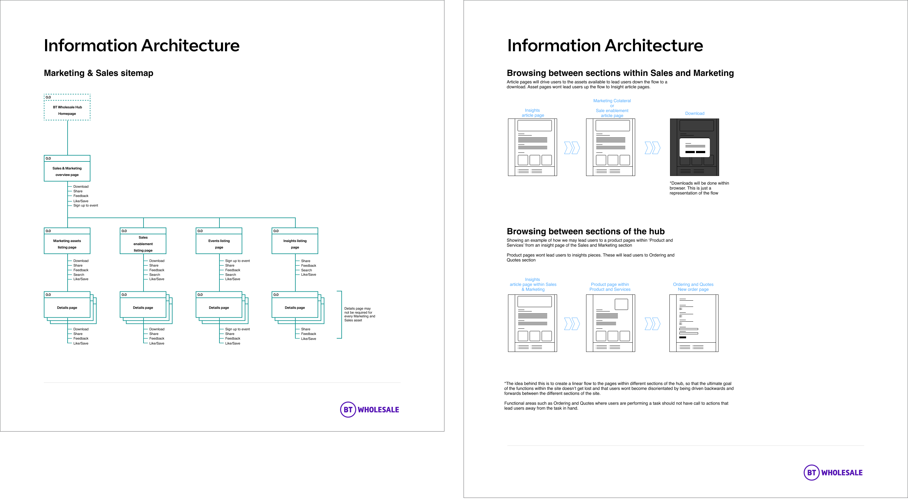
Initial Wires and IA
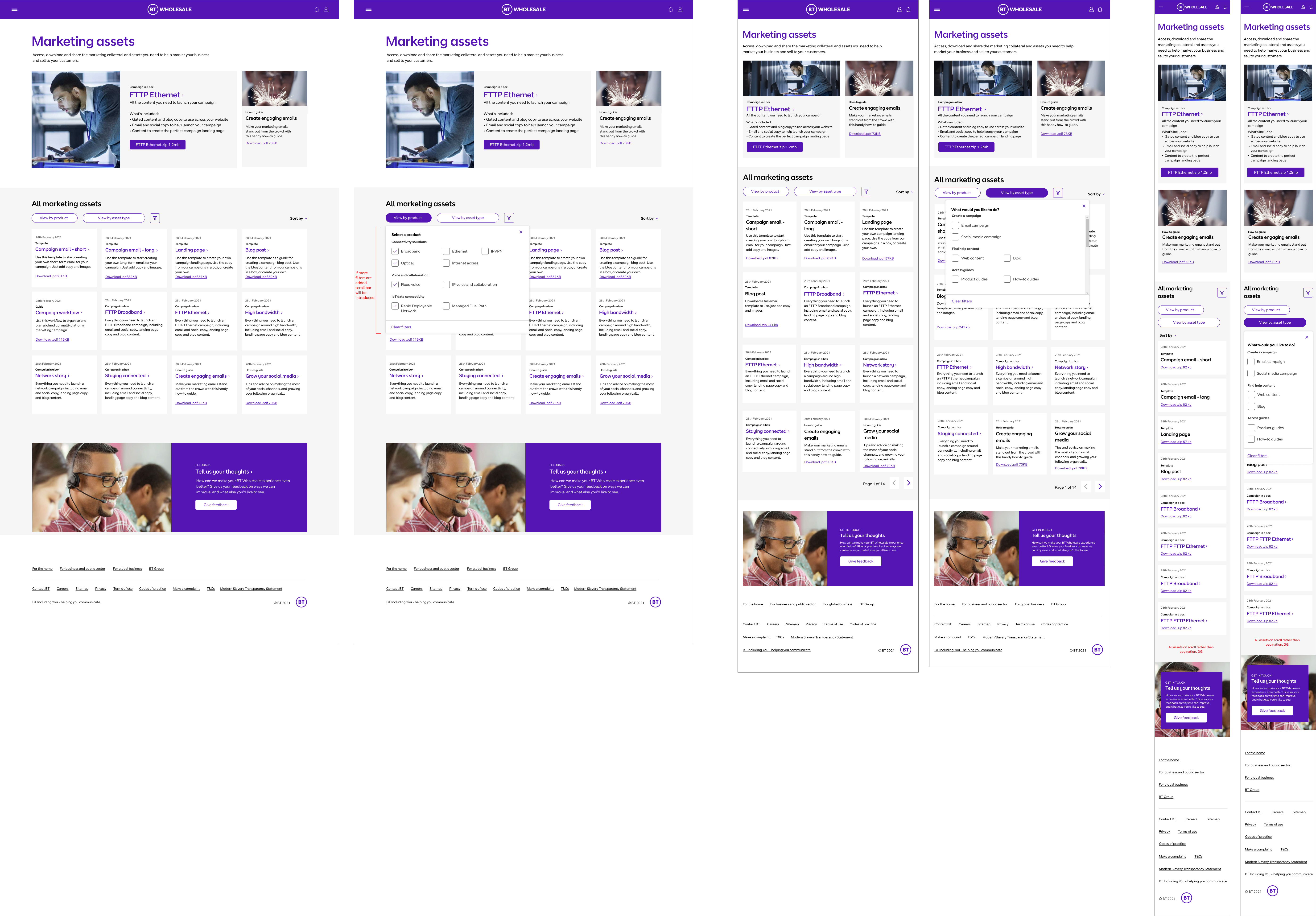
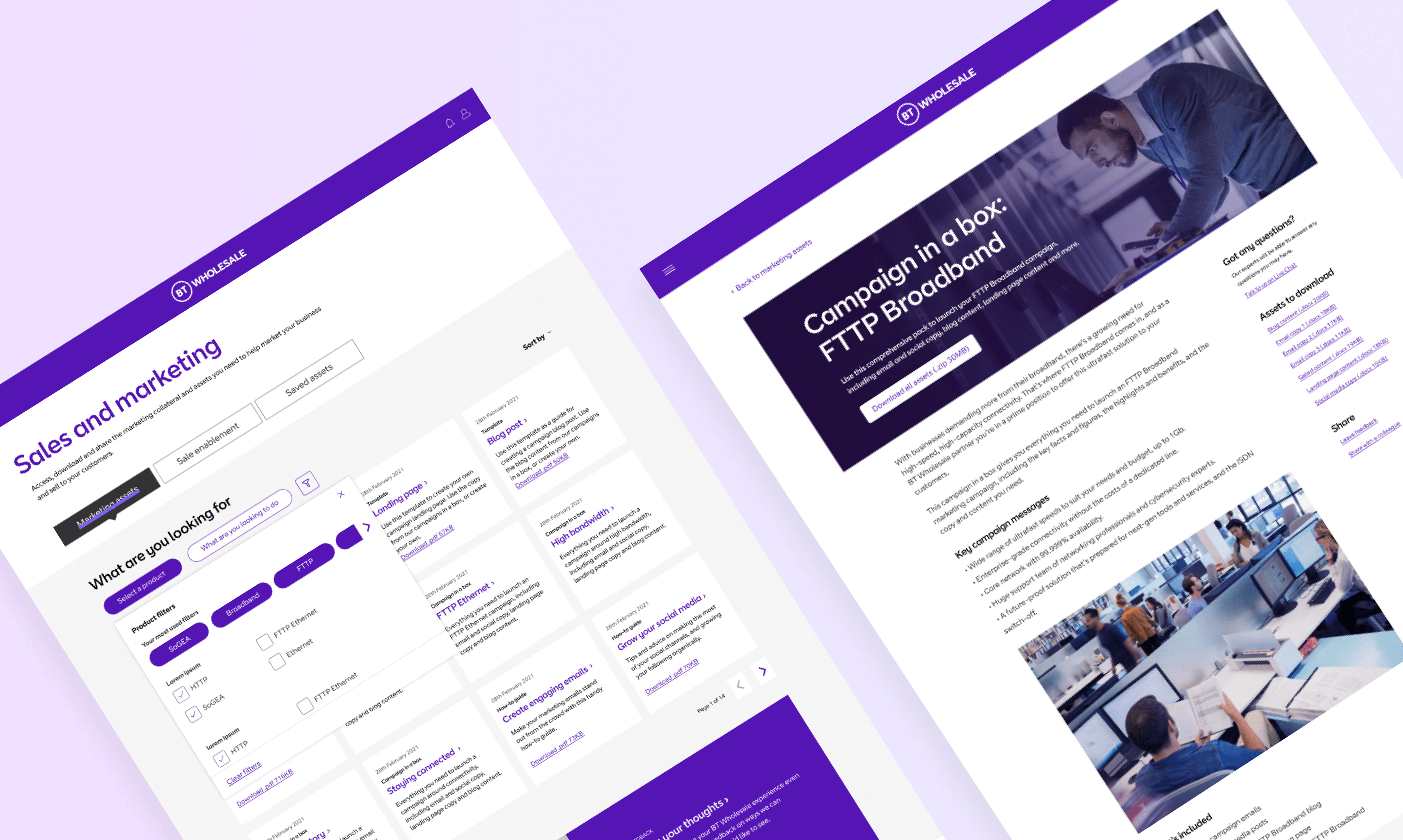
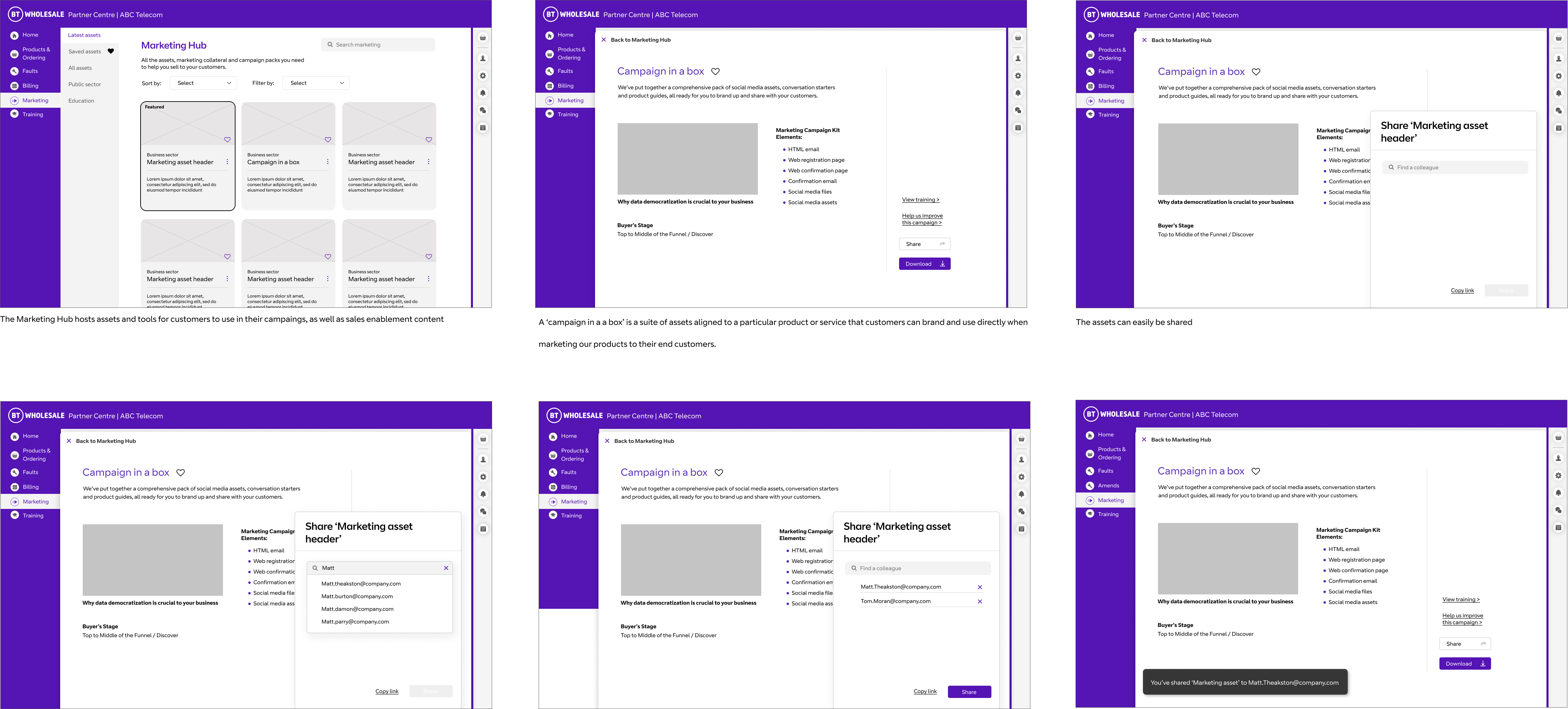
Taking a design pattern used across shopping sites, I created an initial landing page for the section that could be used to show the most recent assets that had been uploaded, as well as creating an area where the Marketing team could showcase specific assets if they wish.
Then the Sales and Marketing was split into 2 sections. This was Marketing assets and sales enablement. With the Marketing section being focused on downloadable content to help the BT Customers (Resellers) market BT products to their customers (e.g. Social media content, email content) and a Sales enablement section focused on content that could be used within the Reseller teams to make sure there was a consistent message to customers. In the later testing look at the term ‘Sales Enablement’ and despite our teams initial trepidation all users understood what this was and what would be behind this link.
Initial Wireframes for the different page levels to the Marketing section of the hub.
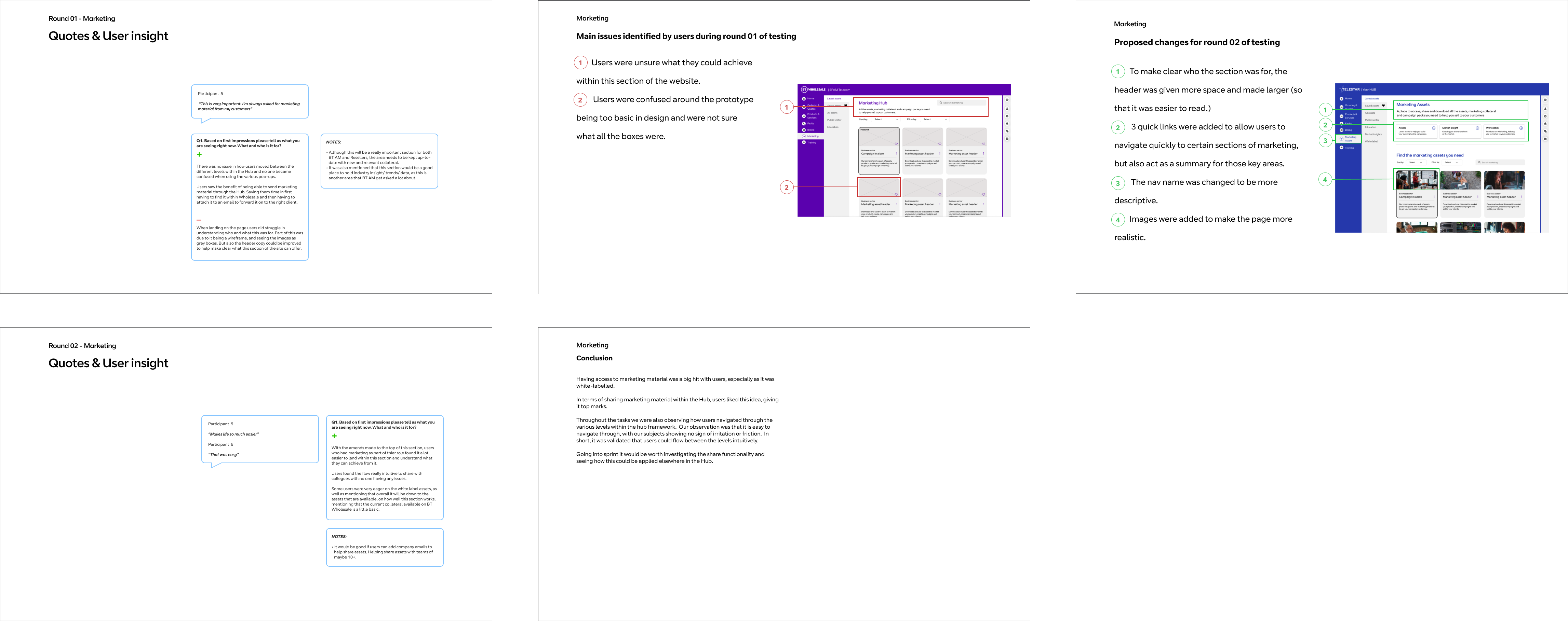
Initial testing
The initial wires tested when looking at the proposition of the hub (The logged in state that the Sales and Marketing section would sit within) to understand if users understood the flow and the proposition.
As we were testing the proposition of the hub within this usability testing the participants were mainly involved in placing orders within the hub, and not Sales and Marketing. Despite this the section was received well and the flow in which users would download content was understood.
Wireframes
Now that we had tested the initial concept I took what we learnt and fed these back into the designs, giving a bit more clarification on the different areas.
These were then presented back to key members within the marketing team which was received well.
Designs
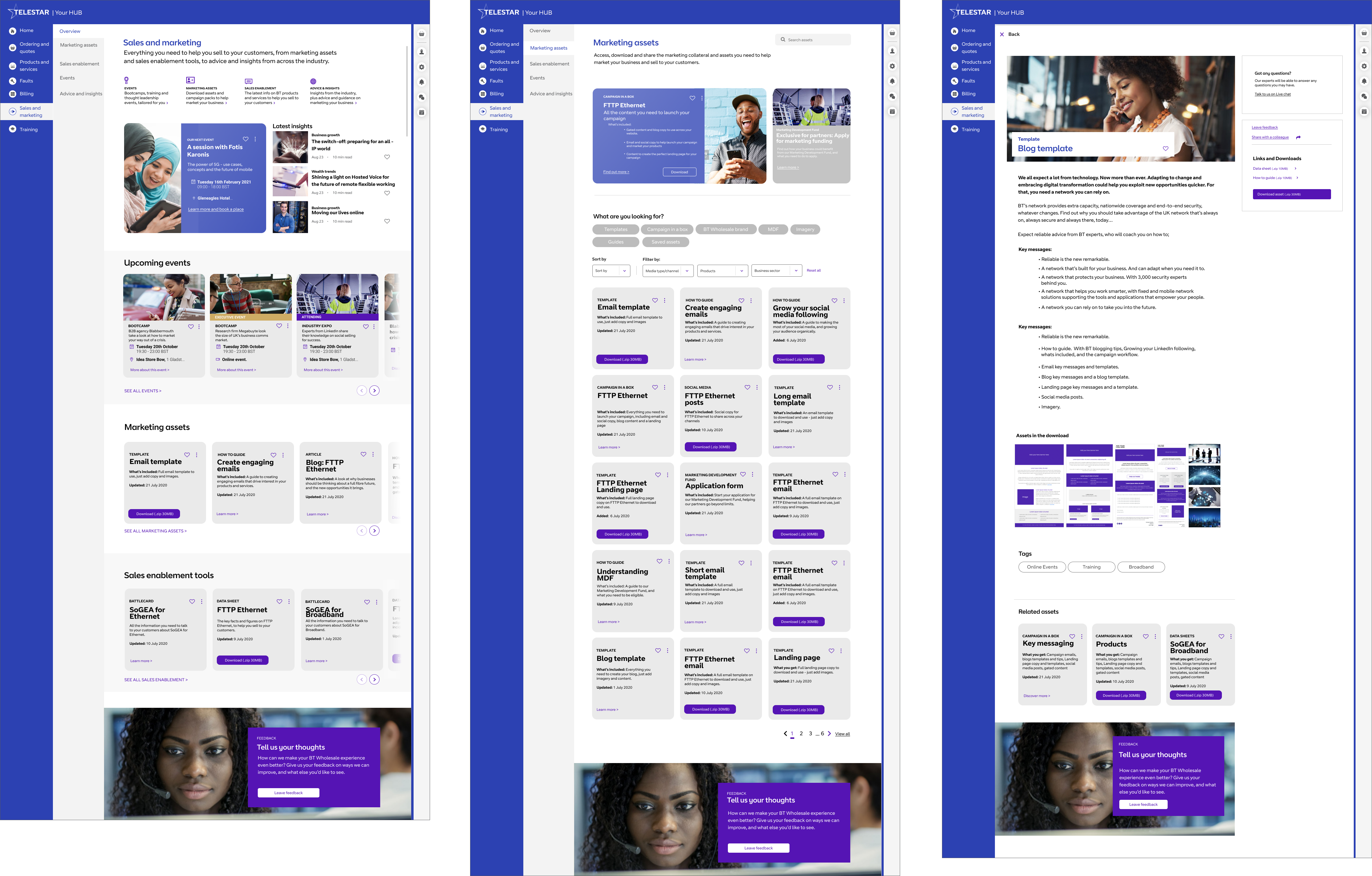
As the hub was a brand new website, a design language was still being created so the next phase was to work with our lead UI designer to move these wireframes into something more visual. This involved working with the development team to understand the constraints that Salesforce had, to deliver designs that worked for both our users but also could be built in the limited time available.
Showing the design vision for this area of the site. Left to right, the landing page to Sales and Marketing, that gives a introduction to the area, and shows the latest assets to be uploaded, Middle the listing page which would display all assets, and right the details page that gives more information about the download.
Testing
I then put the designs into a prototype and got the squad together for a quick workshop to understand what we want to learn from the designs we had put together.
Once I had collected these I briefed in our UX researchers on the project, and what we wanted to find out as well as understanding their thoughts on the testing. The initial difficulty here was to make sure our questions to the test participants were correct to what they would do on a daily basis, but not lead them. To do this we go a third part agency and the Account managers involved, who work with the resellers to get the questions right.
The initial learnings from the testing were generally quite good. Users went to the search bar to find the assets they needed, which had been designed, but will not be part of the MVP release. But when asked to click through the content all users were able to find the assets they needed, and understood the terminology that was being used.
Build
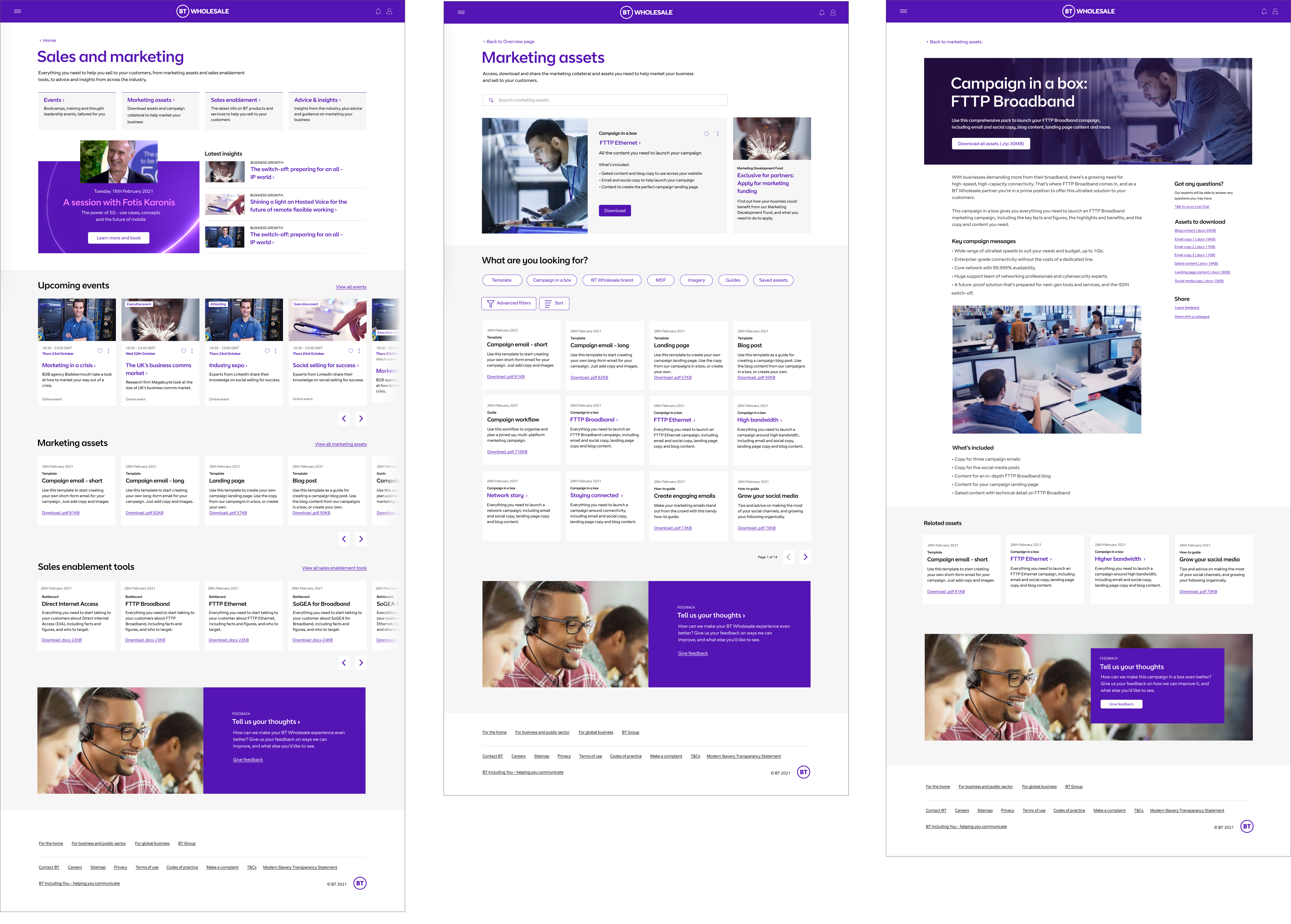
These designs were then stripped back for an initial MVP launch.
Post MVP
Once the initial MVP was launched it was time to look at how we could split up the various functionality in the intial designs and move these into separate tickets to be worked on in sprint.
This first job was to creat a small workshop where we could list out the functionality and work with the BA and developers to understand what is a priority from a business perspective, and what would take some time to develoepr. From this we could work out what to focus on.
The first part was to introduce
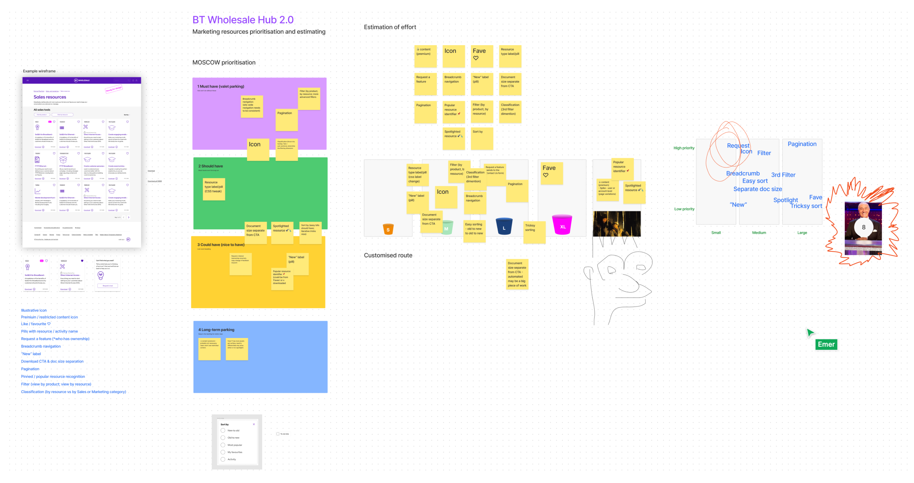
Once we had our list of priorities I started to look at the filter section for the marketing section. For this I went back to the initial designs but with further understand felt that the chips used for the quick filters would soon become untidy and be difficult to manage. We then decided to go for an Air BNB approach as there was two main areas that users would use to search this content, through product type and function.