Project: UK Website re-design
Client: Knight Frank
Company: TH_NK
Date: August 2019 – February 2020
Skills used: Workshops & Ideation sessions, Experience mapping, Information Architecture, Wireframing & Prototyping, Usability testing
Project intro: A complete website refresh, with one of my tasks looking at how you could completely reshape the property page to really help put the user in the property.
Brief
To redesign their current website, with my role to look at and redesign the property page.
Loom Video
18 min
Overview of of the property page design.
Competitors
First looking at the main competitors to Knight Frank that included Savills, JLL, The Modern House. Along with other websites from other industries such as retail to technology with brands like Nike, and Google pixel, to see how we could improve the browsing experience when looking at houses.
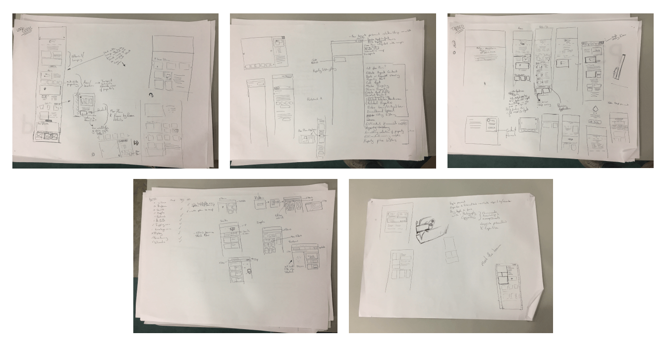
Initial designs
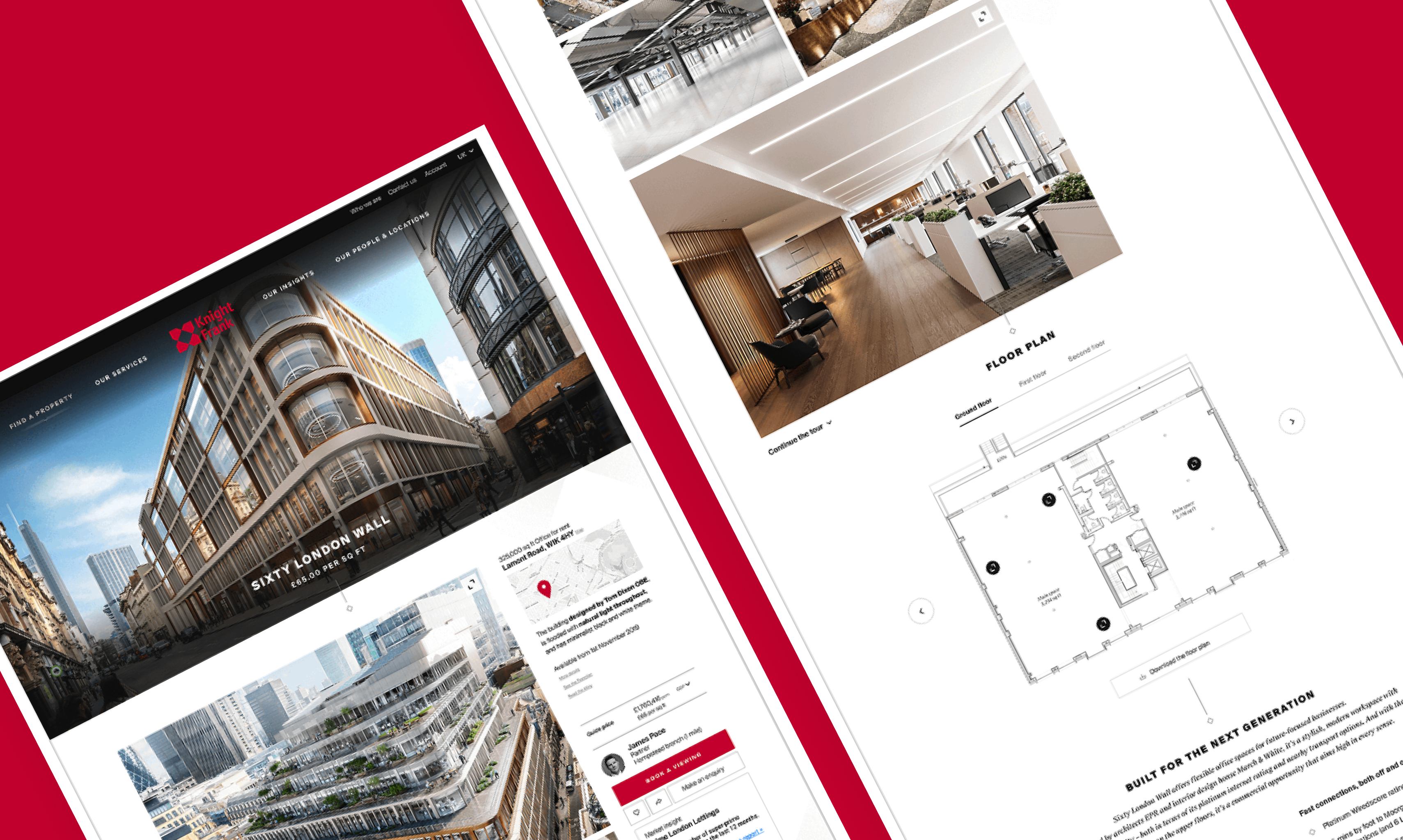
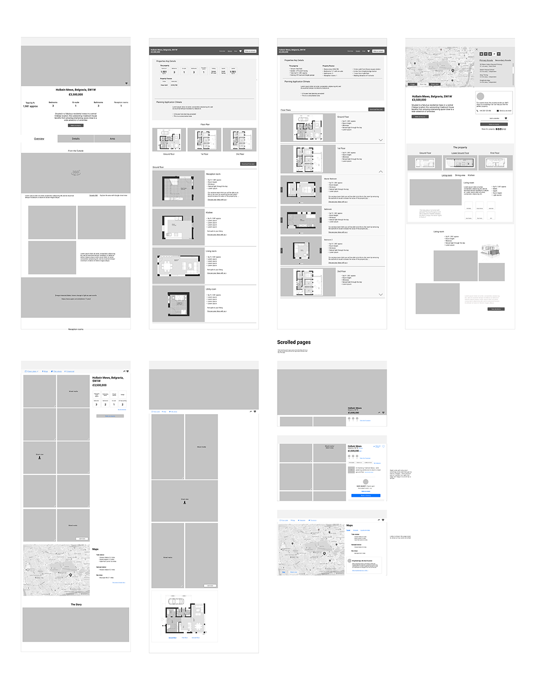
From this I put together a number of different design routes that we could take, and put these to the design team looking at other parts of the project to see which was the favoured route. The route we decided to go down, was to move the gallery into the main part of the page, feeling the images of the house/building was most important to the user. Here we allowed the user to immediately be greeted with with images and allowed them to browse through images of the house as they scroll down the page, instead of having to endlessly click right to view a new image.
Interviews
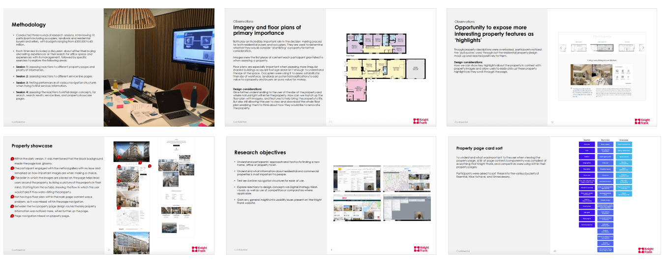
Here we ran an initial set of interviews with potential users where I was the note taker and ran the observation room. Within this set of interviews we tested our initial designs, along with competitors’ sites. Finishing with a card sorting exercise to find out what was important to the user when looking for a property on a website, and a tree jack exercise, to help a colleague understand how a user would go about finding the various services that Knight Frank have to offer.
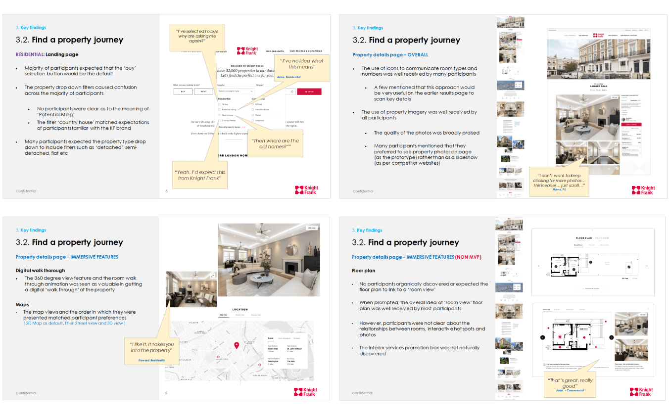
Some of the main things that were noticed when showing the initial designs was how important it was to have a recognisable floorplan, and to visualise the size of the property. We also found that users did not notice that the traditional carousel showing the property images had been removed, as they immediately started to scroll down the page, and talk about how they felt about the look, feel, and design of the property.
Design
From the findings the initial designs were worked into to include what we found with the initial interviews that took place, along with the feedback from Knight Frank and the Strategy team.
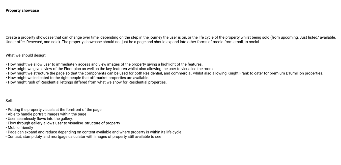
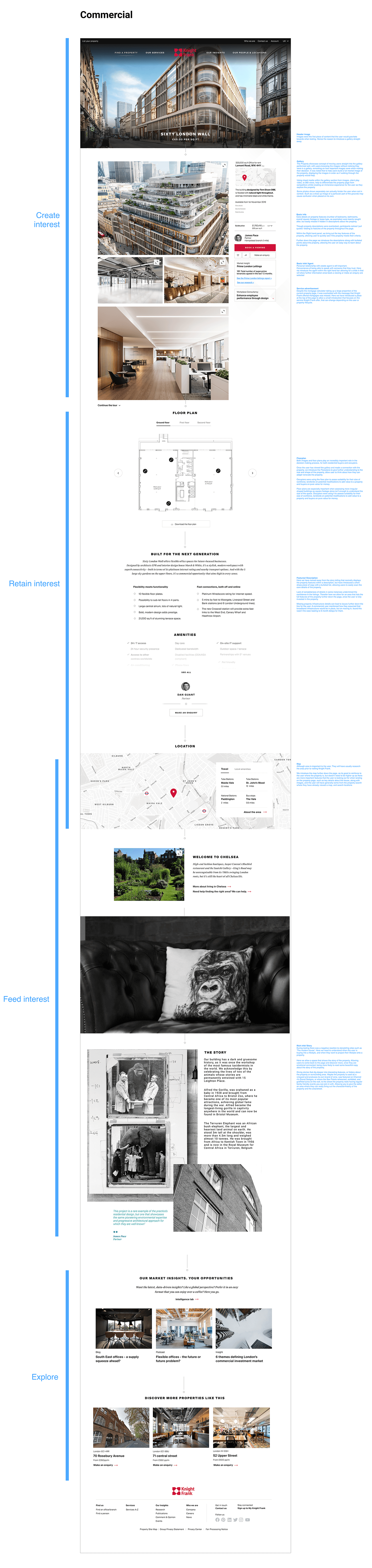
My time here was spent looking at how the initial property page could be adapted to be used for business properties, with maybe use of portrait images, and how the property page may adapt through the life cycle of when the property becomes for sale to being sold. Another area I started to look into was how to make the floor plan more interactive, giving the user a more visual representation of the rooms they are looking at.
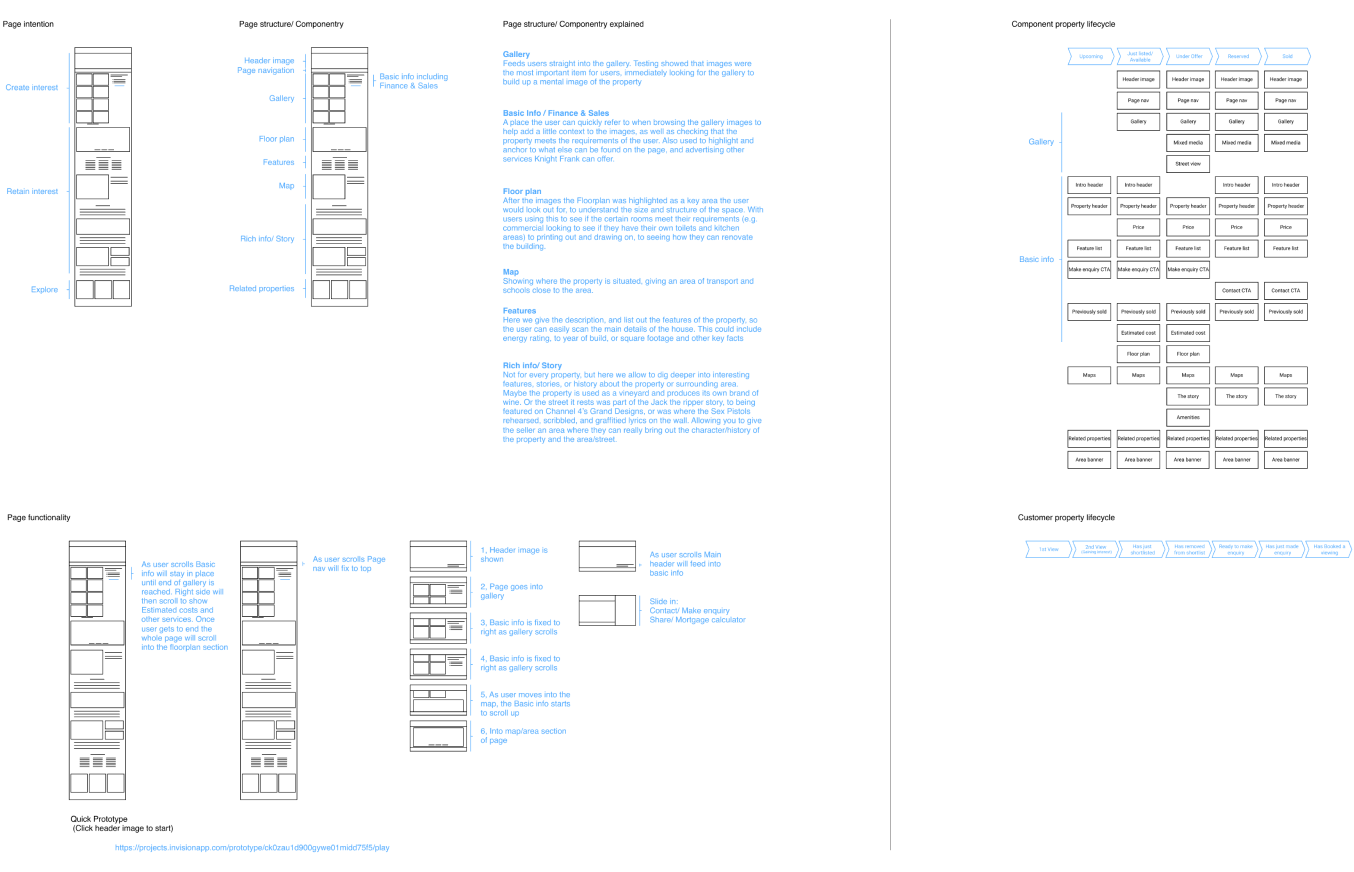
The page is designed to have different lifecycles as the property first gets put on the market, allowing the agents to immediately get something online, to a sold state that drives users to either seeing current properties that are for sale in the area, or to an agent contact that would be able to help a sale of their property.

Showing how the page is broken up into sections that allow the agents to create a bespoke page to the different properties they currently hold.
A very quick prototype to indicate how the page would work as the user scrolled down the page.

Working with the design team to bring to life the page. First by putting together a quick prototype of how the page would work, and explaining how different media types could be used within the scrollable gallery, so the design team could put together an animation of the page.

Testing
Here I built a click through prototype of the website that included all the teams’ designs across the site including, the Homepage, Property, and services sections. I then worked with a UX Researcher to let him know what I wanted to learn about my property page designs.
Loom Video
1 min
Showing the InVision click through prototype used for usability testing.
Audience Type
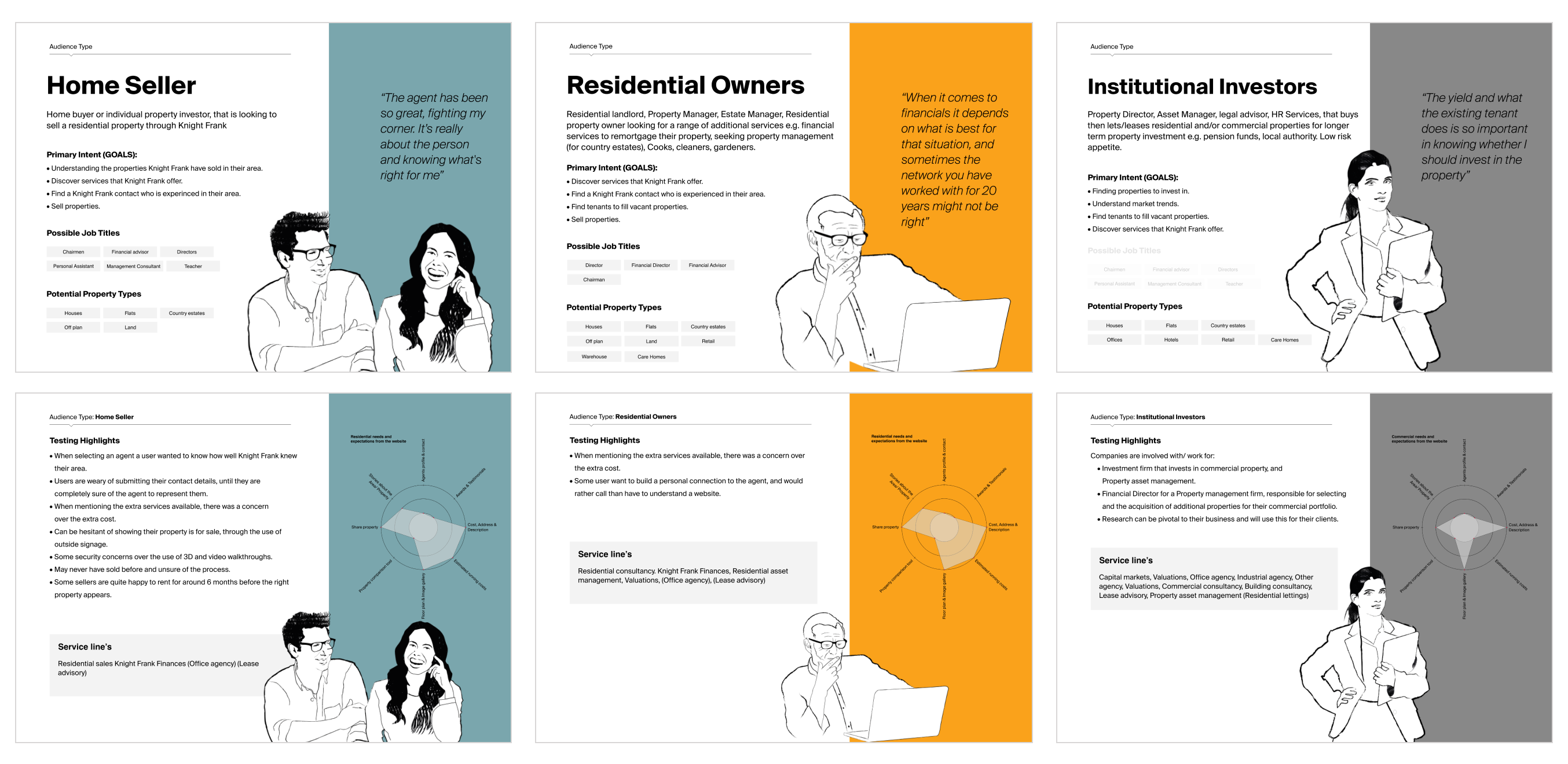
Off the back of 2 rounds of testing where we interview around 16 people, as well as the information that came back from Knight Frank about their customers I created a set of Audience Types/Personas that could be used in the future to help onboarding other colleagues that come onto the project.
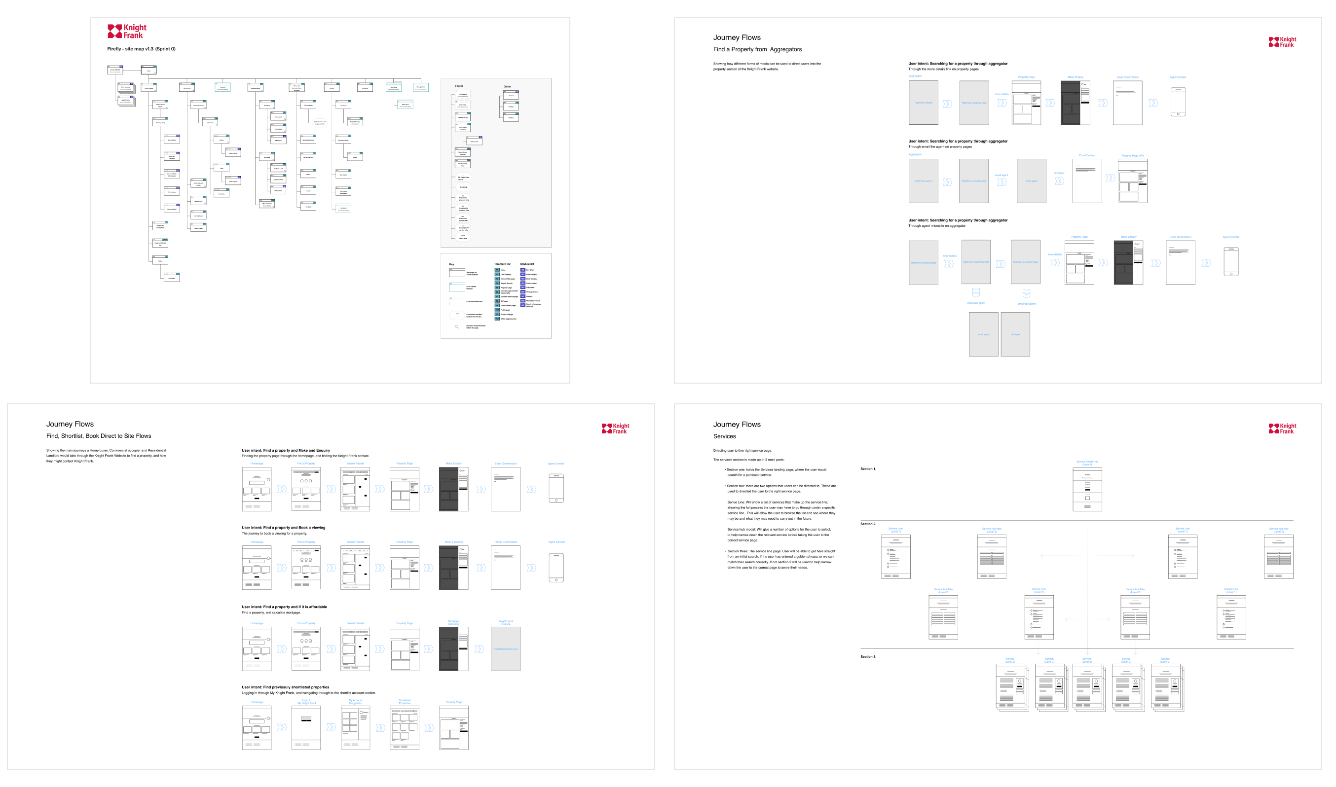
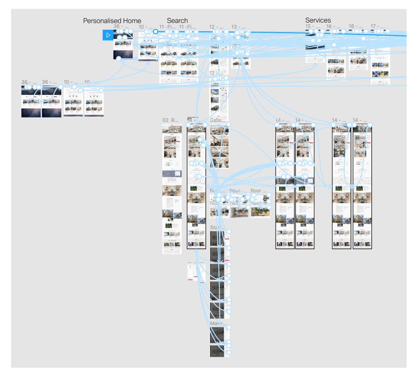
Architecture and Flows
The final part of their phase of work was to draw up the site map with all the amends that had come through from the testing, as well as putting together a set of flows on how the website could be navigated.