Parcelforce Merge with Royal Mail
Creating a dual-brand experience that unified Parcelforce and Royal Mail journeys while protecting each brand identity.
The challenge: Royal Mail and Parcelforce were merging operations, distribution centres, depots, customer service. While keeping brands publicly separate. Design the customer experience without clear strategy or branding direction.
My Role:: As a Lead UX designing I defined a flexible dual-brand IA and navigation model that let both user groups complete tasks reliably and enabled future strategic decisions, validated through testing and used to kick off a 20+ page rollout.
The Impact:
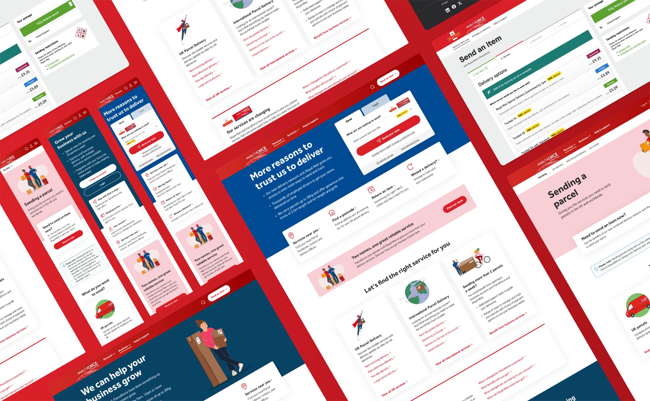
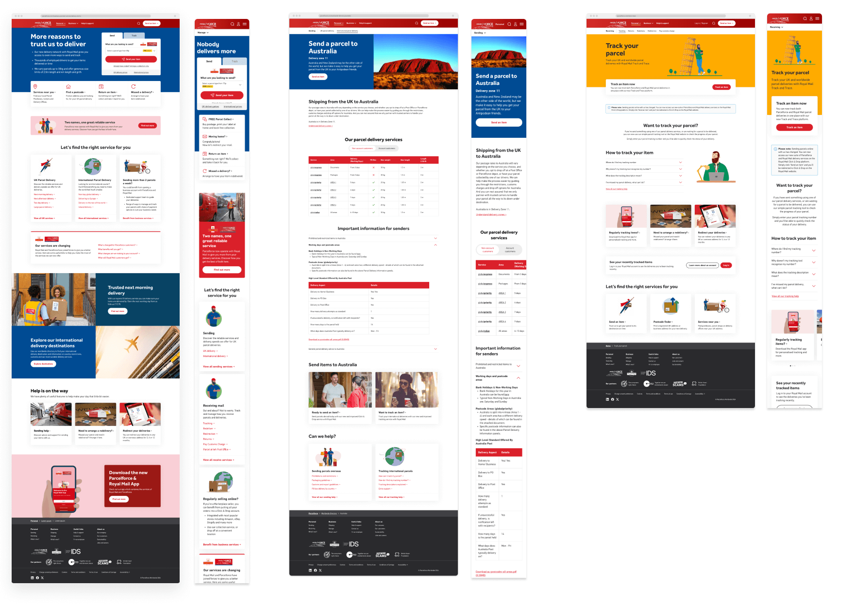
Delivered 50+ page templates and components in 10 weeks using existing design system
Dual-brand navigation validated through user testing users navigated seamlessly between brands
Created flexible framework that could adapt to future merger decisions (full integration or continued separation)
Established scalable model reused across both Royal Mail and Parcelforce ecosystems
Timeline: 4-month delivery (after 1 year of uncertainty)
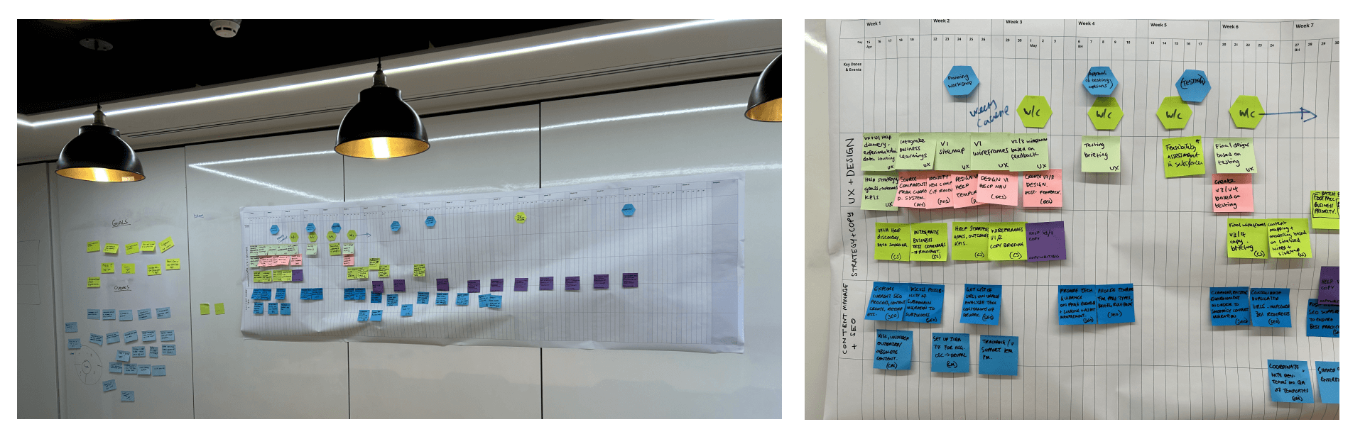
Process: Working with the Principle Consultant we planned a phased design approach spanning discovery, foundation planning, and iterative delivery, moving from problem definition into structured sprint planning and execution as clarity and alignment increased.
Discovery → Foundation planning → Sprint delivery → Iteration & refinement
Skills used: Lead UX | Structured discovery and sprint delivery | Designed dual-brand navigation and IA | Led usability testing strategy | Collaborated with Service Designer, UI Designer, Content Strategist, Copywriter
When operations merge but brands can't
Parcels were being handled by the same depots. Customer service was answering calls for both brands. Distribution centres had already merged. But to customers? Royal Mail and Parcelforce still had to look like two completely separate companies.
We had 4 months to design the front door to a business merger that legally couldn't announce itself yet.
The branding team? Waiting to see what we'd design before committing to decisions. The business strategy? Still being finalised as operations integrated. The customer experience? That was on us to figure out.
What we were really solving
Brief said: "Bring Parcelforce into Royal Mail's digital ecosystem while maintaining distinct brand identities."
What we found: This wasn't a website redesign—it was designing the customer-facing layer for a massive operational transformation. Customers needed to access tools powered by merged backend systems without understanding (or caring about) the internal complexity.
The constraints:
Strategic ambiguity: Business couldn't decide if brands should compete or complement—we had to design for both futures
Branding vacuum: Branding team wouldn't commit to messaging strategy or dual-brand guidelines until they saw our work
Operational reality: Backend systems were merging whether design was ready or not—no time for perfect alignment
Research gap: Royal Mail data showed customers didn't understand business tool availability, creating opportunity but also confusion risk
This wasn't just a UX problem. It was organizational design, brand strategy, and change management—all wrapped in a tight deadline.
How we structured the work
Discovery → Foundation → Sprints. I adapted the GDS framework for our context:
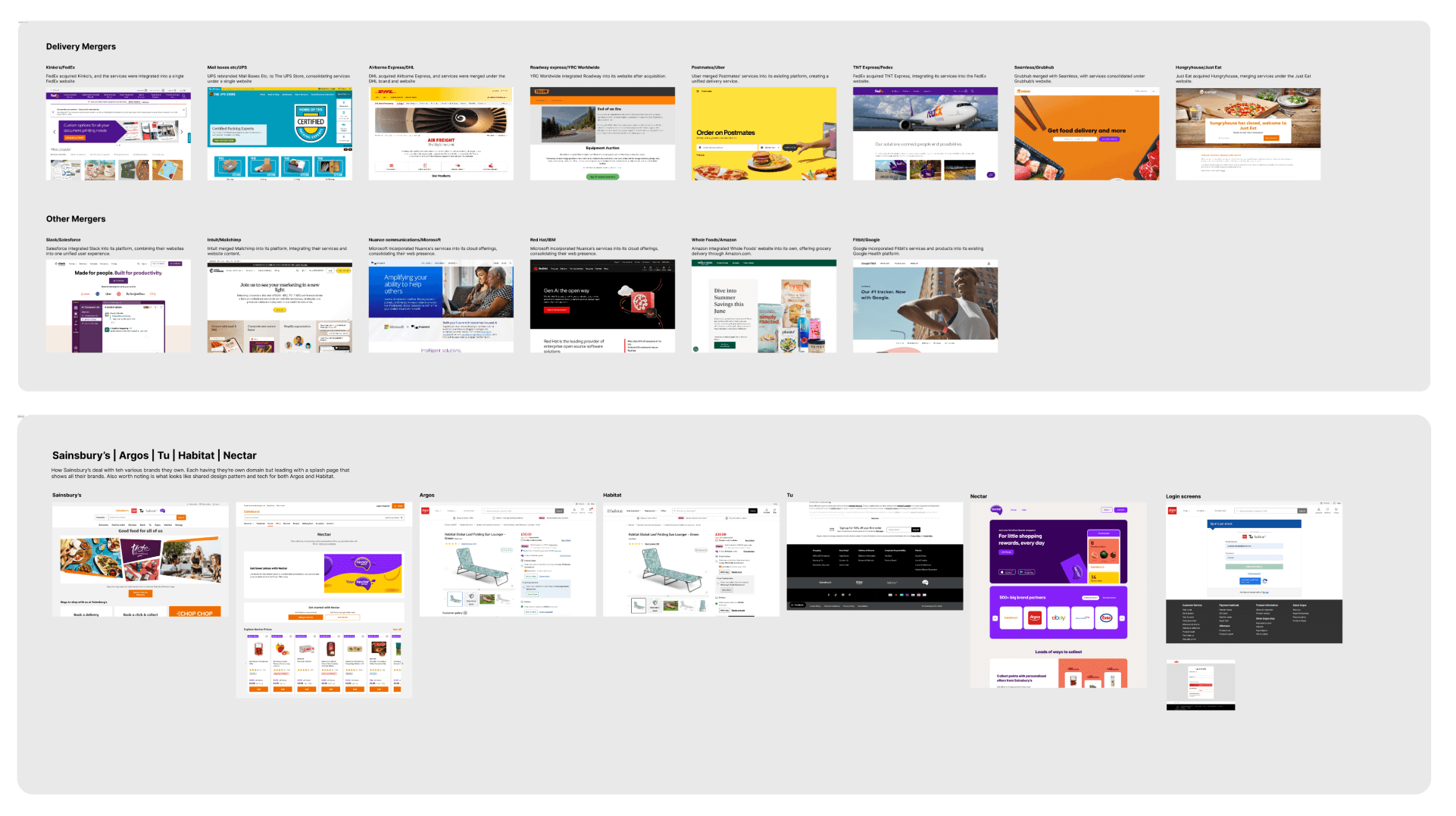
Discovery (Weeks 1-2): Ran workshops to map operational realities, customer needs, and strategic gaps. Researched how other companies handled brand mergers. Our UI designer created quick visual explorations, not to design solutions, but to help stakeholders imagine possibilities.
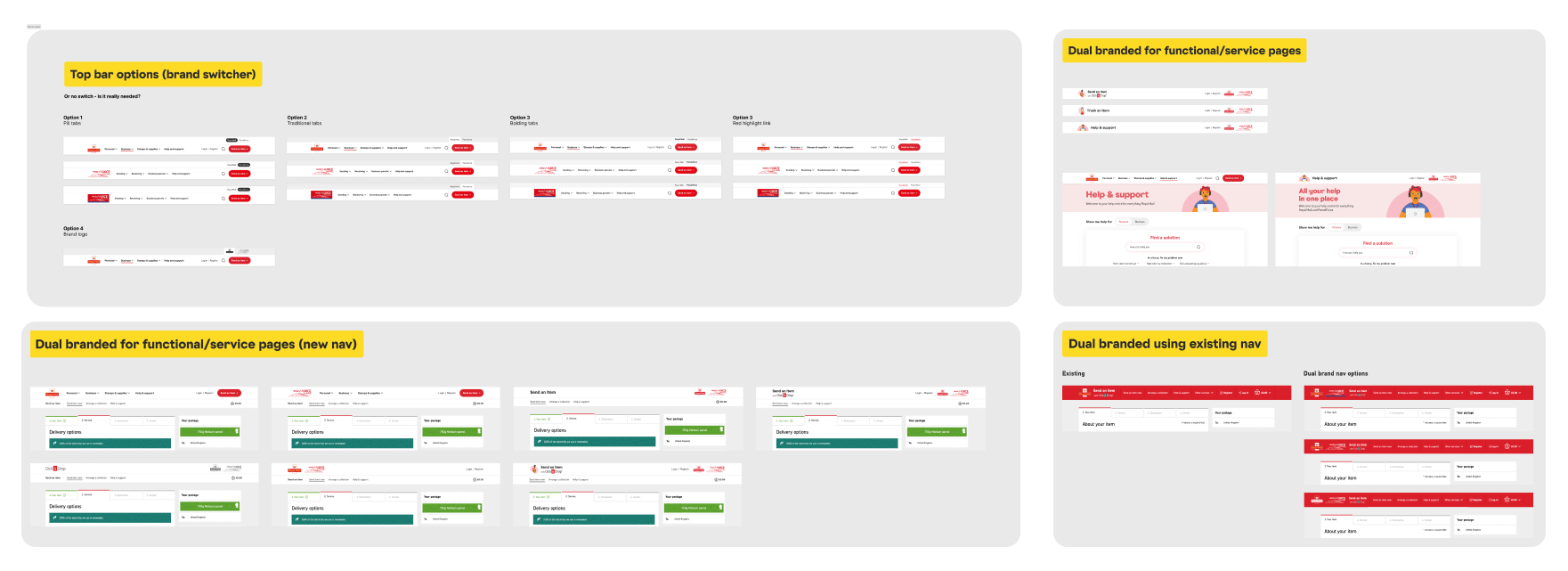
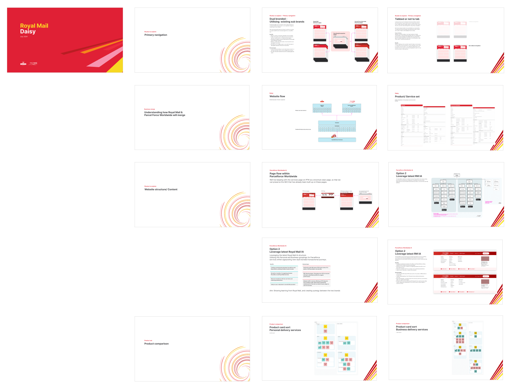
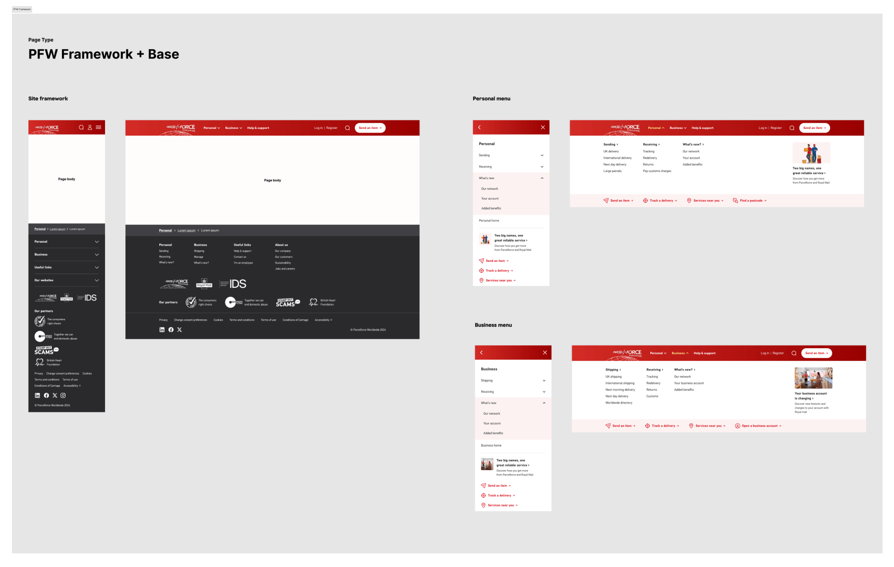
Foundation (Weeks 3-4): Before jumping into pages, I worked with our content strategist to define the IA for Parcelforce and sketch the dual-brand navigation approach. We pressure-tested internally, then presented options to stakeholders. This is where we had to surface the hard questions they'd been avoiding.
Design Sprints (Weeks 5-10):
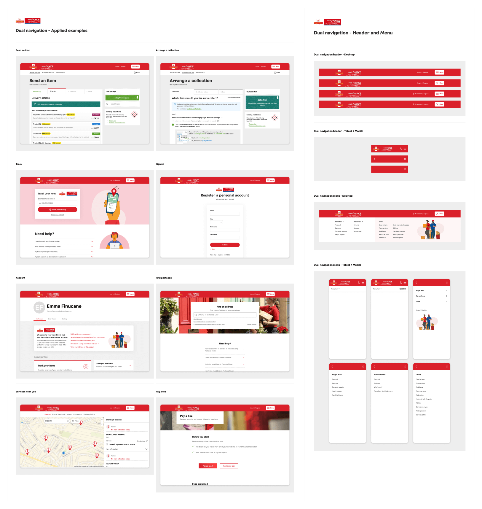
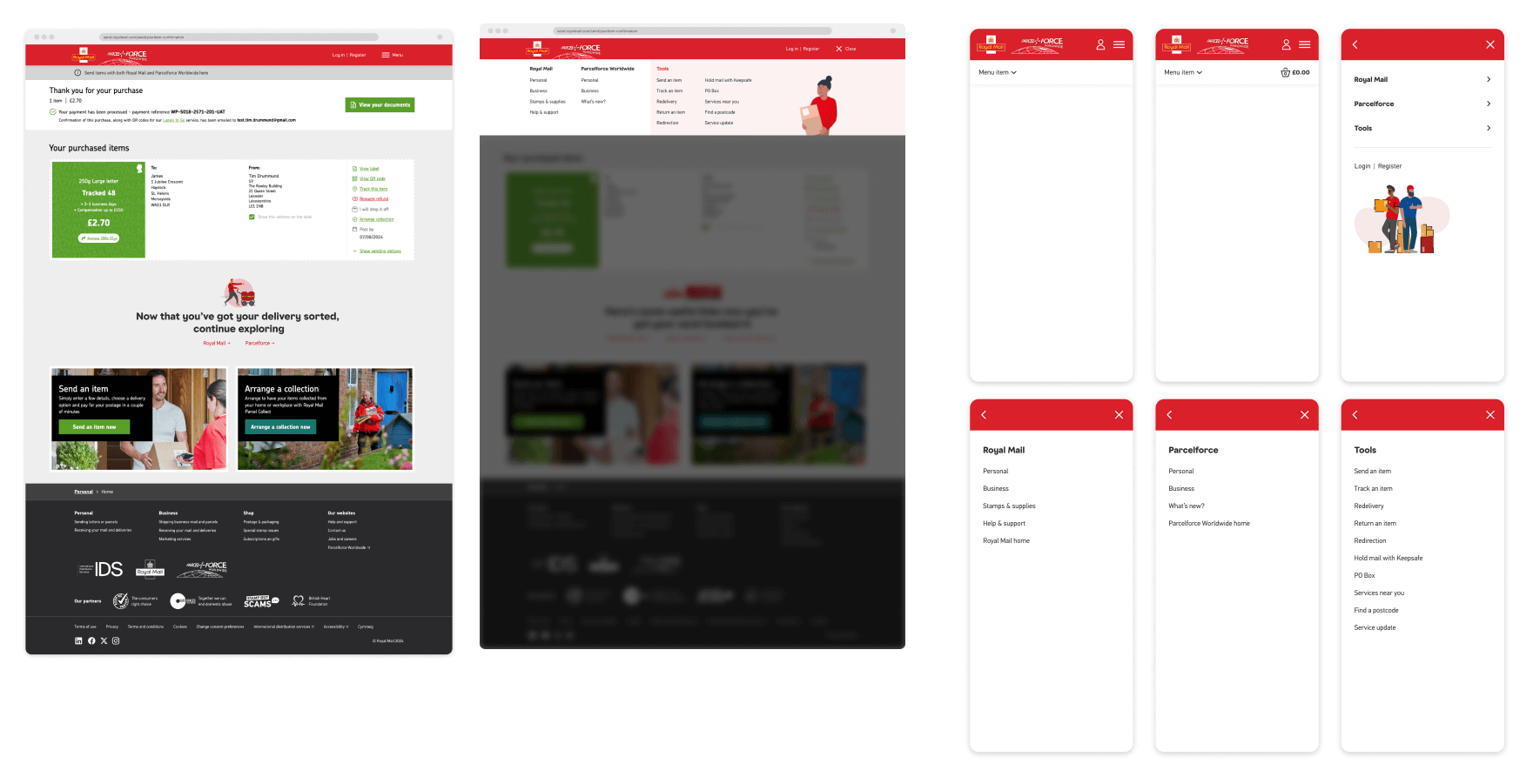
Sprint 1-2: Dual navigation design and usability testing validation
Sprint 3: Messaging components (this is where I took initiative—more on that below)
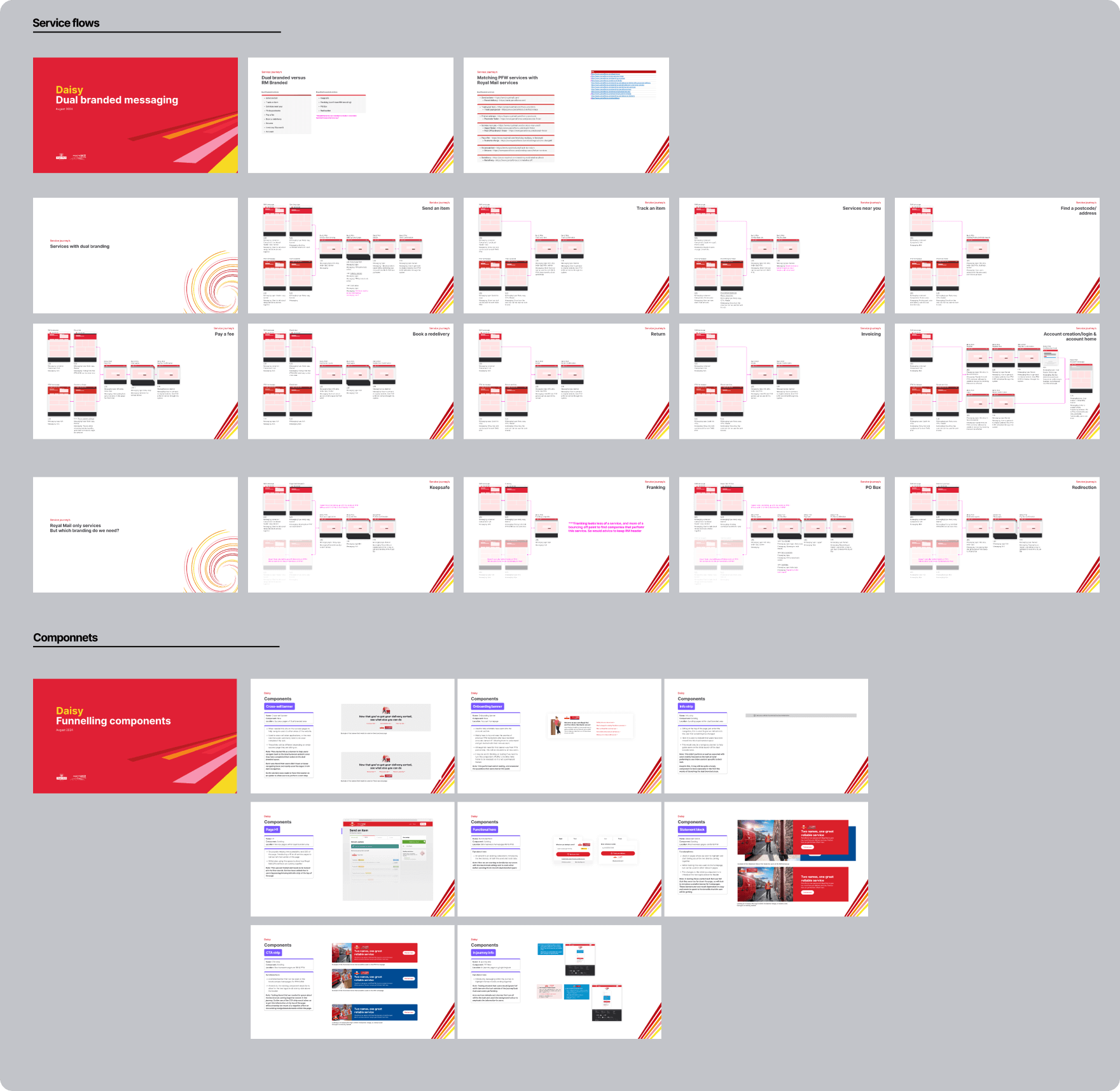
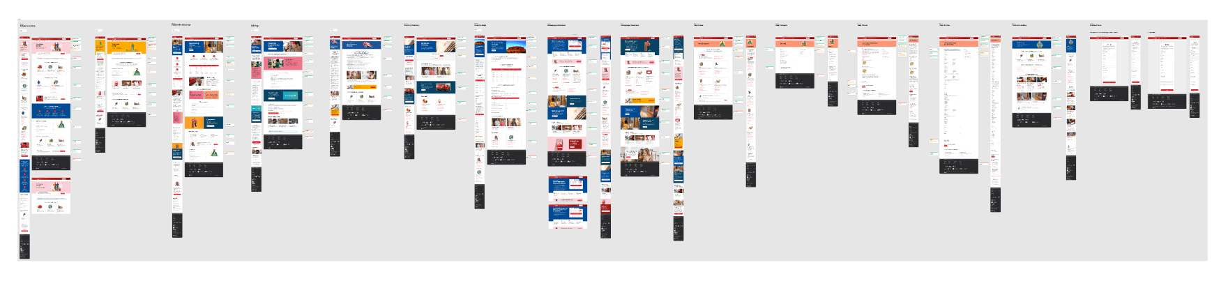
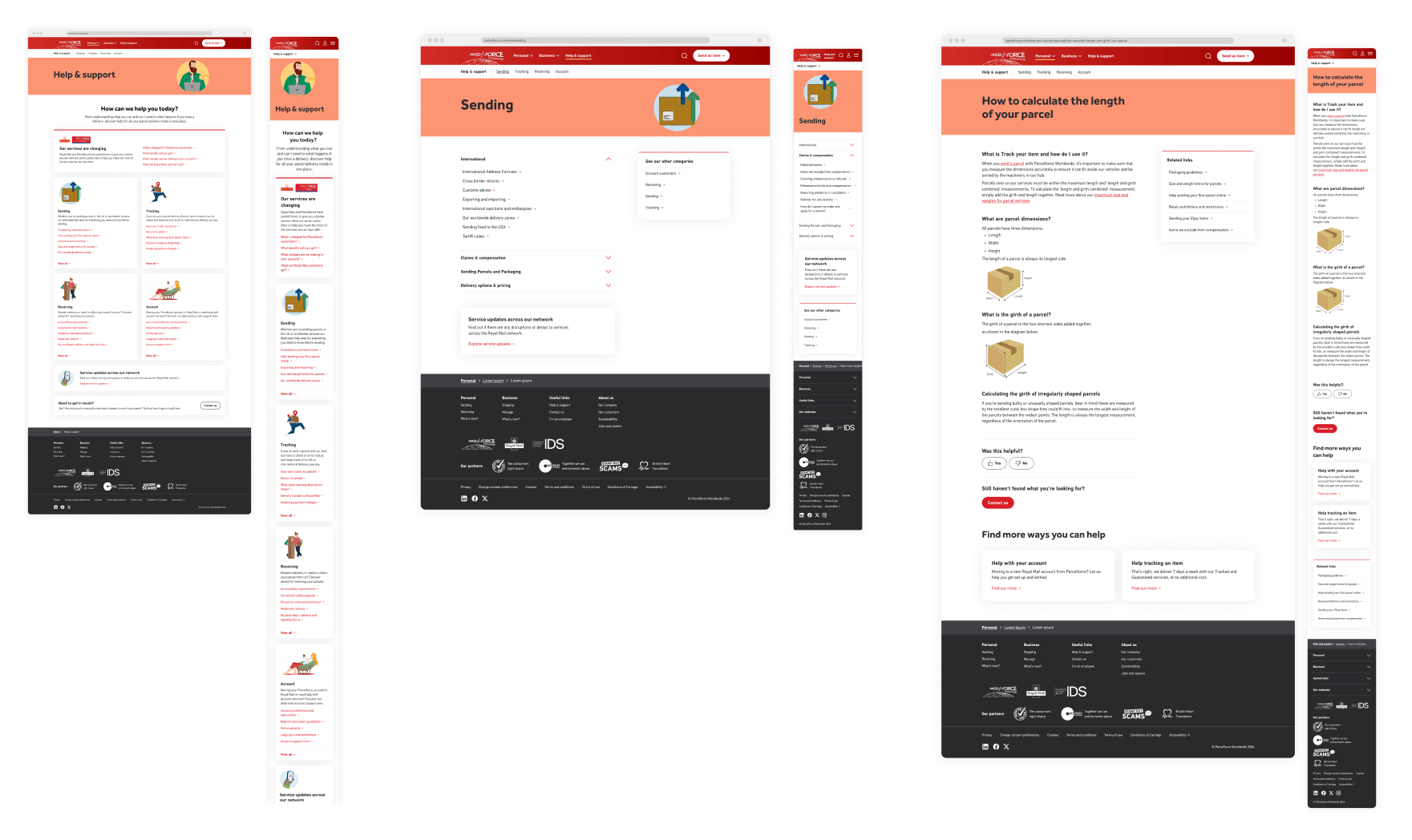
Sprint 4-5: 50+ page templates using our design system
Sprint 6: Testing refinements and documentation
Weekly working sessions with the client. Bi-weekly presentations to leadership. Daily collaboration with UI designer and content strategist to keep everything aligned.
When the client won't decide, you have to
Sprint 3. We needed to finalise the messaging strategy: Where do we tell customers about the merger? What do we say? How do we acknowledge both brands in shared spaces? Here it was creating components and messaging that could be used across the sites and journeys. Mapping out where these would be placed, and making them ready for when the content team would need them.
Reassurance throughout the journey
My call: I worked with our content strategist to map where users would need reassurance throughout their journey. Entry points when switching brands. Confirmation messages that acknowledged both brands. Help content that explained the relationship without requiring users to care.
I documented the full approach, presented it to stakeholders, and said: "This is how we're solving it unless you tell us otherwise."
They approved it in the meeting.
What I learned: On projects with multiple stakeholders and strategic ambiguity, sometimes the designer needs to fill the void. Document your reasoning, present confidently, and give people something concrete to react to. It's faster than waiting for consensus that never comes.
Testing what actually mattered
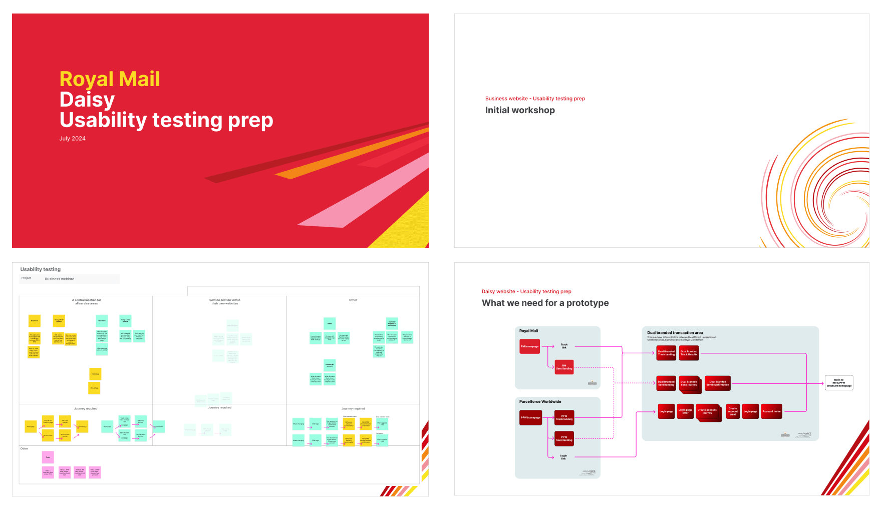
I couldn't test everything, so I prioritised with our researcher:
Critical assumptions:
Would users be confused by dual-brand navigation?
Could users complete tasks when moving between brands?
Did our messaging reassure people or create more questions?
I mapped flows that isolated these questions, created prototypes, and designed research to give us binary answers we could act on quickly. We aligned as a team beforehand on what we needed to learn, then shared prototypes with the wider client group before testing keeping everyone bought in.
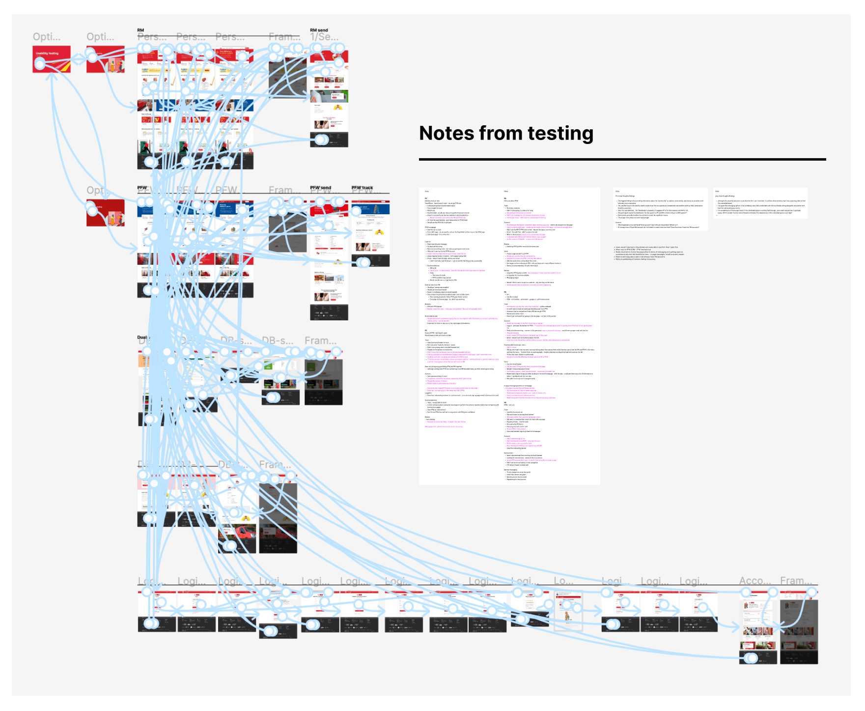
The insight
Users didn't care about our internal merger. They just wanted to complete their task. The dual logo said "you're in a shared space" without requiring them to understand the complexity. Our messaging worked too, users noticed the nudges but didn't need extensive explanation.
Delivering at operational speed
Here's why we could move so fast: Jordan and I had spent the previous year building a design system for Royal Mail. Components, patterns, page templates, all proven and documented as we went through the different projects.
When this brief landed with a 4-month deadline, we weren't starting from scratch, and had an amazing opportunity to show the benefits of a design system.
Delivered:
50+ page templates in one sprint by adapting our design system for Parcelforce branding
Dual-brand navigation that tested successfully with both customer groups
Messaging strategy and component library for communicating the merger
Framework that supports ongoing operational integration as business strategy evolves
Real win
The agile approach meant stakeholders saw progress weekly. No big reveal, they watched the work evolve and provided continuous feedback. That transparency built trust and made the final delivery feel inevitable rather than risky.
What I'd do differently
Earlier testing: I'd have pushed for lightweight prototype testing in the foundation phase, not waited until Sprint 1. Would've caught assumptions sooner.
Messaging ownership: I'd have documented the branding team's accountability explicitly in sprint planning so the gap was visible to leadership earlier.
Developer pairing: I'd have involved developers in Sprint 2-3 to flag technical constraints on the dual-brand navigation before we went too far.
Takeaway
Strategic design isn't just solving user problems, it's filling the strategic gaps clients can't see yet, making decisions when consensus stalls, and structuring work so progress compounds even when the business is still figuring itself out.
“Great team talented and lovely to work with . Good levels of challenge and excellent expertise in UX, Design and Analytics”