Parcelforce Merge with Royal Mail
Creating a dual-brand experience that unified Parcelforce and Royal Mail journeys while protecting each brand identity.
Problem: Two customer groups with overlapping needs, sensitive union involvement, and a business still undecided on its 5–10 year strategy. We had to bring Parcelforce into Royal Mail’s ecosystem without disrupting existing customers or diluting brand equity.
My role: Lead UX Designer shaping navigation, task flows, and page templates for Parcelforce, ensuring journeys worked seamlessly for both customer groups. Worked closely with a small team of Service Designer, UI Designer, Content Strategist, Copywriter, and Account Exec.
Result: Delivered a refreshed Parcelforce site built from Royal Mail’s design system, validated a dual-brand navigation model through testing, and created a scalable structure that could flex with future merger decisions.
Skills used: Workshops | Journey mapping | IA & navigation design | Content strategy collaboration | Design system reuse | Usability testing | Client presentations
Project
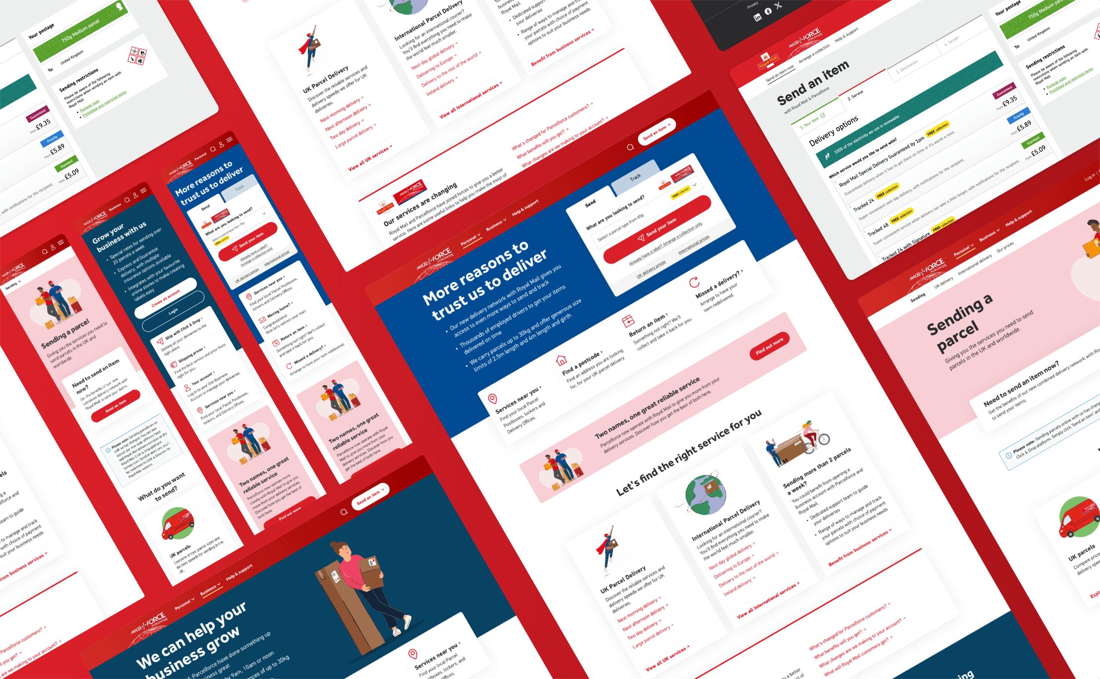
Royal Mail made the business decision to bring Parcelforce into the same infrastructure, while still keeping the two brands outwardly independent. Our role was to design the journeys that would allow both customer groups to complete their delivery tasks in a seamless way, no matter which site they started from. We looked at how users could move between tools without disruption, reusing the components we had already created for Royal Mail to quickly refresh Parcelforce and ensuring the right messages were placed throughout so customers always understood what was happening.
The problem
Two distinct customer groups with similar needs, but different expectations. The challenge was to transition Parcelforce users into this shared ecosystem without disrupting Royal Mail’s existing base. We needed to reflect the partnership between the two companies while carefully preserving the individual brand identities. At the same time, the work was sensitive: unions were involved, and the merger itself had not yet been publicly announced, so the project had to be handled with strict confidentiality. Our small, multi-disciplinary team including a Service Designer, UX (my role), UI Designer, Content Strategist, Copywriter, and Account Exec worked closely together to balance these business, brand, and user needs.
My role
I was responsible for designing the new Parcelforce website and shaping the journeys that could be shared by both customer groups. This meant creating navigation structures, task flows, and page templates that felt familiar to each audience, while also being flexible enough to support future business decisions, whether the brands fully merged or continued to operate side-by-side.
Overview
The long-term business strategy (5–10 years) was still being shaped during the project. Our solution therefore needed to provide a structure that could flex: allowing for the possibility of eventually moving Parcelforce customers entirely into Royal Mail, or maintaining both sites independently while sharing tools and systems. This adaptability underpinned all our design decisions.
Process
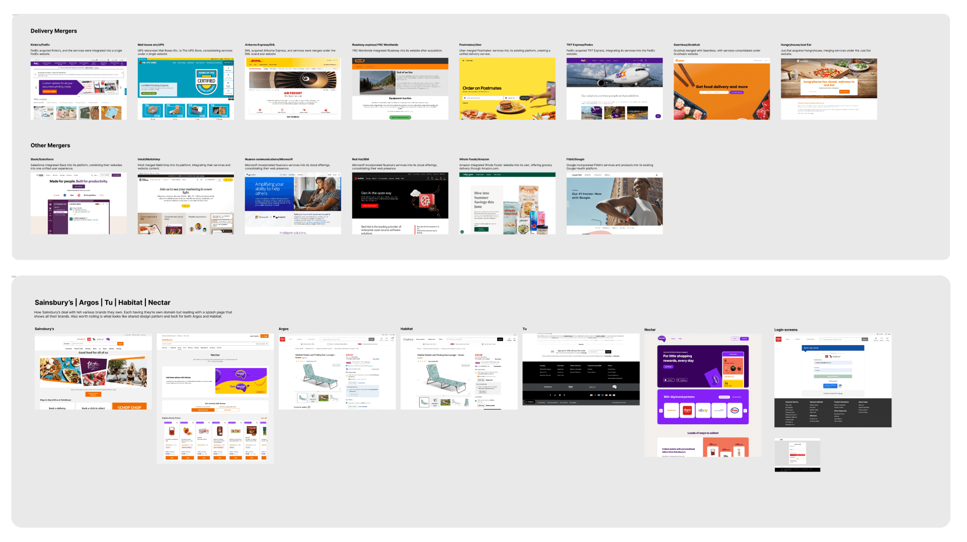
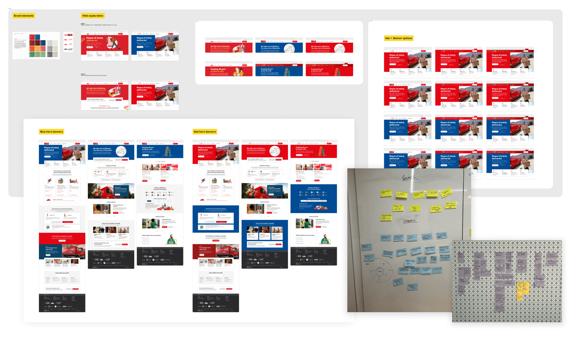
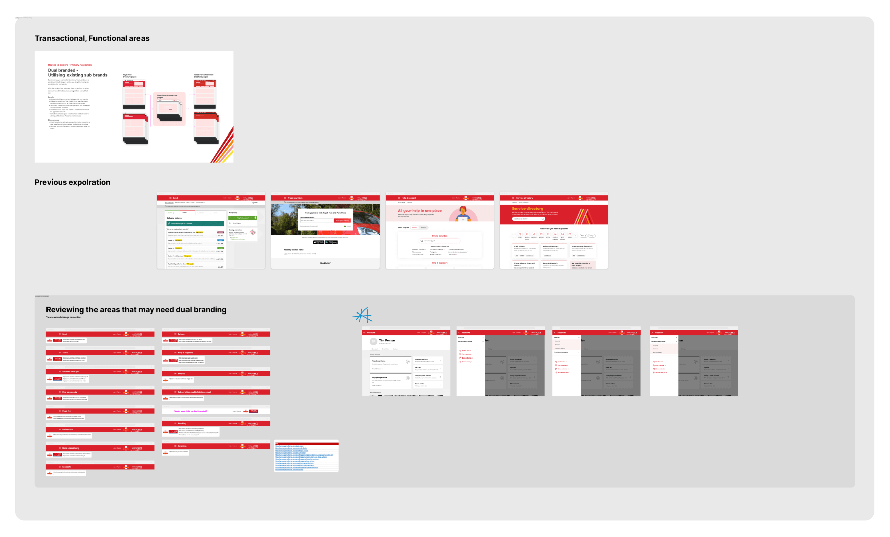
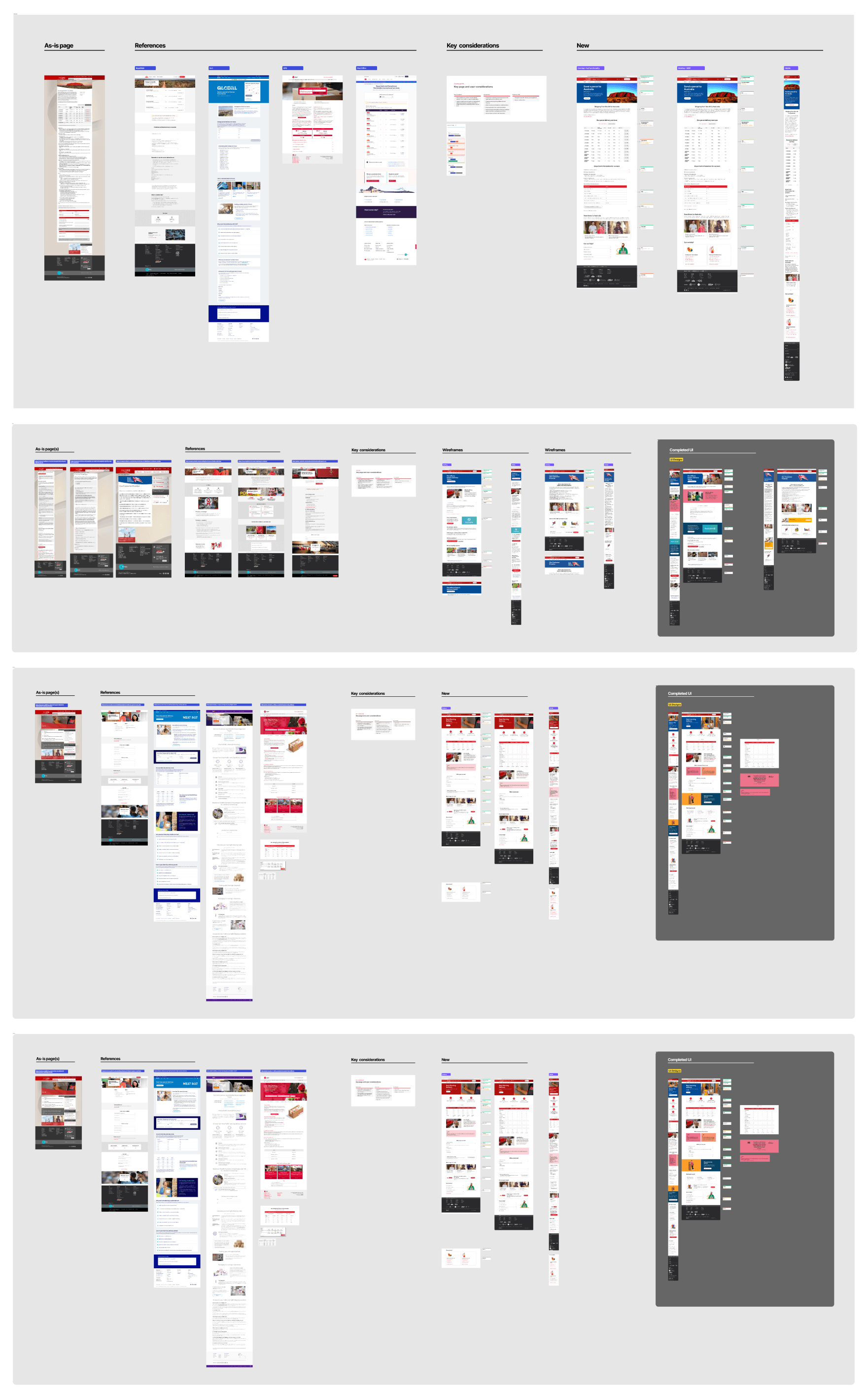
We began with discovery workshops to clarify the problem space, map timelines, and surface requirements. We also researched other companies that had gone through similar transitions, both within and beyond logistics. To spark conversation, our UI designer produced quick visual explorations showing how Royal Mail’s components could be adapted for Parcelforce. This helped the client imagine possibilities early.
From there, we moved into a foundation phase. I collaborated with the content strategist to map a new information hierarchy and navigation for Parcelforce, while the UI designer developed brand adaptations of the design system modules. We then worked together to sketch and prototype key pages, testing how the two brands could align while remaining distinct.
Once the foundations were set, we ran design sprints. The first sprints focused on knotty challenges. The dual navigation, customer messaging, and flow design. Before moving into production. Using the strategist’s content work and our component library, we were able to design and deliver 20+ key pages and modules for Parcelforce in just two sprints. A dedicated testing sprint validated assumptions and left space for refinements.
Throughout, we kept a tight feedback loop with the client: weekly working sessions to share progress and gather input, and bi-weekly presentations to business leads for strategic alignment.
Competitor view & brand exploration
We presented examples of how other companies had approached mergers, often adopting a parent–child brand model. This reinforced the client’s instinct that Royal Mail and Parcelforce should remain independent with equal prominence. At the same time, we showed how patterns and components could be reused to create efficiency without diluting brand identity. This exercise gave the team and client confidence in the chosen direction.
Re-use of components
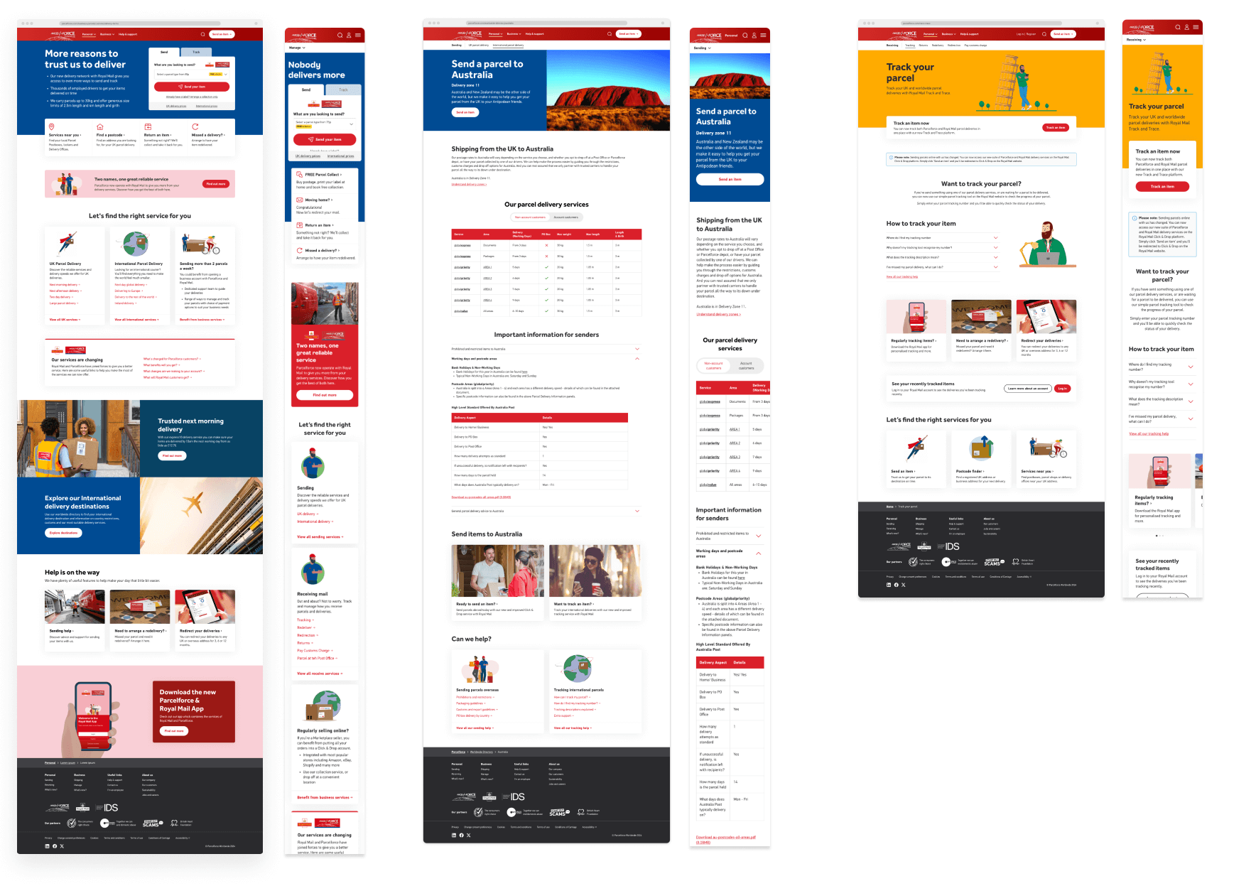
Early mock-ups demonstrated how Parcelforce could be refreshed almost immediately by re-skinning Royal Mail components. With only subtle changes to colours and imagery, we were able to show the value of reusability while still delivering a distinct visual identity. This became the foundation for our production phase, accelerating delivery and reducing complexity.
Discovery & Foundation – Navigation
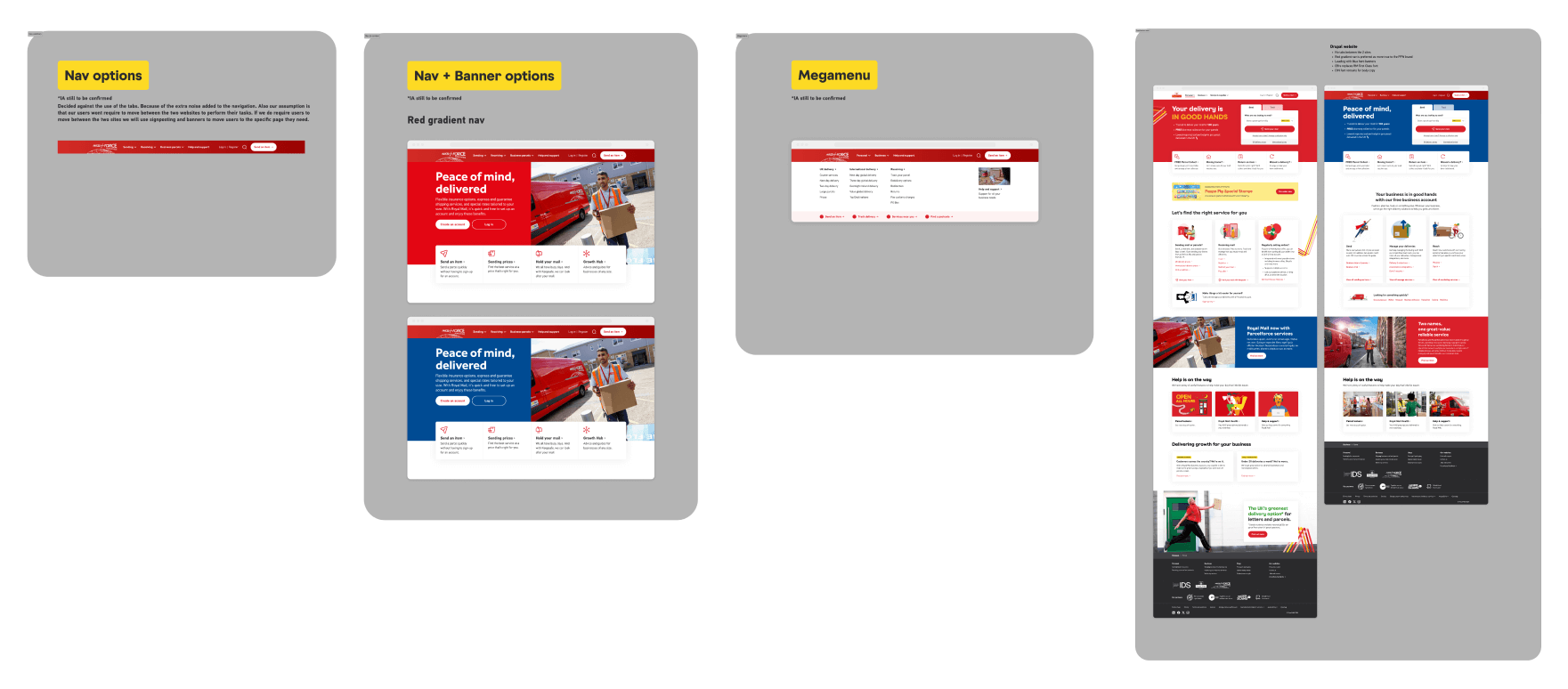
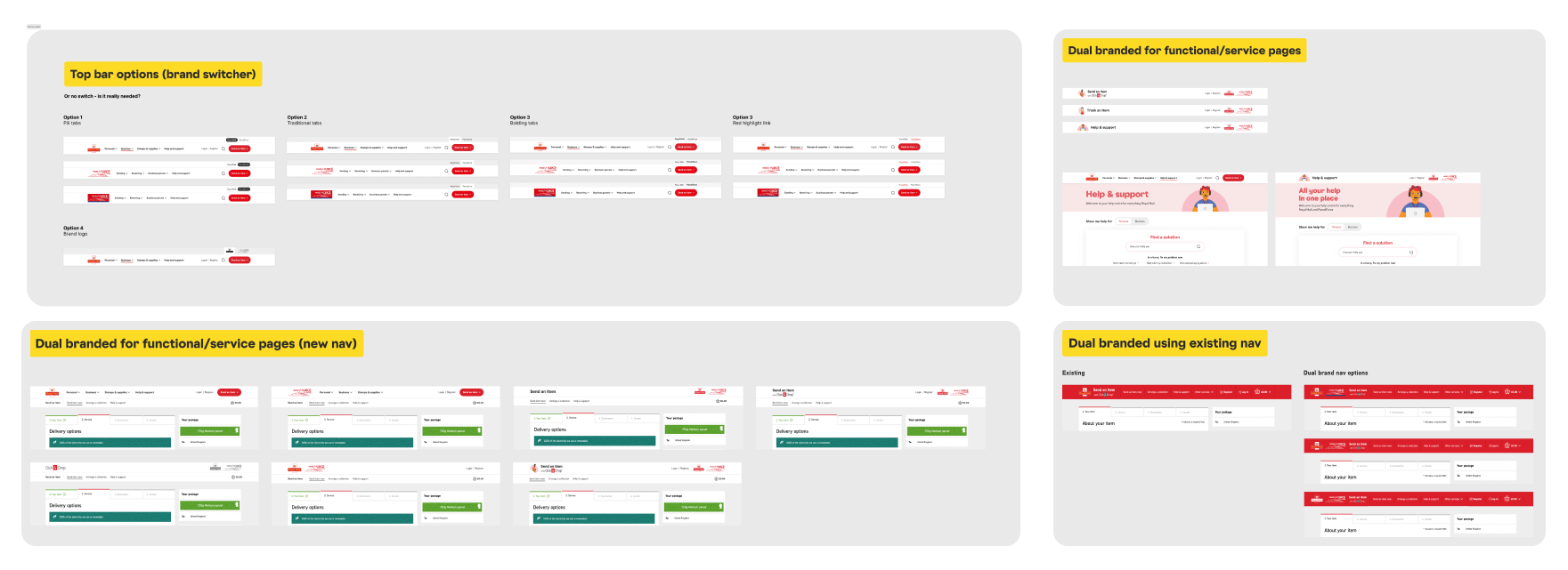
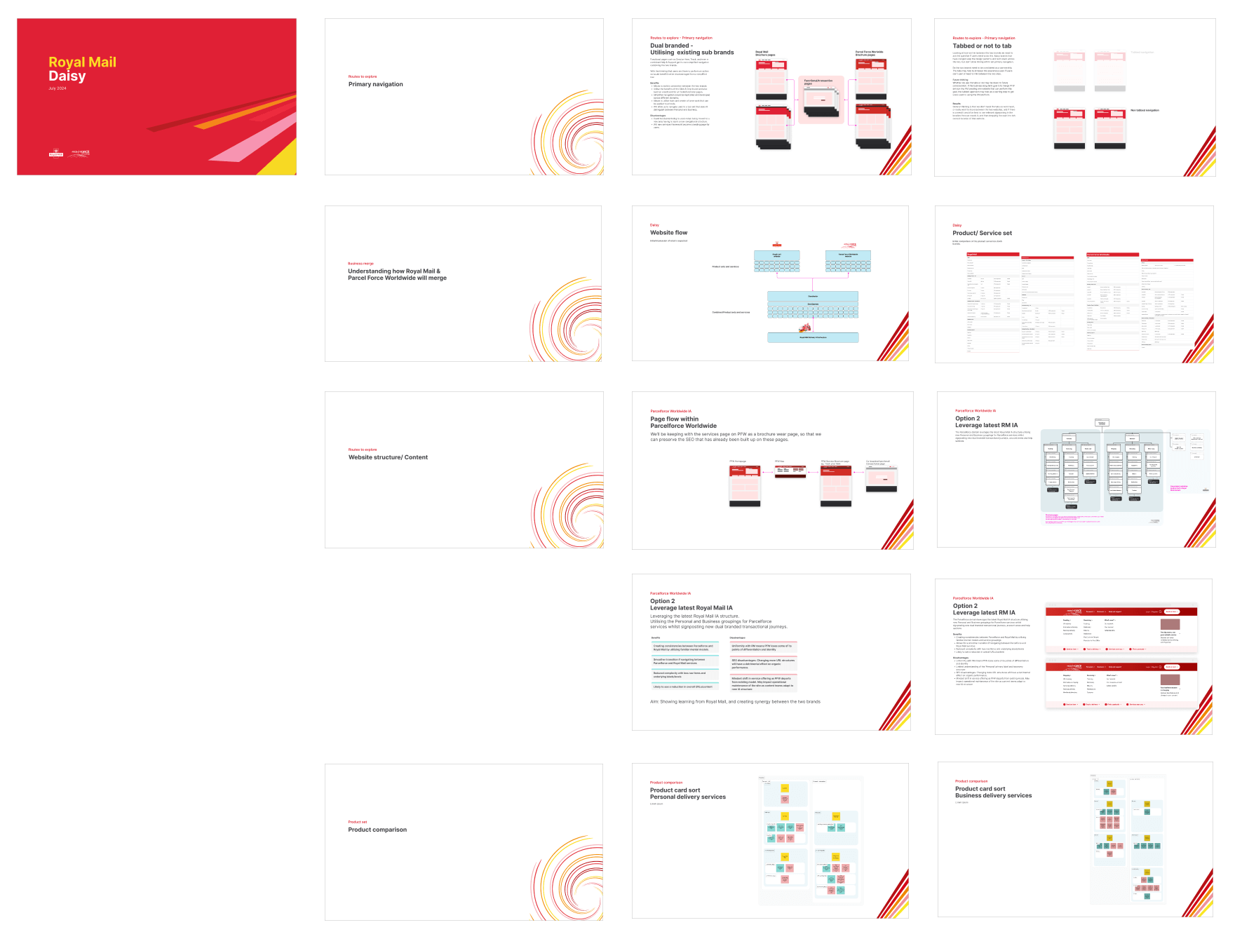
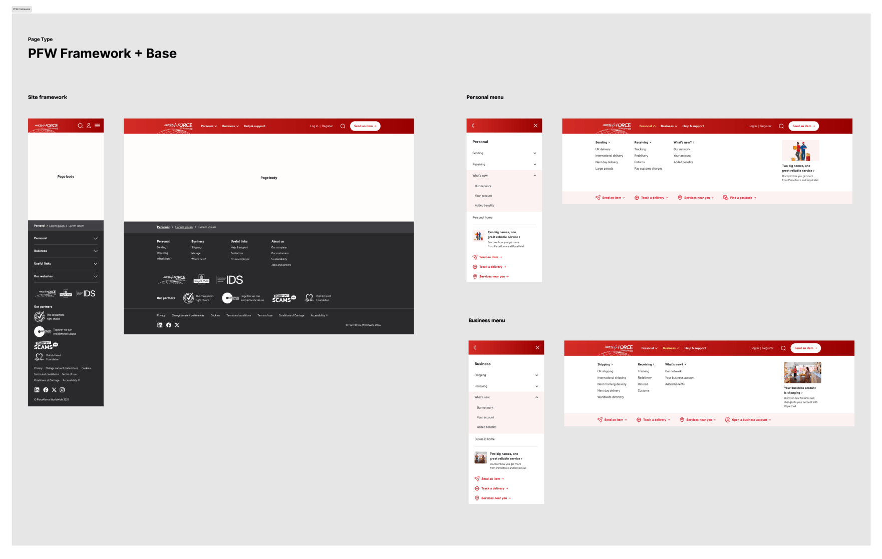
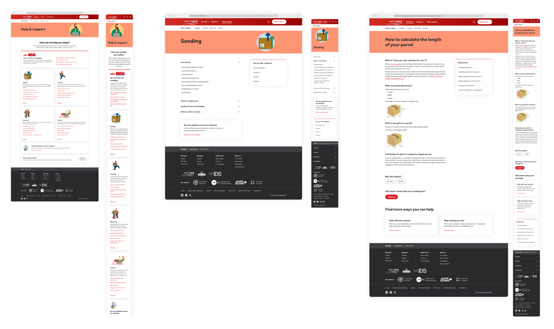
We designed two sites: a brochureware site and a functional task-tool area. For the brochureware, I worked with the strategist and UI designer to adapt Royal Mail’s navigation for Parcelforce, testing how far we could push consistency while still signalling brand difference. For the task area, I focused on designing a shared framework where users from both brands could complete actions without becoming disoriented, with clear pathways back to their starting site.
Discovery & Foundation – Task tool area
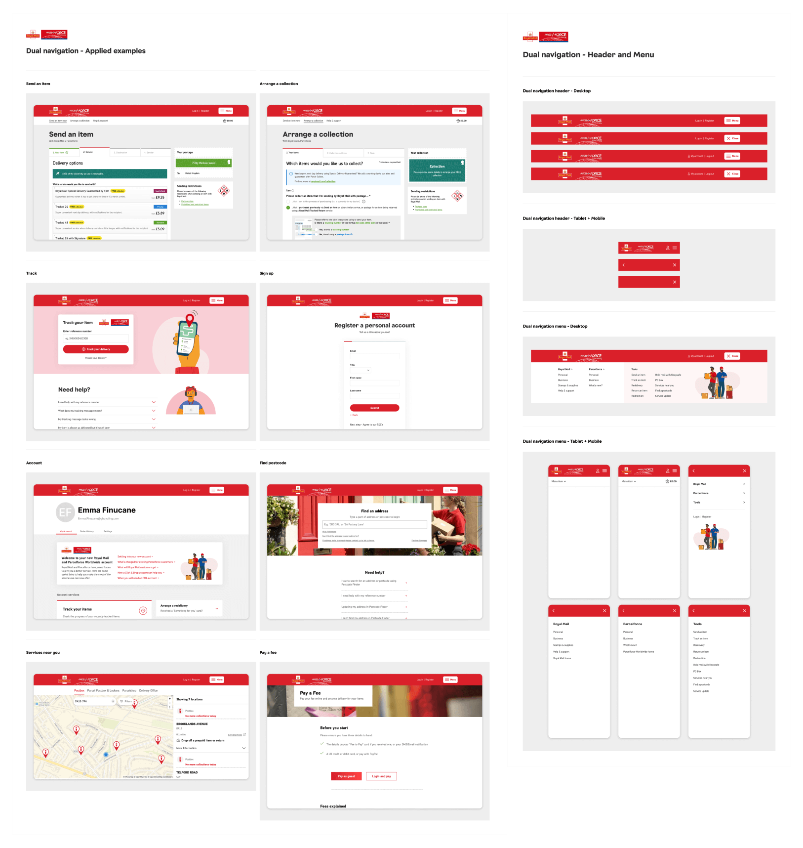
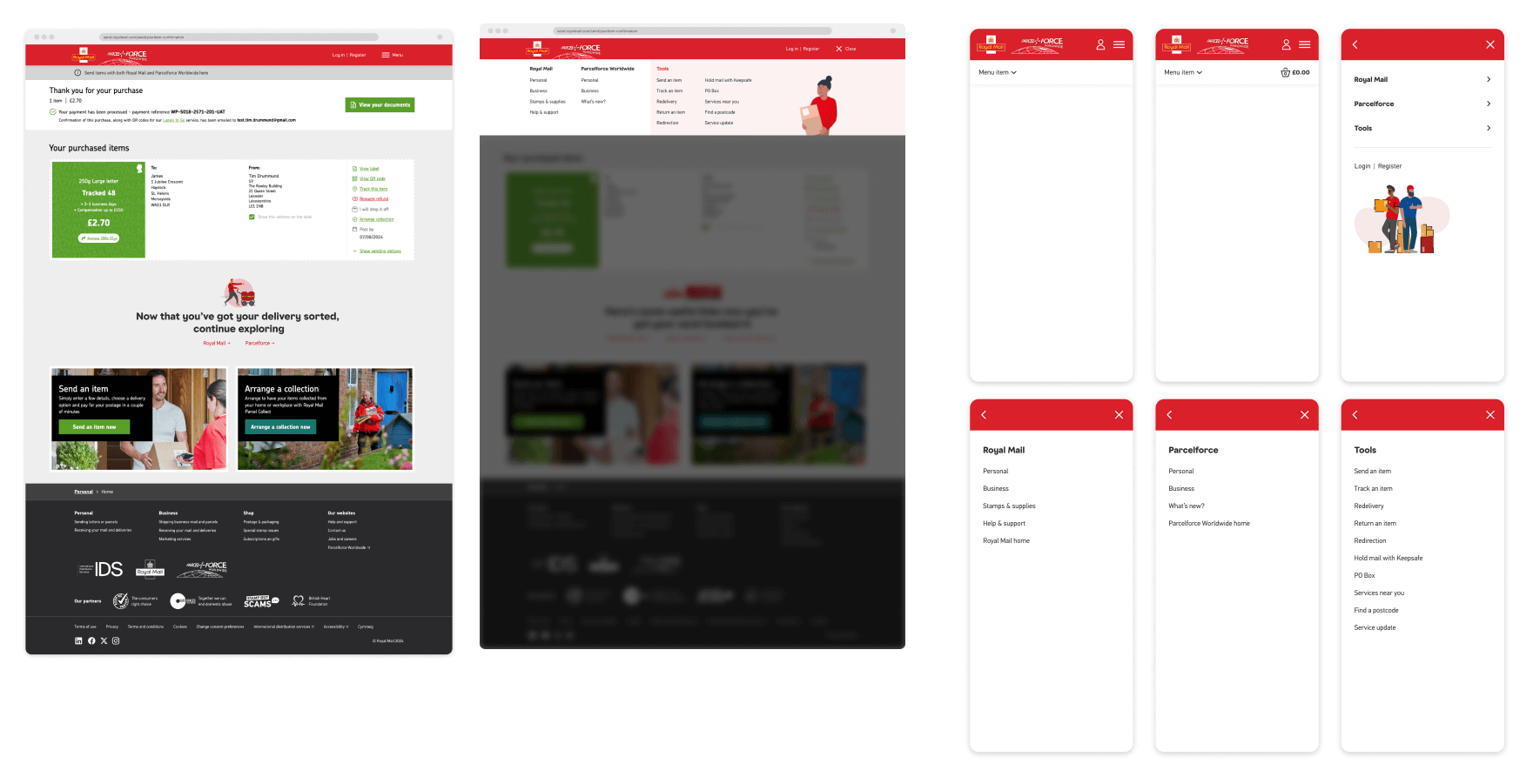
The functional task area required a consistent navigation that worked for both customer sets. We explored multiple options, from dual menus to hybrid approaches, before the client agreed on a solution: the two brand logos sitting side-by-side with a shared navigational structure we had designed for a previous project. Testing confirmed this approach worked as users weren’t disoriented when moving between sites.
Documentation
At the end of the foundation phase, we produced detailed documentation capturing the IA, confirmed navigation patterns, and principles for how the two sites should work together. This gave the business clarity on the direction of travel and a toolkit to carry the work forward.
Usability testing
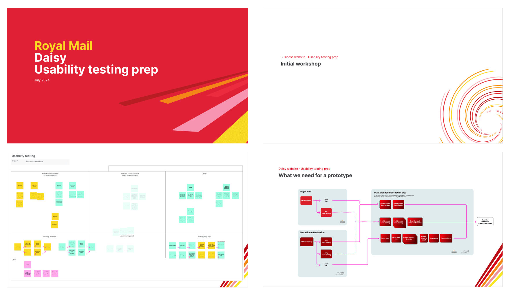
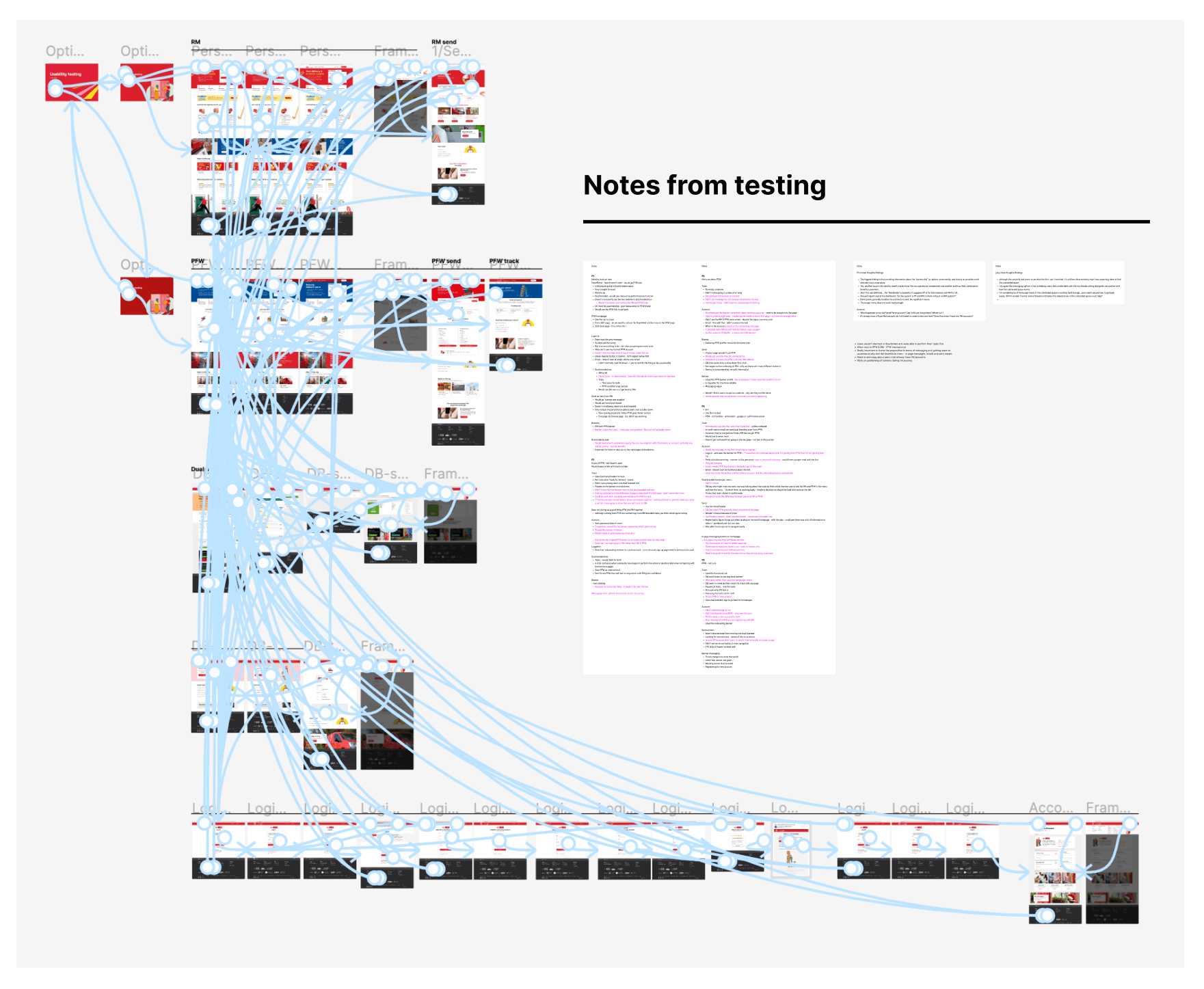
We aligned as a team on what assumptions we needed to validate and what the client wanted to learn, mapping flows into testable prototypes. These were shared back with the wider client group before being taken into research. The findings gave us confidence in both the dual navigation and messaging strategy.
Design sprints – Dual task functional menu
We stress-tested the dual menu against different user scenarios, producing clear examples of how it would appear and behave on live pages. This helped stakeholders see it in action and understand its robustness.
Design sprints – Flows
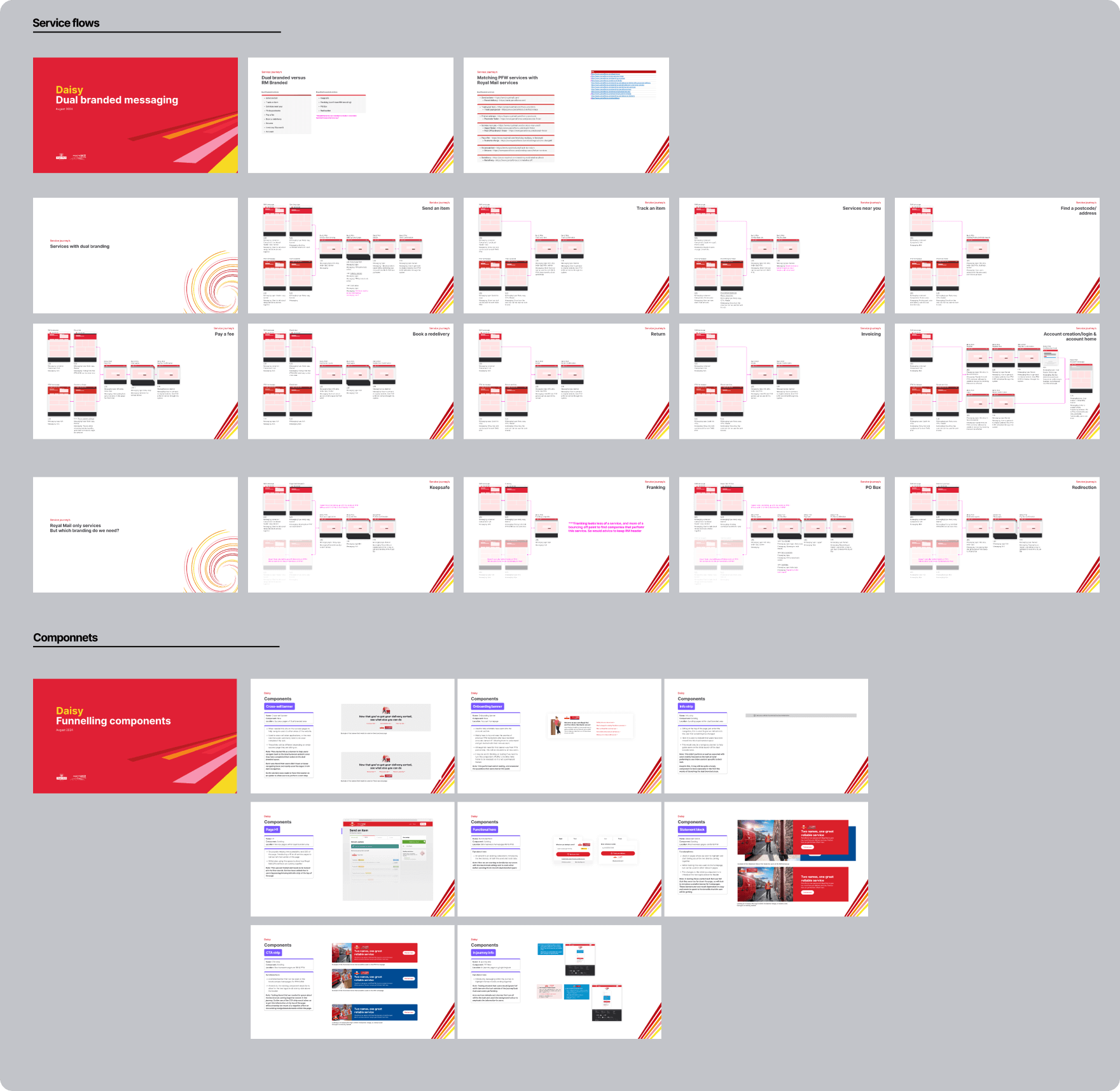
We mapped each key user flow into the dual-brand navigation, ensuring every action could be completed without losing orientation.
Design sprints – Messaging
We documented the components needed to deliver clear, consistent messaging throughout the sites. This ensured users would always understand the changes and the partnership between the two businesses.
Design sprints – Components and page design
We reused and adapted the Royal Mail design system components to deliver Parcelforce’s refreshed site. In sprints we presented existing pages, competitor references, and redesigned versions, before briefing the UI designer to apply the final layer of polish. This approach enabled us to deliver over 20 pages and components for Parcelforce in just two sprints.
Final review
We concluded by aligning the final navigation decisions, page templates, and component set. This created a consistent, dual-brand experience that met user needs, respected both brand identities, and gave the business a scalable framework for the future.
“Great team talented and lovely to work with . Good levels of challenge and excellent expertise in UX, Design and Analytics”
