BT Wholesale’s Offering, and Designing Around It
Simplifying BT Wholesale’s offering to power a smarter, scalable website experience.
History: BT Wholesale’s public website had grown organically over time, with content added by different teams across the business. As new products and services were launched, they were simply bolted on to existing structures — leading to a bloated, inconsistent user experience.
Problem: There was no single, agreed-upon product hierarchy. Different departments used different classifications, and the site tried to speak to too many audiences at once. As a result, it was unclear who the site was really for, and what users were meant to do when they arrived.
RealityBefore any meaningful redesign work could begin, we needed to create clarity around BT Wholesale’s product offering and how it connected to the underlying technologies. The lack of a solid IA made it impossible to structure a site around user needs or business goals.
Results: Aligned Product, Marketing, and Proposition teams on a shared hierarchy. Created a scalable product structure to inform both the new website and internal tooling. Produced a new site map and UX flows based on real user journeys. Designed key visual concepts using BT’s 2020 brand to spark leadership conversations.
Skills used: Aligned Product, Marketing, and Proposition teams on a shared hierarchy | Created a scalable product structure to inform both the new website and internal tooling | Produced a new site map and UX flows based on real user journeys | Designed key visual concepts using BT’s 2020 brand to spark leadership conversations
Discovery & Opportunity Spotting
This project started as a self-initiated effort by myself and a content strategist while working on the logged-in platform for BT Wholesale. We recognised that the public-facing site was unfocused and bloated, and wanted to help the business reimagine what it could be.
We ran an initial analysis of the site and quickly realised that the issue went deeper than IA — it was a service design problem rooted in inconsistent product definition across departments.

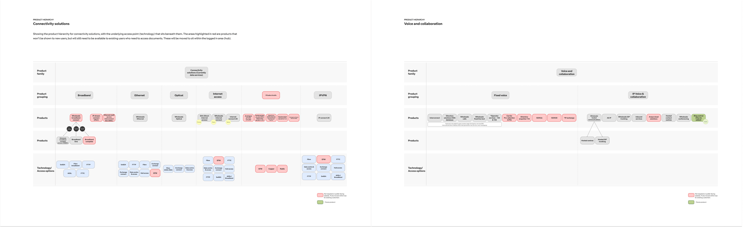
Cross-team Workshops & Product Hierarchy
The first priority was to bring alignment across Product, Marketing, and Proposition teams. Each was working from different product lists, with no single source of truth. This made it impossible to design a coherent experience for users.
We ran a series of workshops where teams reviewed the existing structure and worked collaboratively to reorder and rationalise the product set. This wasn’t just renaming things — it was a process of identifying how products related to each other, how they connected to enabling technologies, and which belonged in the public site versus the logged-in hub.
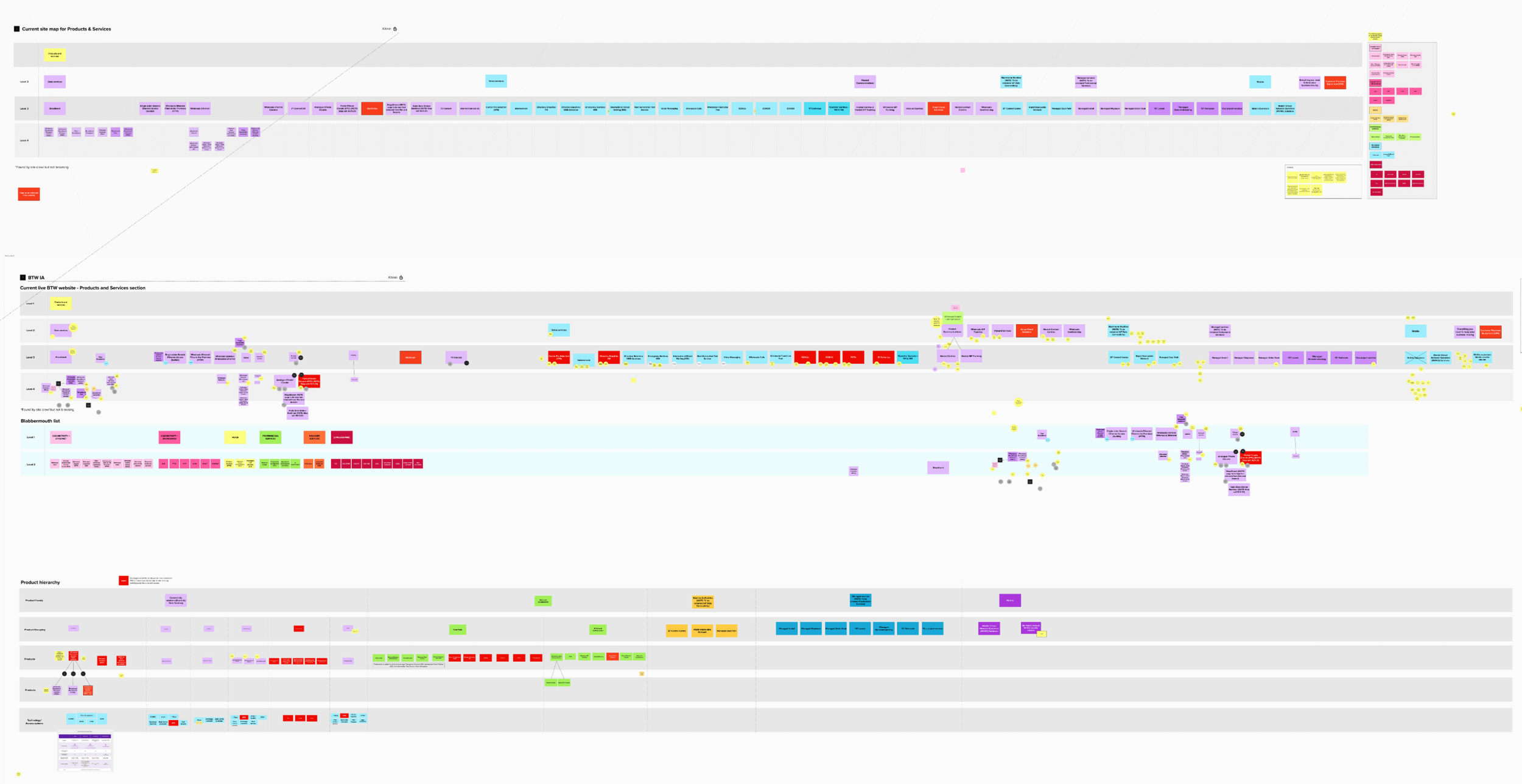
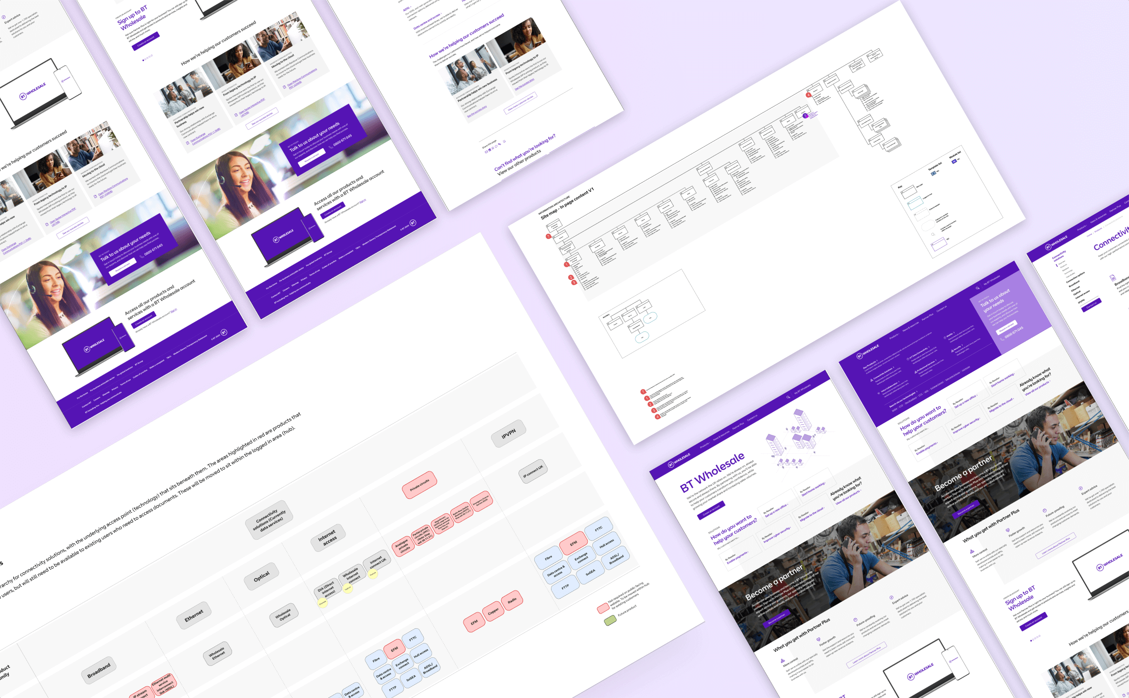
From Hierarchy to Site Map
Once we had alignment on the product structure, we used it as the foundation for a new site map. This allowed us to create a structure that was flexible, scalable, and user-first.
We designed a framework that let users explore the site via product needs or underlying technologies — accommodating both marketing goals and technical users.

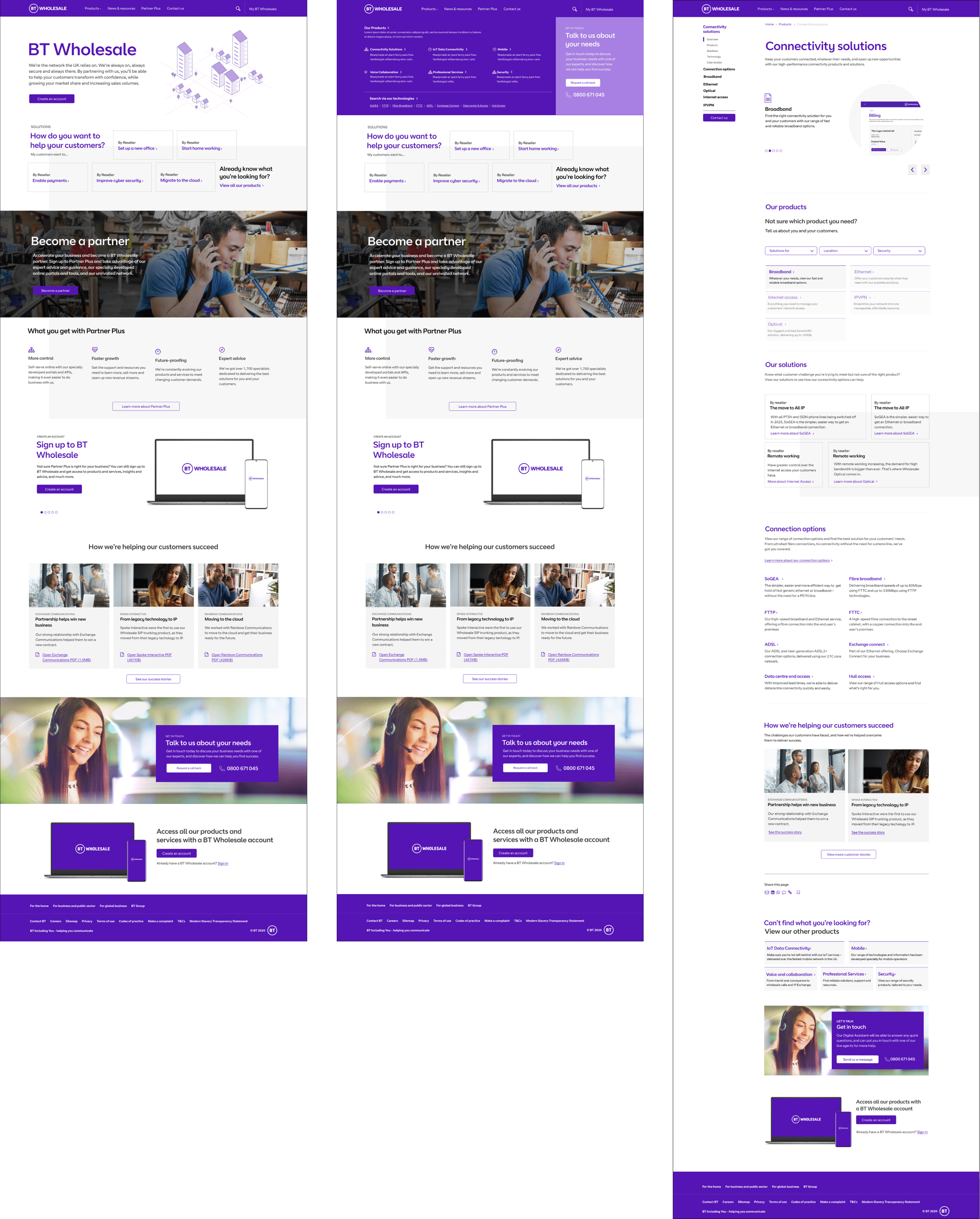
Visual Concepts & UX Flows
To help bring the new IA to life and support internal buy-in, I designed a set of visual journeys and wireframes using BT’s 2020 brand. These focused on:
Entry points for different user types
A solutions panel to help users navigate based on needs
Clear product and technology linking
These visuals weren’t intended as final designs but as artefacts to support strategic conversations and direction-setting.