Shaping a consistent, future-ready hub for BT Wholesale.
Redesigned the BT Wholesale Hub with a scalable information architecture and modular dashboard, creating consistency while enabling future growth
Problem: The BT Wholesale Hub had become dated and inconsistent. Features were being added reactively, creating a fragmented experience with no coherent structure. With the decision to migrate to Salesforce Vlocity, a new information architecture and future-proof design framework was needed.
My Role: Synthesised research into pain points, facilitated workshops, and created personas to anchor design decisions. Defined the new information architecture, documented UI regions, permission sets, and functionality. Designed and delivered the MVP version of a modular, Salesforce-driven dashboard.
Result: A scalable IA and navigation framework, grounded in user needs, plus a component-based dashboard that secured stakeholder buy-in and created the foundations for iterative growth.
Skills used: Workshops | Persona Creation | Information Architecture | Navigation Design | Documentation | UI Pattern Libraries | Stakeholder Management | Salesforce Vlocity | MVP Strategy | Component Design
Project Context
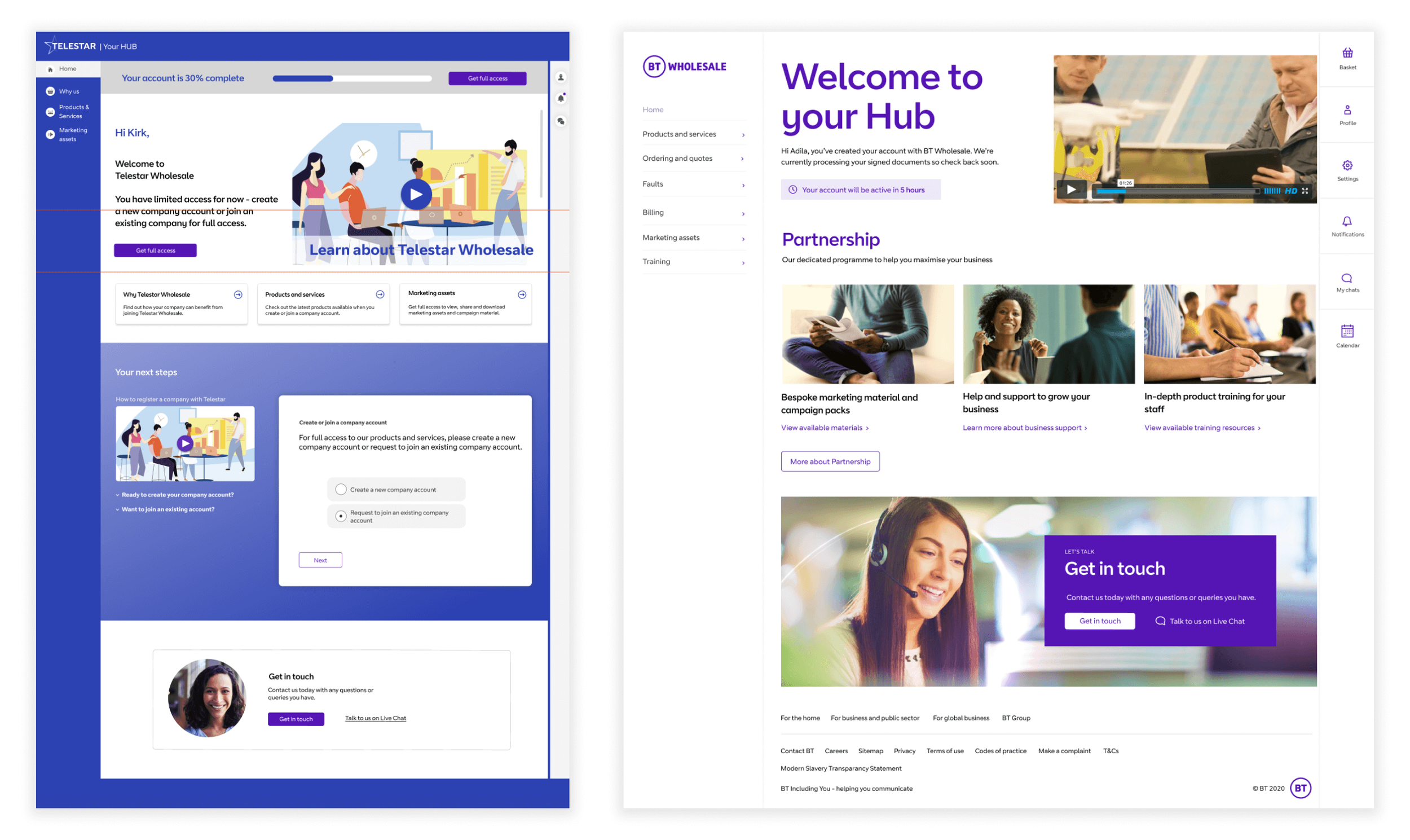
BT Wholesale needed to modernise its hub platform for small and medium-sized resellers (e.g. healthcare, education, or retail businesses). These resellers needed a central hub to package BT products and sell them to their own customers.
The existing site had grown reactively over time, leading to inconsistent content placement, fragmented flows, and lost interaction patterns. The move to Salesforce Vlocity created the opportunity to reset with a structured approach.
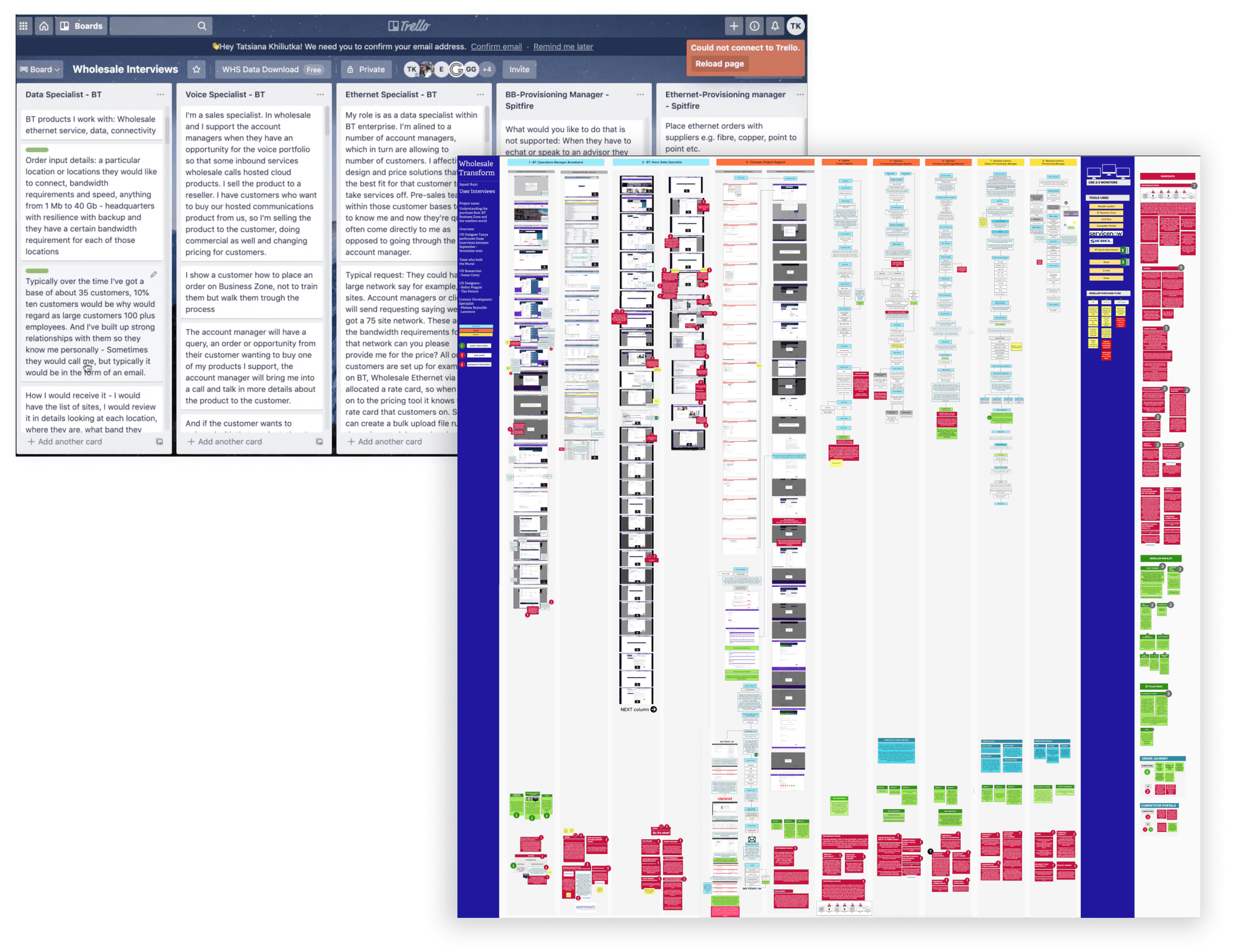
Research & Synthesis
Before workshops were run, I worked with the team to review and synthesise existing research into the hub experience. This included:
Analysing usage data from the current hub.
Reviewing customer feedback and support tickets.
Mapping common journeys where users struggled with navigation or incomplete functionality.
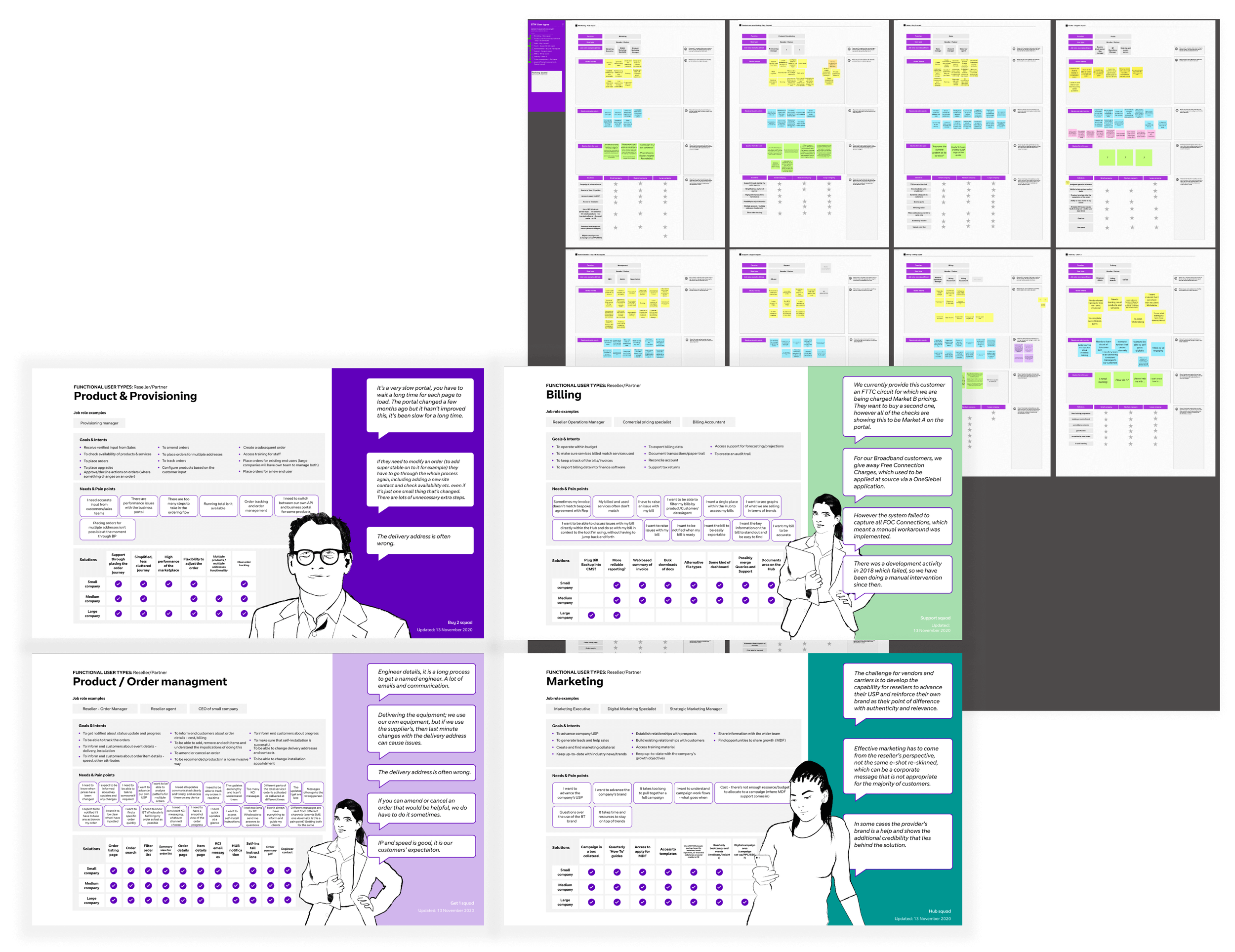
This synthesis identified recurring pain points: difficulty locating product information, unclear navigation between business areas, and inconsistent functionality depending on permission level.
The insights from this work directly informed the agenda for our workshops and shaped the personas, ensuring they were grounded in actual user behaviours and frustrations rather than assumptions.
Kickoff Workshop & Card Sorting
In the kickoff workshop, I facilitated collaborative exercises to capture business goals, user needs, and content requirements.
To translate this into something usable for IA, we ran a card sorting exercise, grouping and re-organising all the pieces of content and functionality uncovered in the workshop. This gave us:
A clear view of how information should be structured.
Early consensus across stakeholders on priorities.
The starting point for a new, logical IA that worked for both users and business.
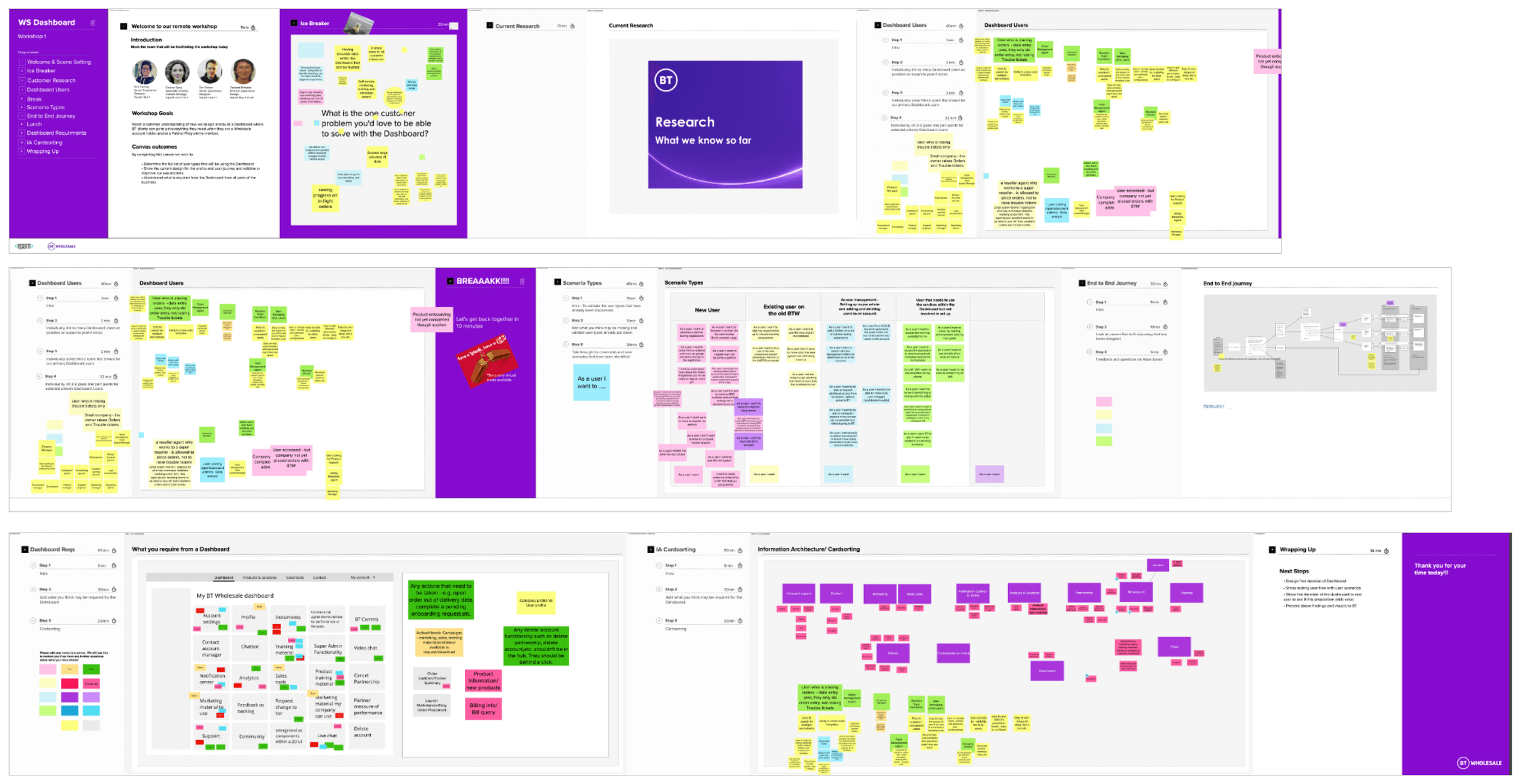
Workshops & Persona Creation
Building on the kickoff insights, I ran further workshops with stakeholders and internal squads to validate and refine the IA directions.
From these sessions, I created personas representing the primary reseller groups (e.g. Business Level, Partner Plus, Normal Business). These personas were grounded in the earlier research and workshop outputs, ensuring they were a practical tool to guide design and prioritisation.
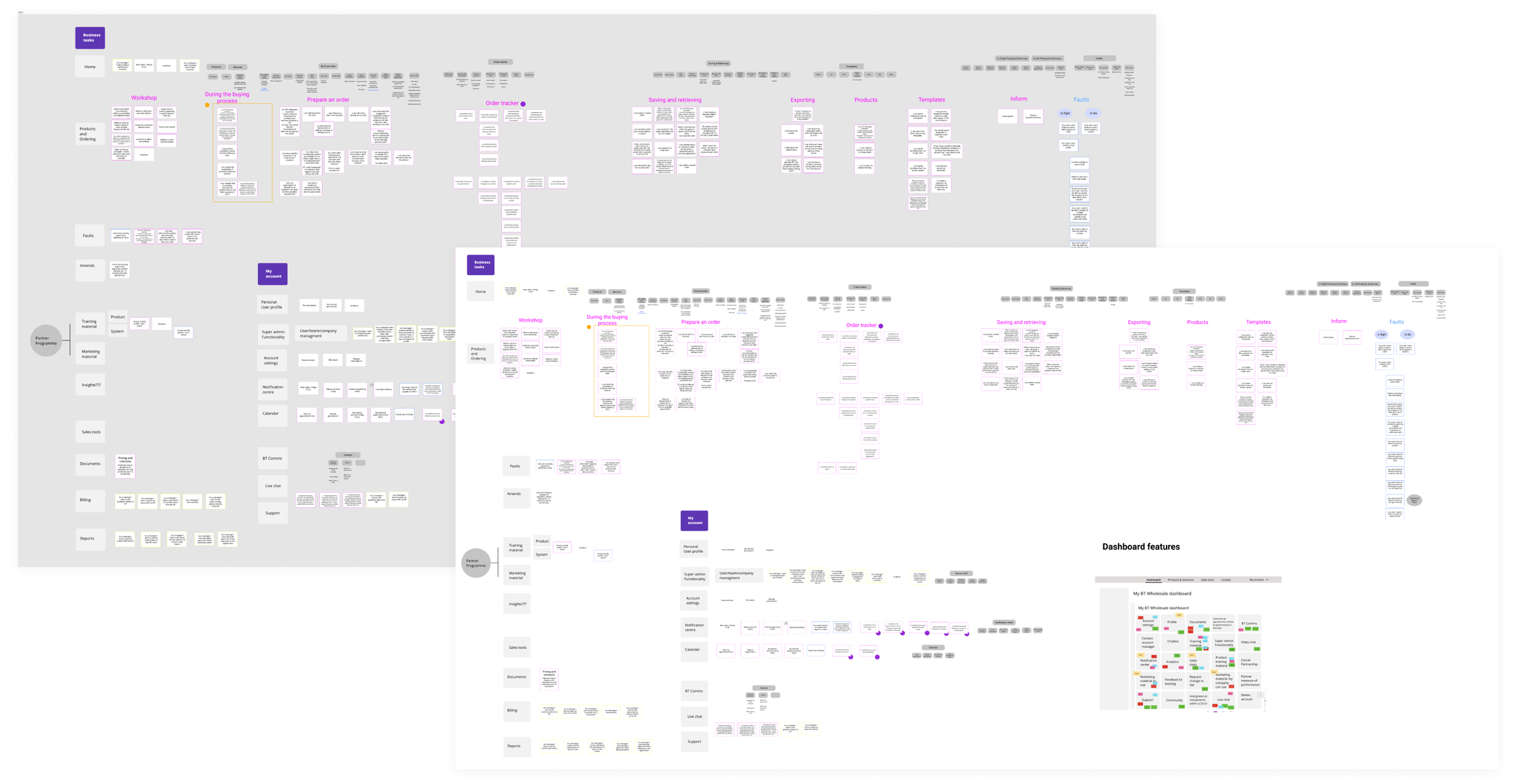
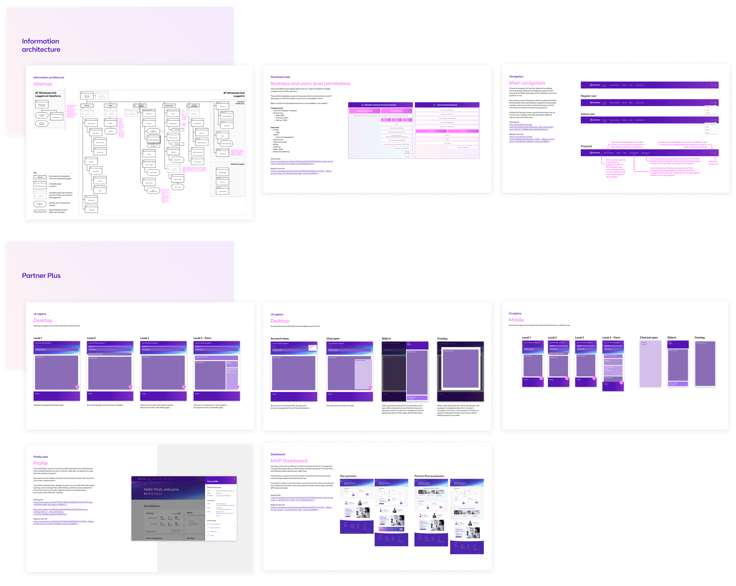
Information Architecture & Navigation
Defining a Future Vision
Ad-hoc requests had previously shaped the hub, leading to disjointed structures. I produced IA documentation that gave squads a clear, consistent vision for growth — allowing for change while maintaining coherence.
UI Regions
Mapped and documented all common UI patterns and content regions, creating a consistency framework across squads and reducing duplication..
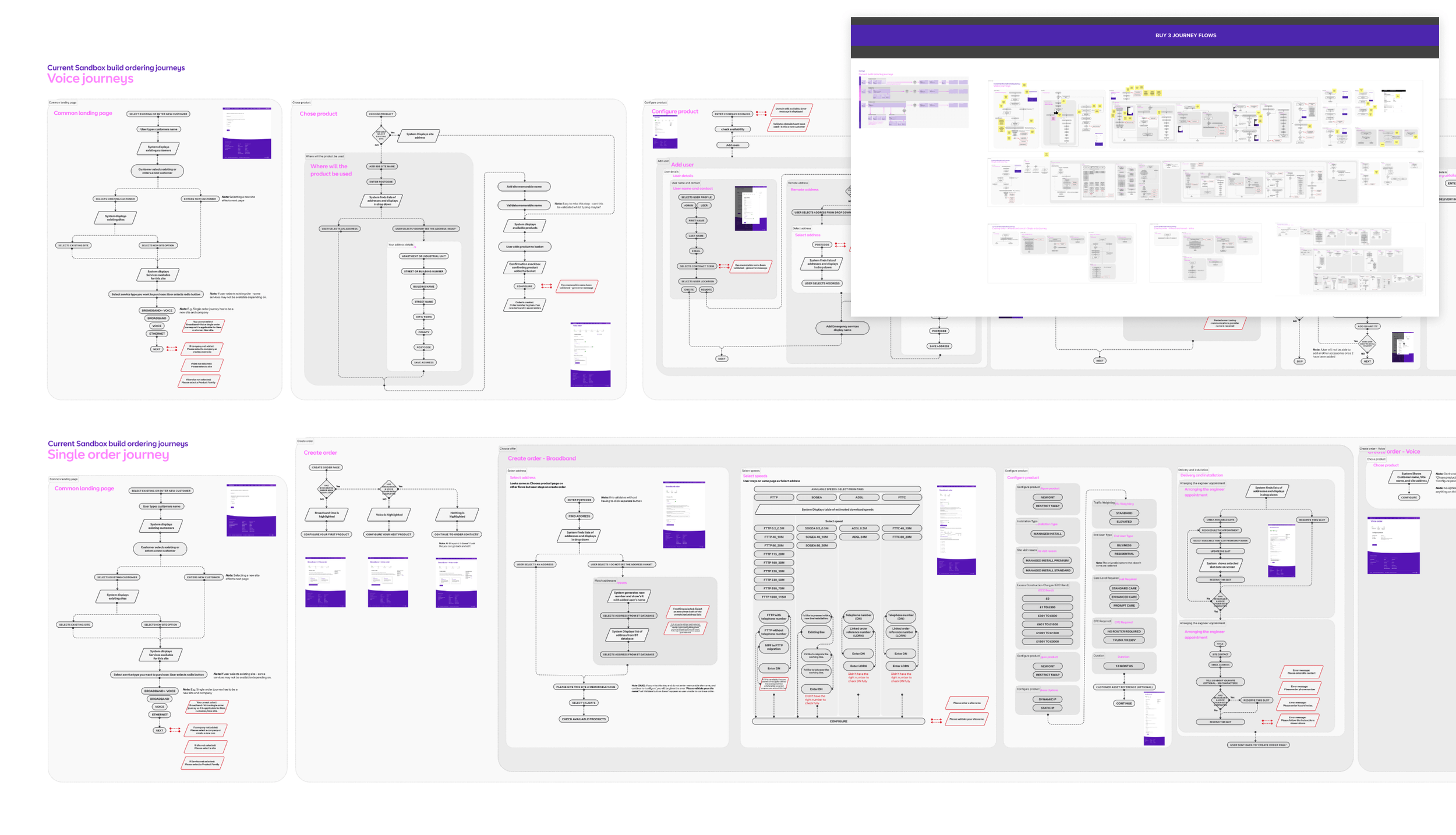
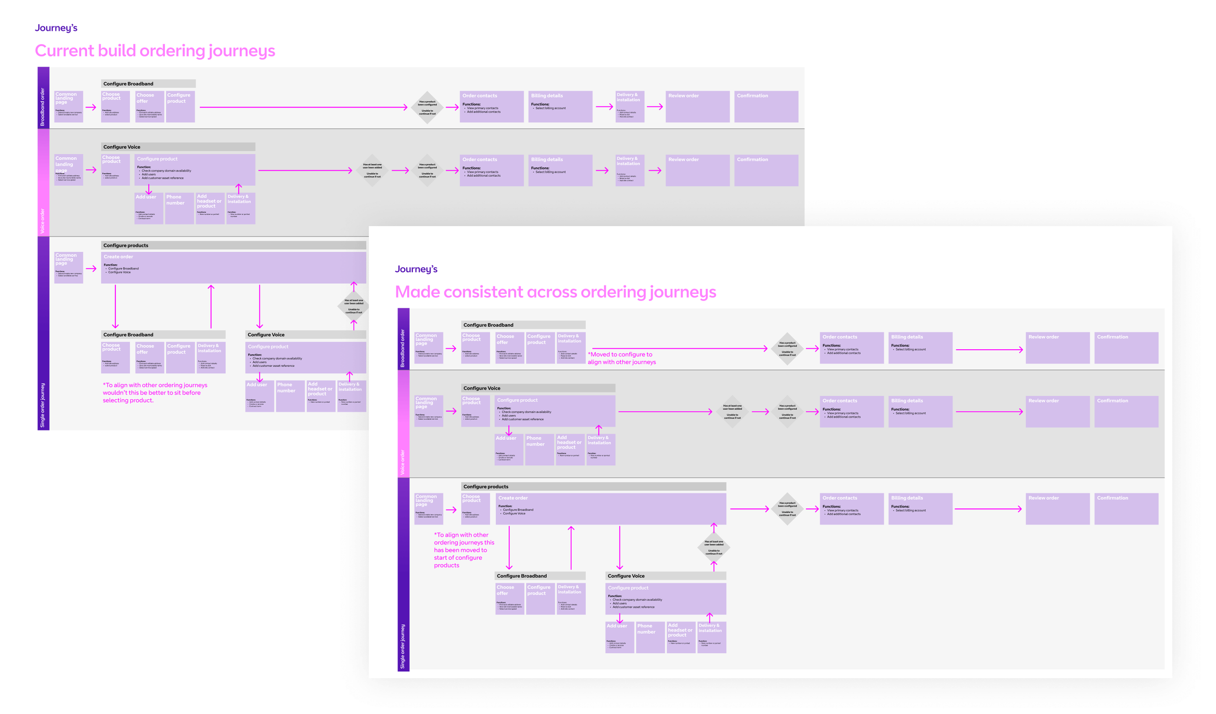
Functionality & Journey Mapping
At this stage, different squads had begun to drift in separate directions, interpreting requirements in inconsistent ways. To reduce development overhead and rework, I initiated a journey mapping exercise across all live processes.
I presented these journeys in a workshop with Product Owners and Business Analysts, showing side-by-side comparisons of how flows had evolved in different squads. This made the inconsistencies visible, sparked alignment conversations, and created a shared vision of where we needed to head.
The result was a single source of truth for functionality that not only documented what existed, but also guided where future development should align.
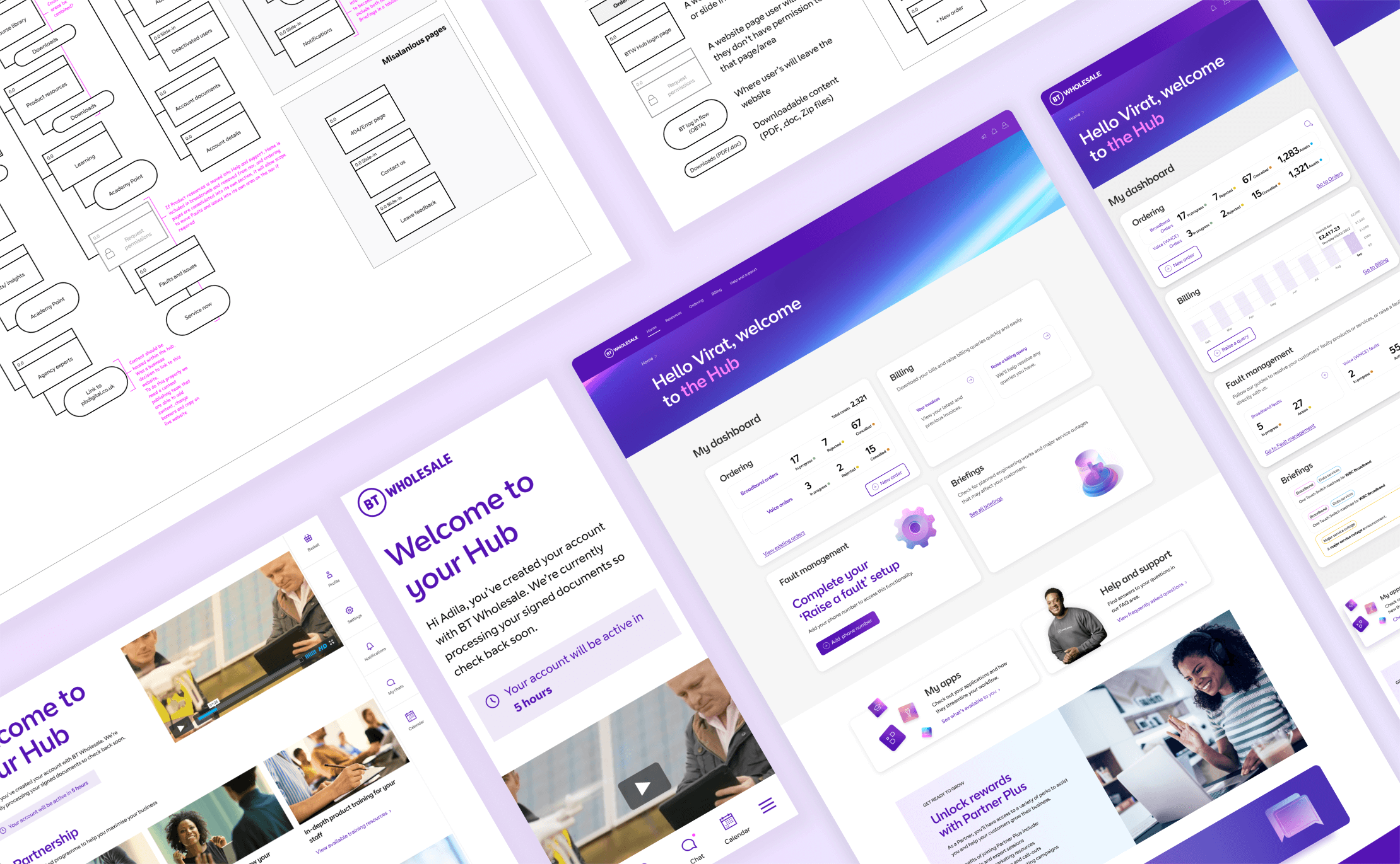
MVP Dashboard
From Vision to MVP
A “full vision” dashboard had already been produced, capturing every business requirement. My role was to phase this vision into deliverable sprints the dev team could realistically ship.

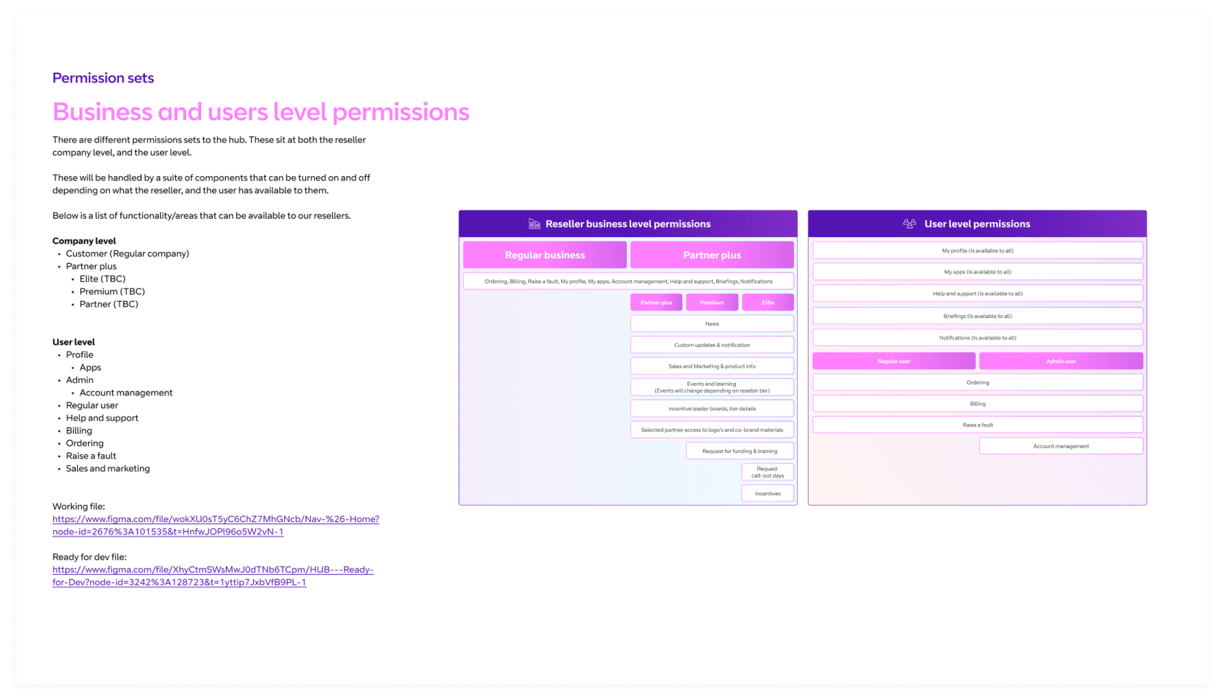
Permission Sets
Visualised how different user types accessed features, ensuring role-based design was baked into roadmap planning
Stakeholder Buy-in
I worked closely with business stakeholders to explain why a phased, modular approach would be more sustainable than delivering everything in one release. This secured support for an MVP-first model.

Component-Based Design
I designed the dashboard as a set of components that could be switched on/off depending on user permission sets. This ensured:
A solid page foundation was in place from the start.
Future sprints could focus on refining individual components.
Squads had time to validate needs and develop supporting APIs.

First Iteration
The MVP focused on structure over data. Instead of fully functional modules, I designed thumbnail placeholders representing components. This gave developers a clear build path and showed stakeholders how the dashboard would evolve over time for different user types.