Knight Franks Occupier platform
Designing Knight Frank’s first flexible office platform from vision, to sprints, to launch.
The problem: WWith the rise of companies like WeWork and Hubble, Knight Frank needed to compete in the flexible office space market. They wanted a platform where businesses could browse and book short-term offices, supported by an internal tool for their teams to manage property listings and enquiries.
My role: TUX Designer within TH_NK's cross-functional team. I worked across the full design process — from early discovery and information architecture, through wireframing, prototyping, and usability testing, to final UI handover.
Impact: TLaunched a customer-facing platform and internal admin tool from scratch. Success on this project directly led to TH_NK being commissioned to redesign Knight Frank's main websites.
Process: A structured, research-led design sprint programme, beginning with discovery through interviews and stakeholder workshops, moving into foundation design to frame key problems, then delivering focused design sprints followed by usability testing and iteration.
Discovery → Foundation design → Design sprints → Validation → Iteration
Skills used: Information Architecture | Wireframing & Prototyping | Design Sprints | Usability Testing
The brief
As a new client to TH_NK, this project carried real weight. Success here would determine whether we'd be trusted with larger work — including the eventual redesign of Knight Frank's main websites. The task was to design a customer-facing platform where businesses could browse and book flexible office space, alongside an internal admin tool for Knight Frank staff to manage listings and track enquiries. Everything built from scratch.
Process
The project ran as a structured programme of work across four phases, each building on the last.
Discovery came first, we explored the problem space, interviewed stakeholders, and mapped what we needed to solve. This gave us a clear set of focus areas to carry into the next phase, and aligned the team on sprint goals before any design work began.
Foundation design tackled the bigger, thornier problems upfront, information architecture, core user flows, and early page structures. Rather than waiting until sprints to surface these, we resolved them here and used the outputs to get an initial read from the client on the direction we were taking. It was a critical alignment moment before the pace increased.
Design sprints then followed 11 in total. Each sprint had a defined problem area or page to focus on, moving the platform forward in structured, reviewable steps.
The final two sprints were blocked out for validation, usability testing with real users, followed by iteration based on findings before launch.
The team I worked within included a UX Designer, UI Designer, Design Director, Solution Architect, Account Director, Product Owner, front and back-end developers, and a copywriter. Across the project my focus was UX, leading on research, flows, wireframes, and prototyping, and I took ownership of the usability testing programme in those final sprints.
Discovery - understanding the space
We started with stakeholder workshops and card sorting exercises to understand what the platform needed to contain. Working across whiteboards with the wider team, we grouped content, mapped user needs, and debated what belonged where, generating the raw material for a coherent site structure.
From that process, I refined a finalised sitemap in digital format, giving content, engineering, and stakeholders a shared reference point before any design work began.


Page structure - establishing the skeleton
Before moving into detailed wireframes, I created thumbnail sketches of the key page types. These rough page structures helped us agree on content hierarchy and layout logic early — avoiding costly decisions being made too late in the process.

Flow design - mapping the key journeys
With the structure agreed, I mapped the key user flows: how a business would discover a space, shortlist it, and make an enquiry. Starting from rough sketches and working up to a polished digital version, these flows gave the team clarity on decision points and logic before any detailed screens were produced.

Straw man wireframes - framing the customer experience
These early wireframes, sometimes called camp wires or straw men, weren't about detail. They were about establishing content areas, spacing, and relative priority on each page. Rough by design, they created a shared language between UX, content, and engineering before anyone committed to anything.

Printed wires with annotations - designing in the open
As wireframes developed, I printed them and annotated them with notes covering interaction logic, content guidance, and open questions. This lo-fi approach made it easy to share work in workshops, gather quick feedback from stakeholders, and capture decisions before they were lost.

From wires to UI - bridging design and build
With wireframes signed off, I worked alongside the UI designer to translate structure into visual design. Placing final wires and UI side by side let us QA decisions together, ensure nothing was lost in translation, and give engineers a clear reference for both layout intent and visual execution.

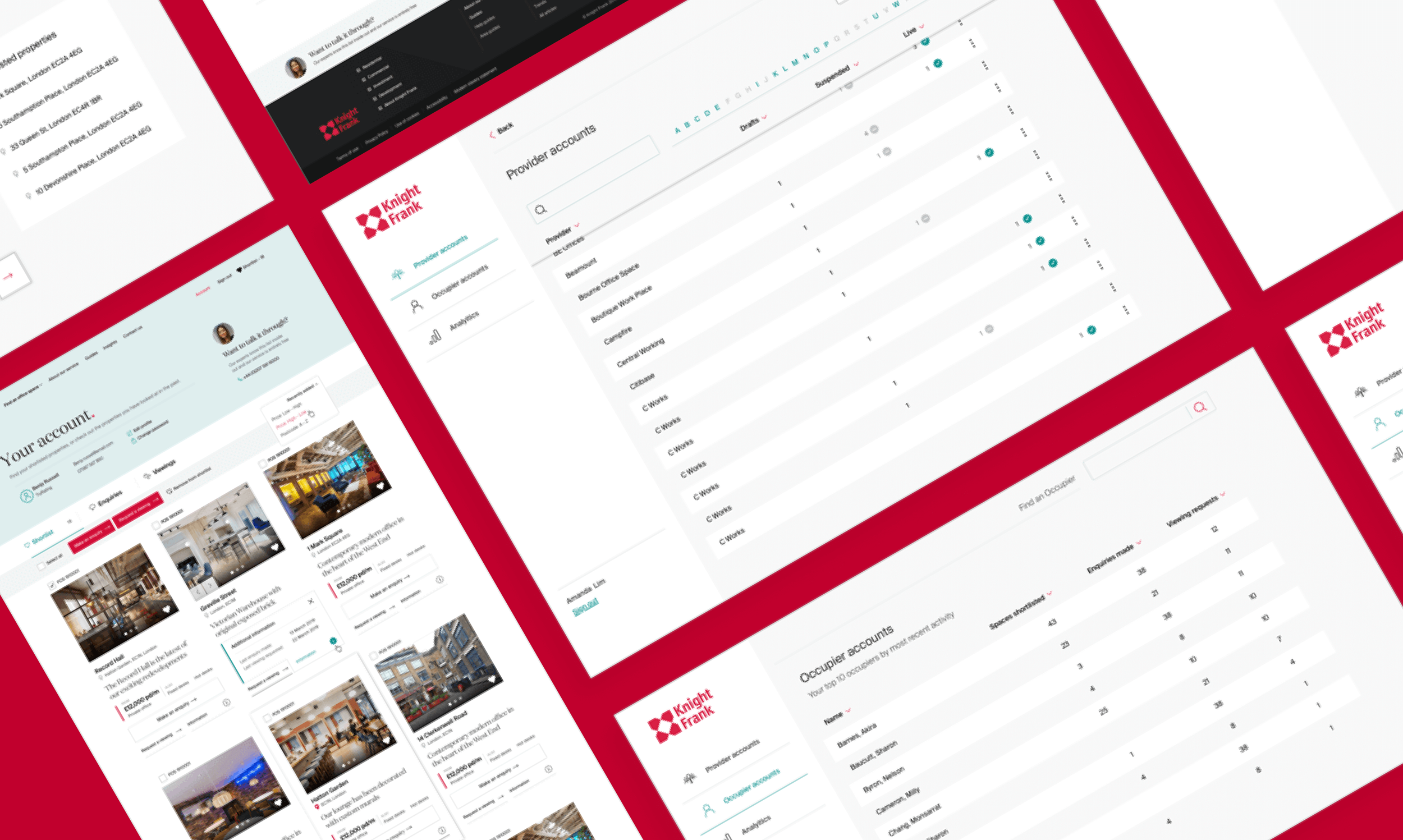
Final UI - customer-facing platform
The finished customer-facing platform, across mobile and desktop. The design gave businesses a clear, confident way to browse flexible offices, shortlist properties, and submit enquiries, positioning Knight Frank as a credible competitor in the flexible workspace market.

The admin tool - designing for internal teams
The platform was only half the brief. Knight Frank's internal teams needed their own tool to upload new properties, manage listings, and track enquiries. I designed the admin area in parallel with the customer-facing site, working through the key flows in wireframes before moving into final UI. The finished tool gave staff a manageable, well-structured workspace that removed reliance on manual processes.


Usability testing - validating before launch
In the penultimate sprint, I co-moderated usability sessions with 9 participants, running tasks and observing behaviour in real time. Knight Frank stakeholders joined us in the observer room, giving them direct exposure to how real users were responding to the designs.
I compiled the findings into a clear summary of decisions: what needed fixing before launch, what could be improved in iteration, and what was worth monitoring. This gave the team and client an unambiguous basis for the final round of changes.


Outcome
The Occupier Platform launched successfully, enabling Knight Frank to enter the flexible office market with a polished, well-tested product. The project's success directly led to TH_NK being commissioned to redesign Knight Frank's main websites the outcome we'd been working towards from day one.

Reflection
Looking back, I'd have pushed earlier for more structured documentation between sprints, particularly around edge cases in the admin tool, where interaction logic was sometimes carried in people's heads rather than written down. On a project of this length and complexity, that discipline pays for itself later.