Putting people inside the property
Redesigning how Knight Frank shows property, from research & workshops to a scroll-based experience built for any need.
The challenge: Redesign a single property page template that works from a city-centre commercial letting to a £30 million country estate.
My role: UX lead on the property page — competitor research, ideation workshops, user interviews, prototyping, and two rounds of usability testing.
Impact: Design phase completed and signed off. The framework and patterns we built have since started appearing on Knight Frank's live website.
Timeline: 6 months design phase. Build phase cancelled due to Covid.
Skills used: Information Architecture | Wireframing & Prototyping | Design Sprints | Usability Testing
The brief said one thing. The problem was something else.
On paper, this was a property page redesign. In practice, it was a question about how to make someone fall in love with a house through a screen — for properties ranging from a flat in Fulham to a Georgian manor with a gate lodge and a lake.
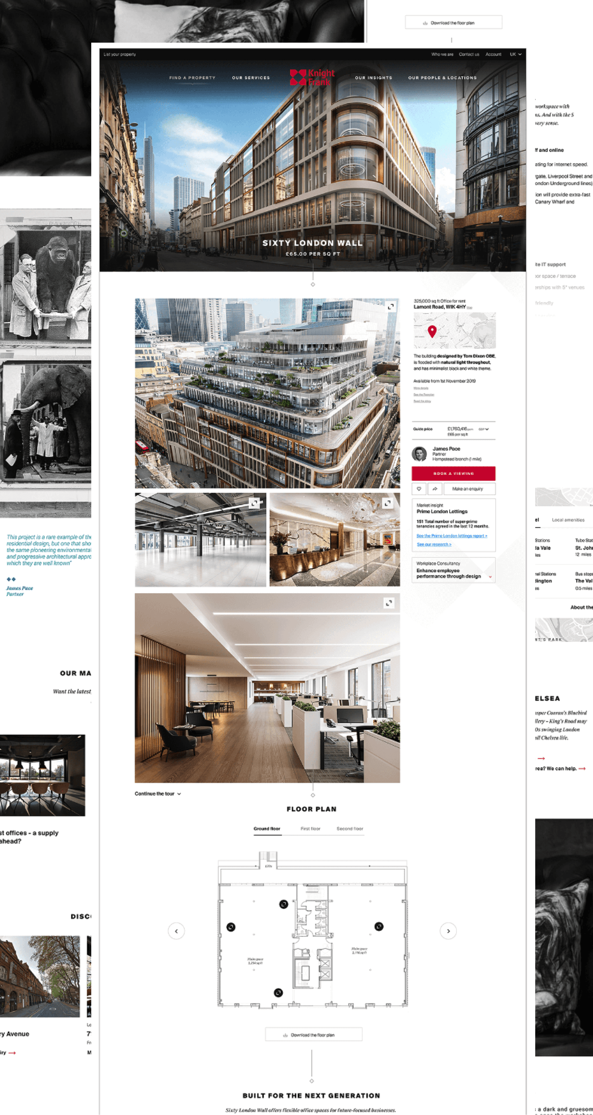
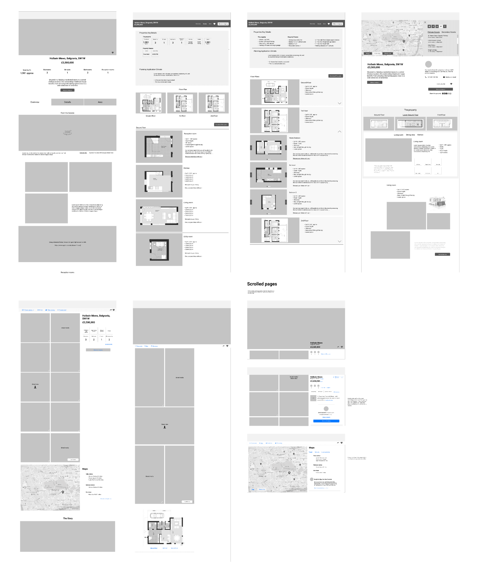
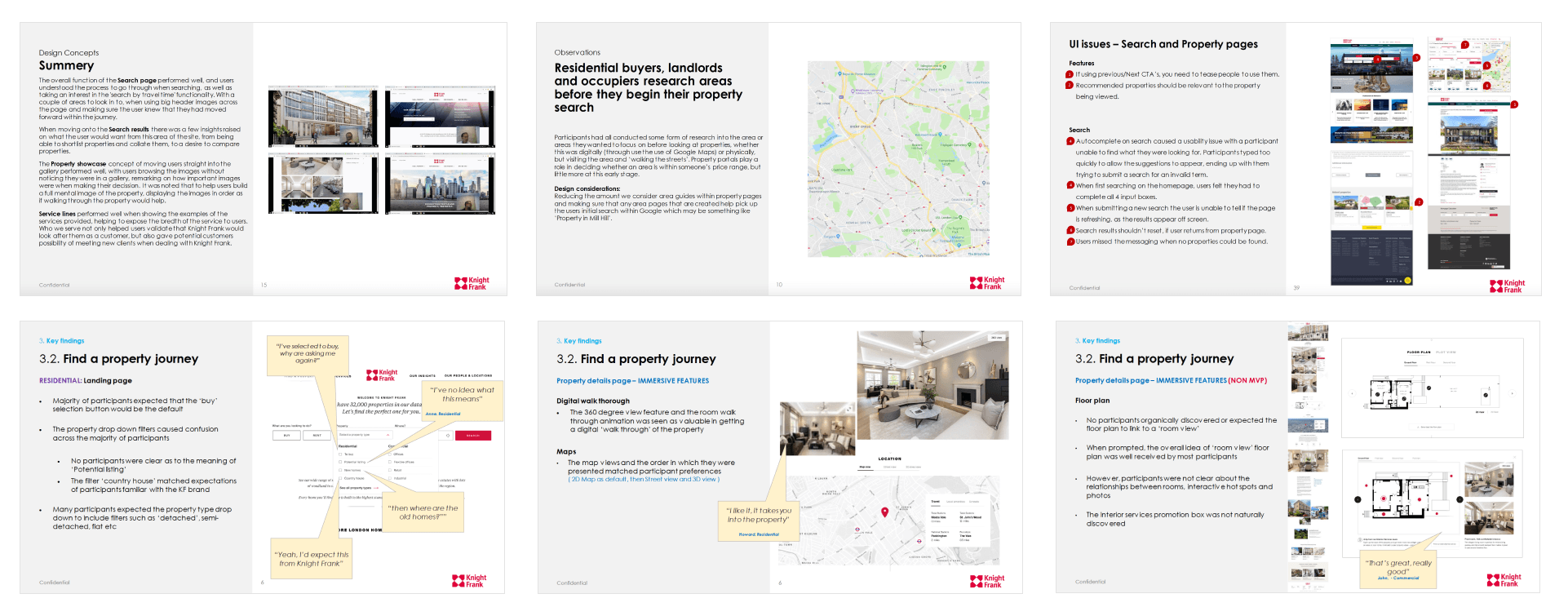
The existing page was doing what most property sites do: small carousel at the top, click through to the next photo, floor plan buried near the bottom. It was functional. It wasn't doing the job of making someone feel anything.
What we were really solving
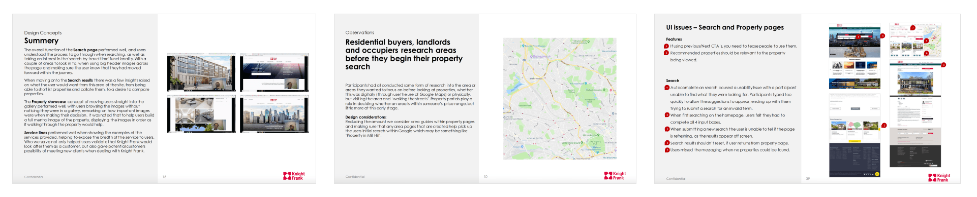
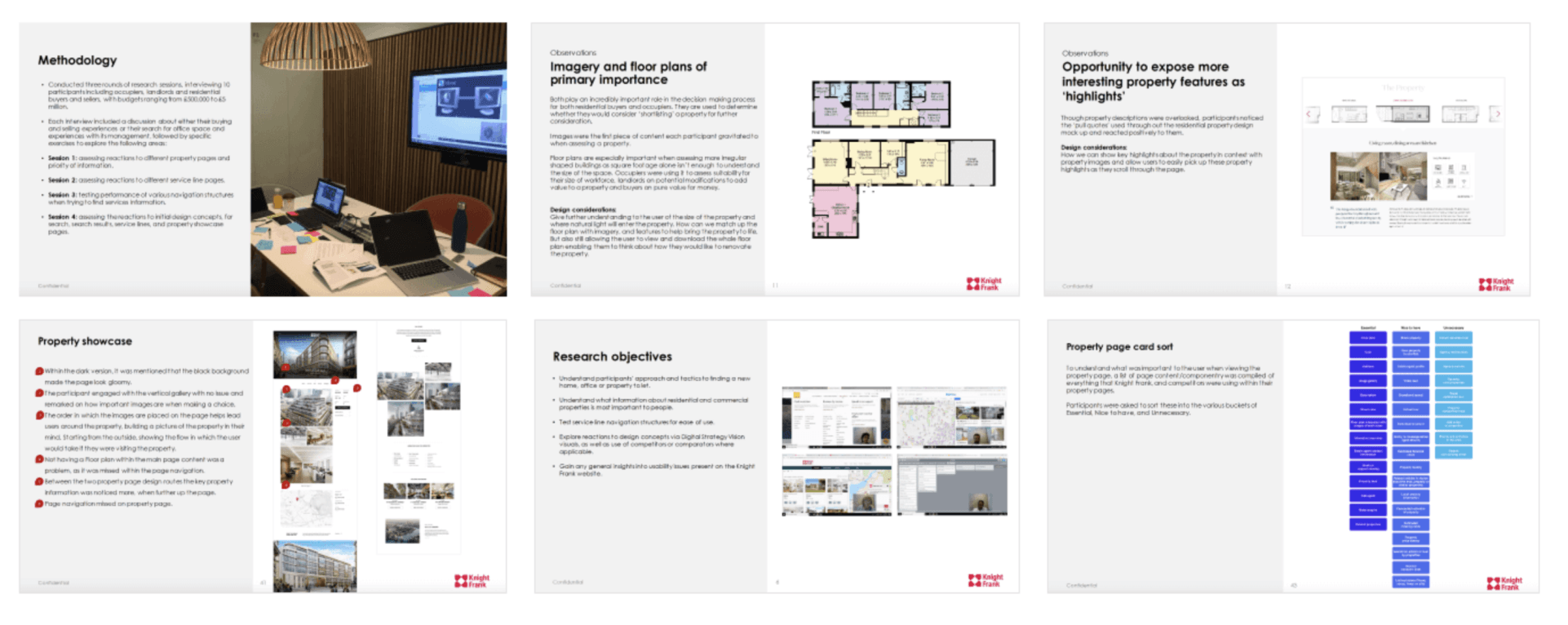
Competitor research started close — Savills, JLL, The Modern House — and widened out to how other industries handle image-led browsing. Nike's product pages and the Google Pixel site became unexpected references. Both let the imagery drive the story rather than leading with specs.
The constraints that made this genuinely difficult:
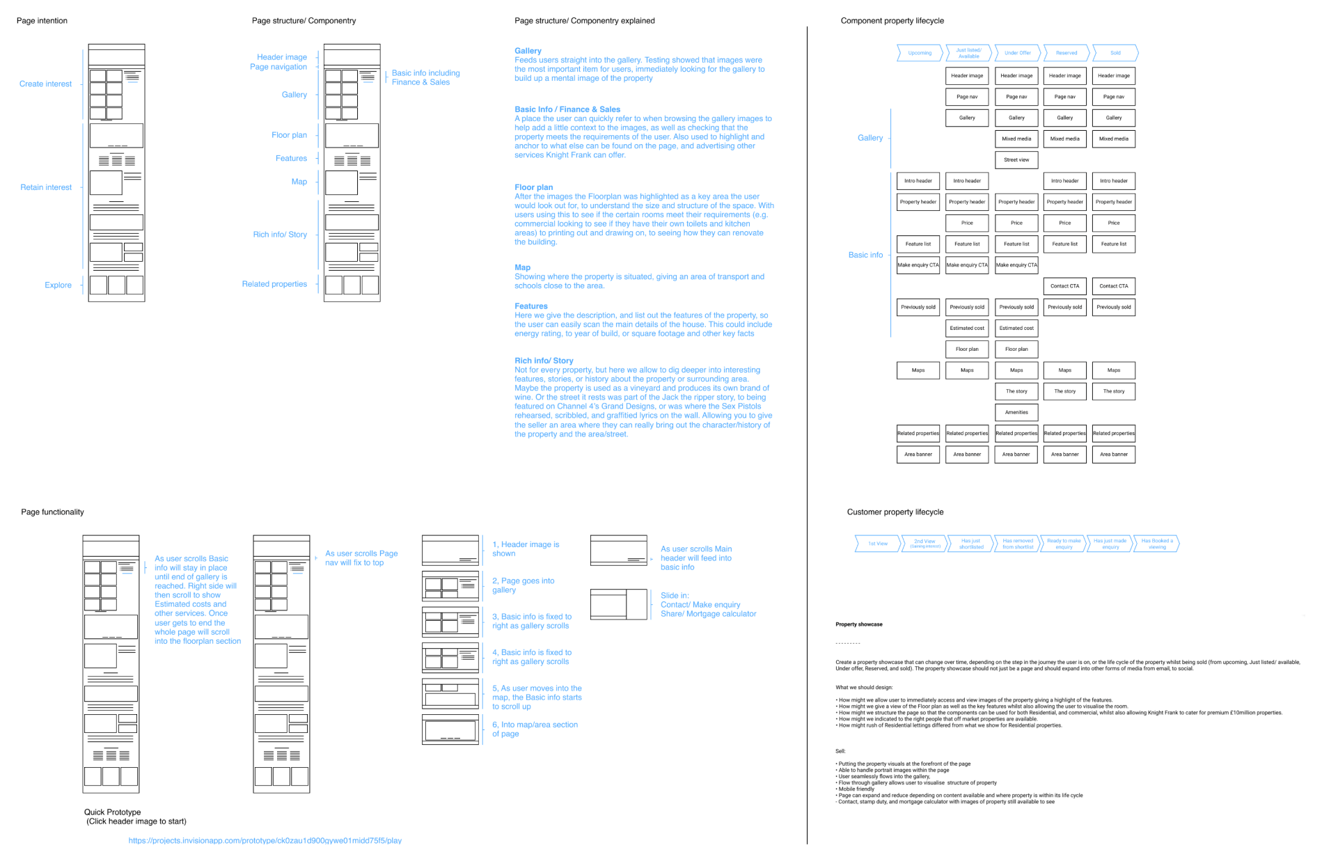
One template, two worlds — commercial listings need speed and clarity; high-end residential needs editorial storytelling. The same page had to do both.
Agent flexibility — agents needed to be able to build the page themselves, with the right level of detail for each property, without it breaking.
Page lifecycle — the page needed to behave differently from the moment a listing goes live, through to active marketing, through to sold.
Residential vs commercial — portrait photography, different content hierarchies, different emotional registers.
The idea
Through workshops, Crazy Eights sessions, and early interviews with the project team, the same theme kept surfacing: people weren't searching for properties — they were trying to feel what it would be like to live there. The images weren't decoration. They were the primary content.
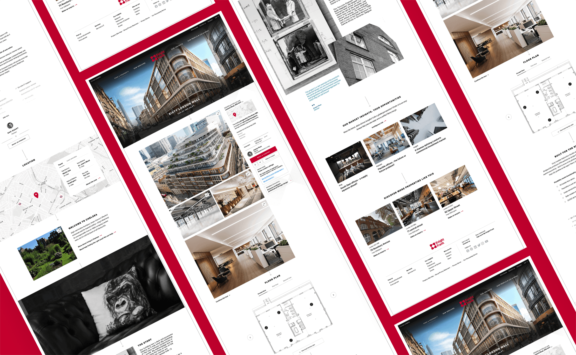
The direction we took was to bring the gallery into the scroll itself. Instead of a click-through carousel, images would flow inline as the user moved down the page — the way you experience a product on Nike or a hotel on a well-designed booking site. As you scroll, you move through the property.
In early user interviews, people didn't notice the carousel had been removed. They were already scrolling, already talking about the feel of the place. That told us we were on the right track.
The page was designed as a component system — agents could build up the right story for each property. Sparse and formal for commercial. Rich and editorial for a Cotswolds estate. Storytelling features only when the property needed them.
What was built
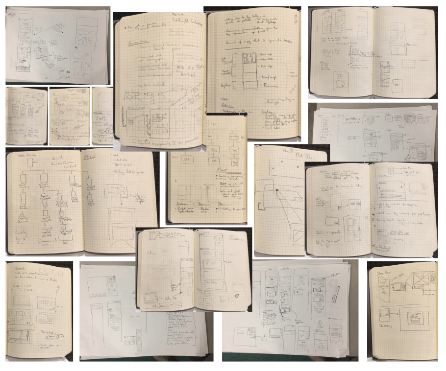
Two rounds of user interviews with 16 participants. A card sorting exercise to understand what users prioritise on a property page. A tree jack to help map out how users navigate Knight Frank's wider services.
Designs across residential and commercial variants, exploring how portrait imagery changed the layout and how the page adapted through its lifecycle. An interactive floor plan concept to give users a more spatial sense of each room. A full InVision click-through prototype used for testing, covering the homepage, property page, and services sections.
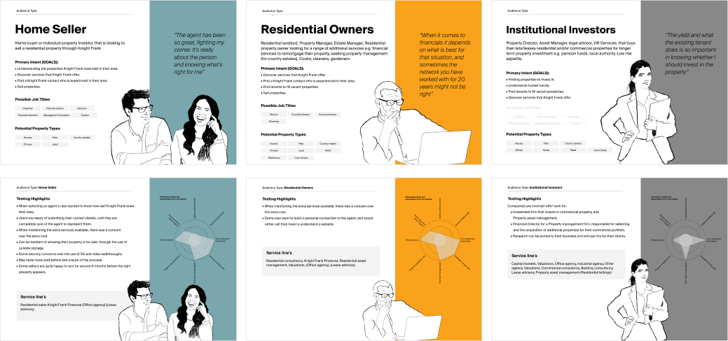
The phase wrapped with a set of audience type personas and a revised site map reflecting everything we'd learned.
What happened
The design phase finished in early 2020. Then Covid hit and Knight Frank pulled funding for the build. A project that felt genuinely ready to go live was shelved — one of the more frustrating full stops of my career.
The consolation: the design patterns and framework we established have since started to appear on their live website. The thinking around scroll-based imagery, component-led page building, and immersive property storytelling landed — just later than expected, and without us in the room.
What I'd do differently
Commercial variants earlier. The residential case was well explored. The commercial pages felt underdeveloped by the time the project ended — I'd have pushed those harder from the start.
Interactive floor plan sooner. That concept came late in the process. It deserved more testing time — users consistently flagged floor plans as important, and we never fully resolved how interactive they should be.
The best property pages don't show people a house — they make them feel like they're already inside it.